wrangling and summaries

Data wrangling refers to the process of organizing, cleaning up, and making a “raw” data set more ready for downstream analysis. It is a key piece of any data analysis process. Here we will look at a few different aspects of wrangling, starting with how to look at a data set, then subsetting, pivoting, and summarizing data. (Getting an outside data set into R in the first place is a setup step rather than a wrangling one, so it lives under “data import” in the installation appendix.)
viewing data
Before a data set can be wrangled, it helps to be able to see it. head() shows the first six rows, which is enough to recall what the columns are called, but not enough to get a feel for what is actually in the table. For that, use view():
That opens the whole table as a scrollable grid. Each column shows its name with its type underneath — chr for text, dbl for numbers with decimals, int for whole numbers, lgl for TRUE/FALSE, fct for a factor. Knowing a column’s type matters more than it might seem because it decides which operations will work on it, and a number that gets imported as chr is one of the most common reasons a calculation can fail.
In this book’s webR sandbox, very large tables are capped at the first 1000 rows so the browser stays responsive. When that happens the caption says so, and more can be requested with view(alaska_lake_data, n = 5000). In addition, view() is not limited to data sets that were loaded in advance — it will show anything, including a table just built:
That second use is the one to get into the habit of. Every wrangling step in this chapter produces a new table, and the quickest way to check that a step did what was intended is to look at the result rather than guess at it. Finally, please note that view() is provided by the sandboxes in this book (and by the escape rooms). In R and RStudio on a local machine, the equivalent is View(), with a capital V.
concept check
Fill in the blank with the command that opens the whole table, rather than just the top of it. Press Run.
Self-check: you have run head(alaska_lake_data) and want to see the rest of it. What does view(alaska_lake_data) give you that head() does not?
subsetting
So far, we have always been passing whole data sets to ggplot to do our plotting. However, suppose we wanted to get at just certain portions of our dataset, say, specific columns, or specific rows? Here are a few ways to do that:
# To look at a single column (the third column)
head(alaska_lake_data[,3])
## # A tibble: 6 × 1
##   water_temp
##        <dbl>
## 1       6.46
## 2       6.46
## 3       6.46
## 4       6.46
## 5       6.46
## 6       6.46

# To look at select columns:
head(alaska_lake_data[,2:5])
## # A tibble: 6 × 4
##   park  water_temp    pH element
##   <chr>      <dbl> <dbl> <chr>
## 1 BELA        6.46  7.69 C
## 2 BELA        6.46  7.69 N
## 3 BELA        6.46  7.69 P
## 4 BELA        6.46  7.69 Cl
## 5 BELA        6.46  7.69 S
## 6 BELA        6.46  7.69 F

# To look at a single row (the second row)
head(alaska_lake_data[2,])
## # A tibble: 1 × 7
##   lake  park  water_temp    pH element mg_per_L element_type
##   <chr> <chr>      <dbl> <dbl> <chr>      <dbl> <chr>
## 1 Devi… BELA        6.46  7.69 N          0.028 bound

# To look at select rows:
head(alaska_lake_data[2:5,])
## # A tibble: 4 × 7
##   lake  park  water_temp    pH element mg_per_L element_type
##   <chr> <chr>      <dbl> <dbl> <chr>      <dbl> <chr>
## 1 Devi… BELA        6.46  7.69 N          0.028 bound
## 2 Devi… BELA        6.46  7.69 P          0     bound
## 3 Devi… BELA        6.46  7.69 Cl        10.4   free
## 4 Devi… BELA        6.46  7.69 S          0.62  free

# To look at just a single column, by name
head(alaska_lake_data$pH)
## [1] 7.69 7.69 7.69 7.69 7.69 7.69

# To look at select columns by name
head(select(alaska_lake_data, park, water_temp))
## # A tibble: 6 × 2
##   park  water_temp
##   <chr>      <dbl>
## 1 BELA        6.46
## 2 BELA        6.46
## 3 BELA        6.46
## 4 BELA        6.46
## 5 BELA        6.46
## 6 BELA 6.46wide and long data
When we make data tables by hand, it’s often easy to make a wide-style table like the following. In it, the abundances of 7 different fatty acids in 10 different species are tabulated. Each fatty acid gets its own row, each species, its own column.
head(fadb_sample)
## # A tibble: 6 × 11
##   fatty_acid      Agonandra_brasiliensis Agonandra_silvatica
##   <chr>                            <dbl>               <dbl>
## 1 Hexadecanoic a…                    3.4                 1
## 2 Octadecanoic a…                    6.2                 0.1
## 3 Eicosanoic acid                    4.7                 3.5
## 4 Docosanoic acid                   77.4                 0.4
## 5 Tetracosanoic …                    1.4                 1
## 6 Hexacosanoic a…                    1.9                12.6
## # ℹ 8 more variables: Agonandra_excelsa <dbl>,
## #   Heisteria_silvianii <dbl>, Malania_oleifera <dbl>,
## #   Ximenia_americana <dbl>, Ongokea_gore <dbl>,
## #   Comandra_pallida <dbl>, Buckleya_distichophylla <dbl>,
## #   Nuytsia_floribunda <dbl>
While this format is very nice for filling in my hand (such as in a lab notebook or similar), it does not groove with ggplot and other tidyverse functions very well. We need to convert it into a long-style table. This is done using pivot_longer(). This function can be thought of as transforming both the data’s column names (or some of the column names) and the data matrix’s values (in this case, the measurements) each into their own variables (i.e. columns). We can do this for our fatty acid dataset using the command below. In it, we specify what data we want to transform (data = fadb_sample), we need to tell it what columns we want to transform (cols = 2:11), what we want the new variable that contains column names to be called (names_to = "plant_species") and what we want the new variable that contains matrix values to be called (values_to = "relative_abundance"). All together now:
pivot_longer(
  data = fadb_sample,
  cols = 2:11,
  names_to = "plant_species",
  values_to = "relative_abundance"
)
## # A tibble: 70 × 3
##    fatty_acid        plant_species        relative_abundance
##    <chr>             <chr>                             <dbl>
##  1 Hexadecanoic acid Agonandra_brasilien…                3.4
##  2 Hexadecanoic acid Agonandra_silvatica                 1
##  3 Hexadecanoic acid Agonandra_excelsa                   1.2
##  4 Hexadecanoic acid Heisteria_silvianii                 2.9
##  5 Hexadecanoic acid Malania_oleifera                    0.7
##  6 Hexadecanoic acid Ximenia_americana                   3.3
##  7 Hexadecanoic acid Ongokea_gore                        1
##  8 Hexadecanoic acid Comandra_pallida                    2.3
##  9 Hexadecanoic acid Buckleya_distichoph…                1.6
## 10 Hexadecanoic acid Nuytsia_floribunda                  3.8
## # ℹ 60 more rows
Brilliant! Now we have a long-style table that can be used with ggplot.
Occasionally you need to go the other way. Some functions — particularly the clustering and
dimensional-reduction ones we meet later in the book — want a numeric matrix: one row per sample,
one column per measured variable. That is a wide table again, and pivot_wider() is how you get back
to one. It is the exact inverse of pivot_longer(), and it takes the mirror-image arguments: instead
of saying which columns to gather up and what to name the two new variables, you say which existing
variable holds the names that should become column headers (names_from) and which one holds the
values that should fill the matrix (values_from).
Let’s take the long table we just made and fold it back up. We’ll save the long version first so we
have something to hand to pivot_wider():
fadb_long <- pivot_longer(
  data = fadb_sample,
  cols = 2:11,
  names_to = "plant_species",
  values_to = "relative_abundance"
)

pivot_wider(
  data = fadb_long,
  names_from = "plant_species",
  values_from = "relative_abundance"
)
## # A tibble: 7 × 11
##   fatty_acid      Agonandra_brasiliensis Agonandra_silvatica
##   <chr>                            <dbl>               <dbl>
## 1 Hexadecanoic a…                    3.4                 1
## 2 Octadecanoic a…                    6.2                 0.1
## 3 Eicosanoic acid                    4.7                 3.5
## 4 Docosanoic acid                   77.4                 0.4
## 5 Tetracosanoic …                    1.4                 1
## 6 Hexacosanoic a…                    1.9                12.6
## 7 Octacosanoic a…                    5                  81.4
## # ℹ 8 more variables: Agonandra_excelsa <dbl>,
## #   Heisteria_silvianii <dbl>, Malania_oleifera <dbl>,
## #   Ximenia_americana <dbl>, Ongokea_gore <dbl>,
## #   Comandra_pallida <dbl>, Buckleya_distichophylla <dbl>,
## #   Nuytsia_floribunda <dbl>
That should look familiar — it is fadb_sample again. Any column you do not name in names_from or
values_from is left alone and used to identify the rows, which is why fatty_acid comes back as the
first column without our having to mention it.
the pipe (%>%)
We have seen how to create new objects using <-, and we have been filtering and plotting data using, for example:
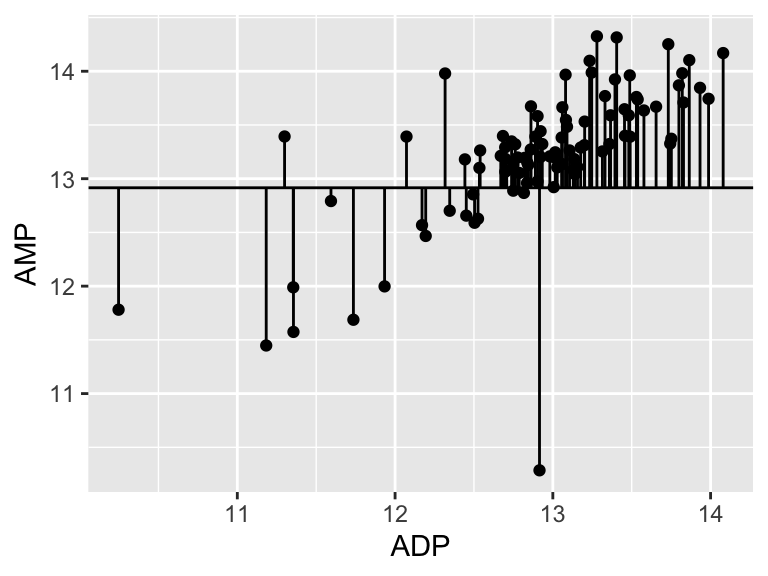
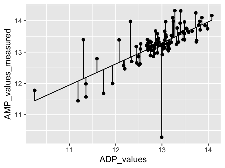
However, as our analyses get more complex, the code can get long and hard to read. We’re going to use the pipe %>% to help us with this. Check it out:
Neat! Another way to think about the pipe:
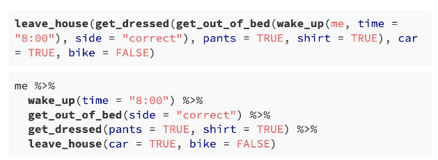
The pipe will become more important as our analyses become more sophisticated, which happens very quickly when we start working with summary statistics, as we shall now see…
summary statistics
So far, we have been plotting raw data. This is well and good, but it is not always suitable. Often we have scientific questions that cannot be answered by looking at raw data alone, or sometimes there is too much raw data to plot. For this, we need summary statistics - things like averages, standard deviations, and so on. While these metrics can be computed in Excel, programming such can be time consuming, especially for group statistics. Consider the example below, which uses the ny_trees dataset. The NY Trees dataset contains information on nearly half a million trees in New York City (this is after considerable filtering and simplification):
head(ny_trees)
## # A tibble: 6 × 14
##   tree_height tree_diameter address        tree_loc pit_type
##         <dbl>         <dbl> <chr>          <chr>    <chr>
## 1        21.1             6 1139 57 STREET Front    Sidewal…
## 2        59.0             6 2220 BERGEN A… Across   Sidewal…
## 3        92.4            13 2254 BERGEN A… Across   Sidewal…
## 4        50.2            15 2332 BERGEN A… Across   Sidewal…
## 5        95.0            21 2361 EAST   7… Front    Sidewal…
## 6        67.5            19 2409 EAST   7… Front    Continu…
## # ℹ 9 more variables: soil_lvl <chr>, status <chr>,
## #   spc_latin <chr>, spc_common <chr>, trunk_dmg <chr>,
## #   zipcode <dbl>, boroname <chr>, latitude <dbl>,
## #   longitude <dbl>
More than 300,000 observations of 14 variables! That’s 4.2M data points! Now, what is the average and standard deviation of the height and diameter of each tree species within each NY borough? Do those values change for trees that are in parks versus sidewalk pits?? I don’t even know how one would begin to approach such questions using traditional spreadsheets. Here, we will answer these questions with ease using two new commands: group_by() and summarize(). Let’s get to it.
Say that we want to know (and of course, visualize) the mean and standard deviation of the heights of each tree species in NYC. We can see that data in first few columns of the NY trees dataset above, but how to calculate these statistics? In R, mean can be computed with mean() and standard deviation can be calculated with sd(). We will use the function summarize() to calculate summary statistics. So, we can calculate the average and standard deviation of all the trees in the data set as follows:
ny_trees %>%
  summarize(mean_height = mean(tree_height))
## # A tibble: 1 × 1
##   mean_height
##         <dbl>
## 1        72.6

ny_trees %>%
  summarize(stdev_height = sd(tree_height))
## # A tibble: 1 × 1
##   stdev_height
##          <dbl>
## 1         28.7
Great! But how to do this for each species? We need to subdivide the data by species, then compute the mean and standard deviation, then recombine the results into a new table. First, we use group_by(). Note that in ny_trees, species are indicated in the column called spc_latin. Once the data is grouped, we can use summarize() to compute statistics.
ny_trees %>%
  group_by(spc_latin) %>%
  summarize(mean_height = mean(tree_height))
## # A tibble: 12 × 2
##    spc_latin              mean_height
##    <chr>                        <dbl>
##  1 ACER PLATANOIDES              82.6
##  2 ACER RUBRUM                  106.
##  3 ACER SACCHARINUM              65.6
##  4 FRAXINUS PENNSYLVANICA        60.6
##  5 GINKGO BILOBA                 90.4
##  6 GLEDITSIA TRIACANTHOS         53.0
##  7 PLATANUS ACERIFOLIA           82.0
##  8 PYRUS CALLERYANA              21.0
##  9 QUERCUS PALUSTRIS             65.5
## 10 QUERCUS RUBRA                111.
## 11 TILIA CORDATA                 98.8
## 12 ZELKOVA SERRATA              101.
Bam. Mean height of each tree species. We can also count the number of observations using n():
ny_trees %>%
  group_by(spc_latin) %>%
  summarize(number_of_individuals = n())
## # A tibble: 12 × 2
##    spc_latin              number_of_individuals
##    <chr>                                  <int>
##  1 ACER PLATANOIDES                       67260
##  2 ACER RUBRUM                            11506
##  3 ACER SACCHARINUM                       13161
##  4 FRAXINUS PENNSYLVANICA                 16987
##  5 GINKGO BILOBA                          15672
##  6 GLEDITSIA TRIACANTHOS                  48707
##  7 PLATANUS ACERIFOLIA                    80075
##  8 PYRUS CALLERYANA                       39125
##  9 QUERCUS PALUSTRIS                      37058
## 10 QUERCUS RUBRA                          10020
## 11 TILIA CORDATA                          25970
## 12 ZELKOVA SERRATA                        13221
Cool! summarize() is more powerful though, we can do many summary statistics at once:
ny_trees %>%
  group_by(spc_latin) %>%
  summarize(
    mean_height = mean(tree_height),
    stdev_height = sd(tree_height)
  ) -> ny_trees_by_spc_summ
ny_trees_by_spc_summ
## # A tibble: 12 × 3
##    spc_latin              mean_height stdev_height
##    <chr>                        <dbl>        <dbl>
##  1 ACER PLATANOIDES              82.6        17.6
##  2 ACER RUBRUM                  106.         15.7
##  3 ACER SACCHARINUM              65.6        16.6
##  4 FRAXINUS PENNSYLVANICA        60.6        21.3
##  5 GINKGO BILOBA                 90.4        24.5
##  6 GLEDITSIA TRIACANTHOS         53.0        13.0
##  7 PLATANUS ACERIFOLIA           82.0        16.0
##  8 PYRUS CALLERYANA              21.0         5.00
##  9 QUERCUS PALUSTRIS             65.5         6.48
## 10 QUERCUS RUBRA                111.         20.7
## 11 TILIA CORDATA                 98.8        32.6
## 12 ZELKOVA SERRATA              101.         10.7
Now we can use this data in plotting. For this, we will use a new geom, geom_pointrange, which takes x and y aesthetics, as usual, but also requires two additional y-ish aesthetics ymin and ymax (or xmin and xmax for variation along x). Also, note that in the aesthetic mappings for xmin and xmax, we can use a mathematical expression: mean-stdev and mean+stdev, respectivey. In our case, these are mean_height - stdev_height and mean_height + stdev_height. Let’s see it in action:
ny_trees_by_spc_summ %>%
ggplot() +
  geom_pointrange(
      aes(
        y = spc_latin,
        x = mean_height,
        xmin = mean_height - stdev_height,
        xmax = mean_height + stdev_height
      )
    )
Cool! Just like that, we’ve found (and visualized) the average and standard deviation of tree heights, by species, in NYC. But it doesn’t stop there. We can use group_by() and summarize() on multiple variables (i.e. more groups). We can do this to examine the properties of each tree species in each NYC borough. Let’s check it out:
ny_trees %>%
  group_by(spc_latin, boroname) %>%
  summarize(
    mean_diam = mean(tree_diameter),
    stdev_diam = sd(tree_diameter)
  ) -> ny_trees_by_spc_boro_summ
ny_trees_by_spc_boro_summ
## # A tibble: 48 × 4
## # Groups:   spc_latin [12]
##    spc_latin        boroname  mean_diam stdev_diam
##    <chr>            <chr>         <dbl>      <dbl>
##  1 ACER PLATANOIDES Bronx         13.9        6.74
##  2 ACER PLATANOIDES Brooklyn      15.4       14.9
##  3 ACER PLATANOIDES Manhattan     11.6        8.45
##  4 ACER PLATANOIDES Queens        15.1       12.9
##  5 ACER RUBRUM      Bronx         11.4        7.88
##  6 ACER RUBRUM      Brooklyn      10.5        7.41
##  7 ACER RUBRUM      Manhattan      6.63       4.23
##  8 ACER RUBRUM      Queens        14.1        8.36
##  9 ACER SACCHARINUM Bronx         19.7       10.5
## 10 ACER SACCHARINUM Brooklyn      22.2       10.1
## # ℹ 38 more rows
Now we have summary statistics for each tree species within each borough. This is different from the previous plot in that we now have an additional variable (boroname) in our summarized dataset. This additional variable needs to be encoded in our plot. Let’s map boroname to x and facet over tree species, which used to be on x. We’ll also manually modify the theme element strip.text.y to get the species names in a readable position.
ny_trees_by_spc_boro_summ %>%
ggplot() +
  geom_pointrange(
    aes(
      y = boroname,
      x = mean_diam,
      xmin = mean_diam-stdev_diam,
      xmax = mean_diam+stdev_diam
    )
  ) +
  facet_grid(spc_latin~.) +
  theme(
    strip.text.y = element_text(angle = 0)
  )
Excellent! And if we really want to go for something pretty:
ny_trees_by_spc_boro_summ %>%
ggplot() +
  geom_pointrange(
    aes(
      y = boroname,
      x = mean_diam,
      xmin = mean_diam-stdev_diam,
      xmax = mean_diam+stdev_diam,
      fill = spc_latin
    ), color = "black", shape = 21
  ) +
  labs(
    y = "Borough",
    x = "Trunk diameter"
    # caption = str_wrap(
    #   "Figure 1: Diameters of trees in New York City. Points correspond to
    #   average diameters of each tree species in each borough. Horizontal lines
    #   indicate the standard deviation of tree diameters. Points are colored
    #   according to tree species.",
    #   width = 80
    # )
  ) +
  facet_grid(spc_latin~.) +
  guides(fill = "none") +
  scale_fill_brewer(palette = "Paired") +
  theme_bw() +
  theme(
    strip.text.y = element_text(angle = 0),
    plot.caption = element_text(hjust = 0.5)
  )
Now we are getting somewhere. It looks like there are some really big maple trees (Acer) in Queens.
ordering
We can also sort or order a data frame based on a specific column with the command arrange(). Let’s have a quick look. Suppose we wanted to know which lake was the coldest:
arrange(alaska_lake_data, water_temp)
## # A tibble: 220 × 7
##    lake             park  water_temp    pH element mg_per_L
##    <chr>            <chr>      <dbl> <dbl> <chr>      <dbl>
##  1 Desperation_Lake NOAT        2.95  6.34 C          2.1
##  2 Desperation_Lake NOAT        2.95  6.34 N          0.005
##  3 Desperation_Lake NOAT        2.95  6.34 P          0
##  4 Desperation_Lake NOAT        2.95  6.34 Cl         0.2
##  5 Desperation_Lake NOAT        2.95  6.34 S          2.73
##  6 Desperation_Lake NOAT        2.95  6.34 F          0.01
##  7 Desperation_Lake NOAT        2.95  6.34 Br         0
##  8 Desperation_Lake NOAT        2.95  6.34 Na         1.11
##  9 Desperation_Lake NOAT        2.95  6.34 K          0.16
## 10 Desperation_Lake NOAT        2.95  6.34 Ca         5.87
## # ℹ 210 more rows
## # ℹ 1 more variable: element_type <chr>
Or suppose we wanted to know which was the warmest?
arrange(alaska_lake_data, desc(water_temp))
## # A tibble: 220 × 7
##    lake      park  water_temp    pH element mg_per_L
##    <chr>     <chr>      <dbl> <dbl> <chr>      <dbl>
##  1 Lava_Lake BELA        20.2  7.42 C          8.3
##  2 Lava_Lake BELA        20.2  7.42 N          0.017
##  3 Lava_Lake BELA        20.2  7.42 P          0.001
##  4 Lava_Lake BELA        20.2  7.42 Cl         2.53
##  5 Lava_Lake BELA        20.2  7.42 S          0.59
##  6 Lava_Lake BELA        20.2  7.42 F          0.04
##  7 Lava_Lake BELA        20.2  7.42 Br         0.01
##  8 Lava_Lake BELA        20.2  7.42 Na         2.93
##  9 Lava_Lake BELA        20.2  7.42 K          0.57
## 10 Lava_Lake BELA        20.2  7.42 Ca        11.8
## # ℹ 210 more rows
## # ℹ 1 more variable: element_type <chr>
arrange() will work on grouped data, which is particularly useful in combination with slice(), which can show us the first n elements in each group:
alaska_lake_data %>%
  group_by(park) %>%
  arrange(water_temp) %>%
  slice(1)
## # A tibble: 3 × 7
## # Groups:   park [3]
##   lake  park  water_temp    pH element mg_per_L element_type
##   <chr> <chr>      <dbl> <dbl> <chr>      <dbl> <chr>
## 1 Devi… BELA        6.46  7.69 C            3.4 bound
## 2 Wild… GAAR        5.5   6.98 C            6.5 bound
## 3 Desp… NOAT        2.95  6.34 C            2.1 bound
It looks like the coldest lakes in the three parks are Devil Mountain Lake, Wild Lake, and Desperation Lake!
mutate
One last thing before our exercises… there is another command called mutate(). It is like summarize it calculates user-defined statistics, but it creates output on a per-observation level instead of for each group. This means that it doesn’t make the data set smaller, in fact it makes it bigger, by creating a new row for the new variables defined inside mutate(). It can also take grouped data. This is really useful for calculating percentages within groups. For example: within each park, what percent of the park’s total dissolved sulfur does each lake have?
alaska_lake_data %>%
  filter(element == "S") %>%
  group_by(park) %>%
  select(lake, park, element, mg_per_L) %>%
  mutate(percent_S = mg_per_L/sum(mg_per_L)*100)
## # A tibble: 20 × 5
## # Groups:   park [3]
##    lake                park  element mg_per_L percent_S
##    <chr>               <chr> <chr>      <dbl>     <dbl>
##  1 Devil_Mountain_Lake BELA  S           0.62     32.3
##  2 Imuruk_Lake         BELA  S           0.2      10.4
##  3 Kuzitrin_Lake       BELA  S           0.29     15.1
##  4 Lava_Lake           BELA  S           0.59     30.7
##  5 North_Killeak_Lake  BELA  S           0.04      2.08
##  6 White_Fish_Lake     BELA  S           0.18      9.38
##  7 Iniakuk_Lake        GAAR  S          12.1      13.2
##  8 Kurupa_Lake         GAAR  S          12.4      13.6
##  9 Lake_Matcharak      GAAR  S          13.3      14.5
## 10 Lake_Selby          GAAR  S           7.92      8.64
## 11 Nutavukti_Lake      GAAR  S           2.72      2.97
## 12 Summit_Lake         GAAR  S           3.21      3.50
## 13 Takahula_Lake       GAAR  S           5.53      6.03
## 14 Walker_Lake         GAAR  S           5.77      6.30
## 15 Wild_Lake           GAAR  S          28.7      31.3
## 16 Desperation_Lake    NOAT  S           2.73     25.8
## 17 Feniak_Lake         NOAT  S           4.93     46.5
## 18 Lake_Kangilipak     NOAT  S           0.55      5.19
## 19 Lake_Narvakrak      NOAT  S           1.38     13.0
## 20 Okoklik_Lake        NOAT  S           1.01      9.53
The percent columns for each park add to 100%, so, for example, Devil Mountain Lake has 32.3% of BELA’s dissolved sulfur.
exercises


further reading
Tidy Data Tutor. This interactive site animates what happens to a data frame as verbs like
select(),filter(), orpivot_longer()are applied, making it easier to see how each operation reshapes the tables.tidyverse cheat sheet. Posit maintains printable cheat sheets for dplyr, tidyr, and readr that summarize the verbs we used here; they’re handy for looking up a forgotten argument name or exploring related functions.
tidyr and dplyr vignettes. The official package articles dig into the philosophy behind tidy data, the rationale for pivoting functions, and worked examples that go deeper than our walkthrough.
R for Data Science, Chapter 5–10. Hadley Wickham and Mine Çetinkaya-Rundel’s open textbook expands on wrangling, reshaping, and summarizing with narratives, exercises, and datasets that reinforce the patterns we practiced.
genzplyr. genzplyr is an alternative syntax for dplyr that replaces boring old function names with GenZ slang. Data wrangling is about to hit different.