data visualization II
In the last chapter we learned the core grammar of ggplot: pick your data, map variables to the axes with aes(), and choose one or more geometric objects to represent the data with a geom_*(). That trio is enough to make a huge range of plots, but there is much more that can be done. In this chapter we will look at (i) more geoms, (ii) how to split a plot into small multiples with facets, (iii) how to adjust the appearance of scales, (iv) control the non-data parts of a plot with themes, and (v) stitch several plots together into one figure. Together these take you from a plot that simply works to one that is genuinely nice to look at.
more geoms
We’ve looked at how to filter data and map variables in our data to geometric shapes to make plots. Let’s have a look at a few more things. For these examples, we’re going to use the data set called solvents. In these examples, I’d like to introduce you to two new geoms. The first geom_smooth() is used when there are two continuous variables. It is particularly nice when geom_point() is stacked on top of it.
ggplot(data = solvents, aes(x = boiling_point, y = vapor_pressure)) +
  geom_smooth() +
  geom_point()
## `geom_smooth()` using method = 'loess' and formula = 'y ~
## x'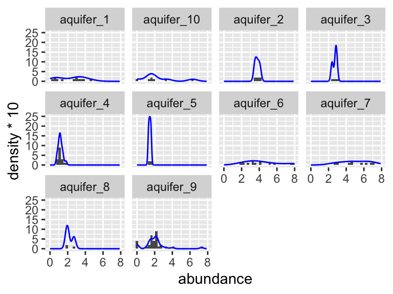
Also, please be aware of geom_tile(), which is nice for situations with two discrete variables and one continuous variable. geom_tile() makes what are often referred to as heat maps. Note that geom_tile() is somewhat similar to geom_point(shape = 21), in that it has both fill and color aesthetics that control the fill color and the border color, respectively.
ggplot(
  data = filter(algae_data, harvesting_regime == "Heavy"),
  aes(x = algae_strain, y = chemical_species)
) +
  geom_tile(aes(fill = abundance), color = "black", linewidth = 1)
These examples should illustrate that there is, to some degree, correspondence between the type of data you are interested in plotting (number of discrete and continuous variables) and the types of geoms that can effectively be used to represent the data.
facets
As alluded to in Exercises 1, it is possible to map variables in your dataset to more than the geometric features of shapes (i.e. geoms). One very common way of doing this is with facets. Faceting creates small multiples of your plot, each of which shows a different subset of your data based on a categorical variable of your choice. Let’s check it out.
Here, we can facet in the horizontal direction:
ggplot(data = algae_data, aes(x = algae_strain, y = chemical_species)) +
  geom_tile(aes(fill = abundance), color = "black") +
  facet_grid(.~replicate)
We can facet in the vertical direction:
ggplot(data = algae_data, aes(x = algae_strain, y = chemical_species)) +
  geom_tile(aes(fill = abundance), color = "black") +
  facet_grid(replicate~.)
And we can do both at the same time:
ggplot(data = algae_data, aes(x = algae_strain, y = chemical_species)) +
  geom_tile(aes(fill = abundance), color = "black") +
  facet_grid(harvesting_regime~replicate)
Faceting is a great way to describe more variation in your plot without having to make your geoms more complicated. For situations where you need to generate lots and lots of facets, consider facet_wrap instead of facet_grid:
ggplot(data = algae_data, aes(x = replicate, y = algae_strain)) +
  geom_tile(aes(fill = abundance), color = "black") +
  facet_wrap(chemical_species~.)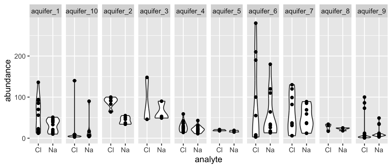
scales
Every time you define an aesthetic mapping (e.g. aes(x = algae_strain)), you are defining a new scale that is added to your plot. You can control these scales using the scale_* family of commands. Consider our faceting example above. In it, we use geom_tile(aes(fill = abundance)) to map the abundance variable to the fill aesthetic of the tiles. This creates a scale called fill that we can adjust using scale_fill_*. In this case, fill is mapped to a continuous variable and so the fill scale is a color gradient. Therefore, scale_fill_gradient() is the command we need to change it. Remember that you could always type ?scale_fill_ into the console and it will help you find relevant help topics that will provide more detail. Another option is to google: “How to modify color scale ggplot geom_tile”, which will undoubtedly turn up a wealth of help.
ggplot(data = algae_data, aes(x = algae_strain, y = chemical_species)) +
  geom_tile(aes(fill = abundance), color = "black") +
  facet_grid(harvesting_regime~replicate) +
  scale_fill_gradient(low = "white", high = "black") +
  theme_classic()
One particularly useful type of scale are the color scales provided by RColorBrewer:
display.brewer.all()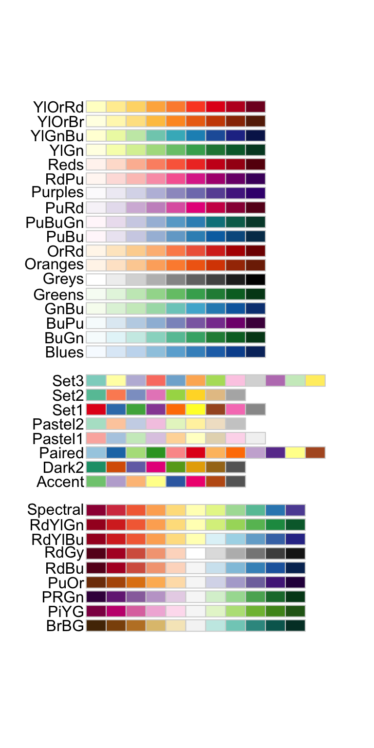
ggplot(mtcars) +
  geom_point(
    aes(x = mpg, y = factor(cyl), fill = factor(carb)),
    shape = 21, size = 6
  ) +
  scale_fill_brewer(palette = "Set1")
themes
So far we’ve just looked at how to control the means by which your data is represented on the plot. There are also components of the plot that are, strictly speaking, not data per se, but rather non-data ink. These are controlled using the theme() family of commands. There are two ways to go about this.
ggplot comes with a handful of built in “complete themes”. These will change the appearance of your plots with respect to the non-data ink. Compare the following plots:
ggplot(data = solvents, aes(x = boiling_point, y = vapor_pressure)) +
  geom_smooth() +
  geom_point() +
  theme_classic()
## `geom_smooth()` using method = 'loess' and formula = 'y ~
## x'
ggplot(data = solvents, aes(x = boiling_point, y = vapor_pressure)) +
  geom_smooth() +
  geom_point() +
  theme_dark()
## `geom_smooth()` using method = 'loess' and formula = 'y ~
## x'
ggplot(data = solvents, aes(x = boiling_point, y = vapor_pressure)) +
  geom_smooth() +
  geom_point() +
  theme_void()
## `geom_smooth()` using method = 'loess' and formula = 'y ~
## x'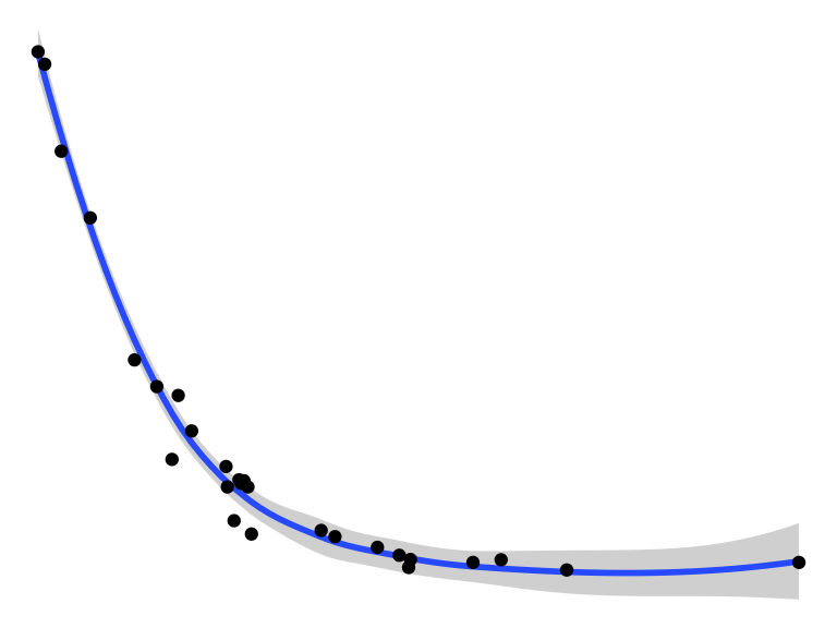
You can also change individual components of themes. This can be a bit tricky, but it’s all explained if you run ?theme(). Here is an example (and google will provide many, many more).
ggplot(data = solvents, aes(x = boiling_point, y = vapor_pressure)) +
  geom_smooth() +
  geom_point() +
  theme(
    text = element_text(size = 20, color = "black")
  )
## `geom_smooth()` using method = 'loess' and formula = 'y ~
## x'
Last, here is an example of combining scale_* and theme_* with previous commands to really get a plot looking sharp.
ggplot(data = solvents, aes(x = boiling_point, y = vapor_pressure)) +
  geom_smooth(color = "#4daf4a") +
  scale_x_continuous(
    name = "Boiling Point", breaks = seq(0,200,25), limits = c(30,210)
  ) +
  scale_y_continuous(
    name = "Vapor Pressure", breaks = seq(0,600,50)
  ) +
  geom_point(color = "#377eb8", size = 4, alpha = 0.6) +
  theme_bw() +
  theme(
    axis.text = element_text(color = "black"),
    text = element_text(size = 16, color = "black")
  )
## `geom_smooth()` using method = 'loess' and formula = 'y ~
## x'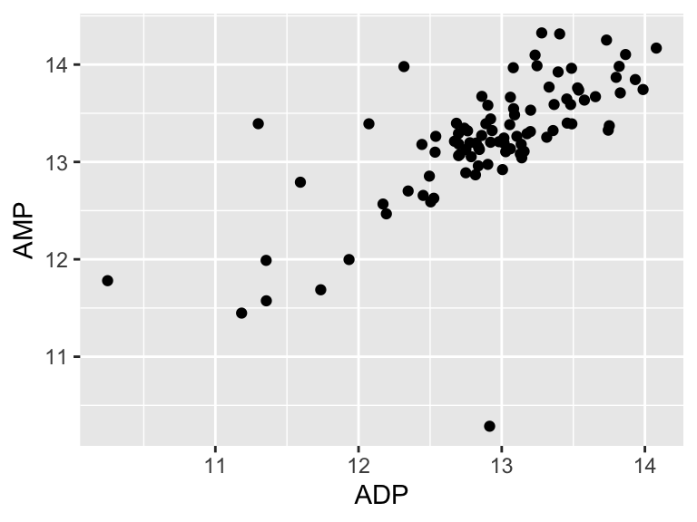
Figure 2.1: Vapor pressure as a function of boiling point. A scatter plot with trendline showing the vapor pressure of thirty-two solvents (y-axis) a as a function of their boiling points (x-axis). Each point represents the boiling point and vapor pressure of one solvent. Data are from the ‘solvents’ dataset used in UMD CHEM5725.
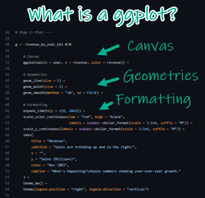
In some cases, the following diagram illustrates a useful way to think about the ggplot() / geom_*() / scale_*() / theme_*() situation. It shows how we use these things together to achieve a sharp-looking plot:
subplots
We can make subplots using the plot_grid() function from the cowplot package, which comes with the source() command. Let’s see:
plot1 <-  ggplot(
            filter(alaska_lake_data, element_type == "free")
          ) +
          geom_violin(aes(x = park, y = mg_per_L)) + theme_classic() +
          ggtitle("A")

plot2 <-  ggplot(
            filter(alaska_lake_data, element_type == "bound")
          ) +
          geom_violin(aes(x = park, y = mg_per_L)) + theme_classic() +
          ggtitle("B")

plot3 <-  ggplot(
            filter(alaska_lake_data, element == "C")
          ) +
          geom_violin(aes(x = park, y = mg_per_L)) + theme_classic() +
          coord_flip() + ggtitle("C")

plot_grid(plot_grid(plot1, plot2), plot3, ncol = 1)
further reading
ggplot2 geom cheat sheet. A handy reference that maps common plot types to their corresponding geoms, useful for quickly identifying the right geom for a given visualization need.
ggplot2: Elegant Graphics for Data Analysis. The official ggplot2 book by Hadley Wickham, covering the grammar of graphics and providing in-depth explanations of layers, scales, coordinates, and themes.
R Graph Gallery. A curated collection of R graphics with reproducible code, organized by chart type, making it easy to find inspiration and implementation patterns for attractive figures.
ColorBrewer2. An interactive tool for selecting perceptually appropriate color schemes for maps and charts, with options filtered by colorblind safety, print friendliness, and data type (sequential, diverging, qualitative).
Top R Color Palettes. An overview of popular R color palettes including colorblind-friendly options, sequential gradients, and qualitative scales, with example plots for each.
Friends Don’t Let Friends Make Bad Graphs. A GitHub repository cataloging common data visualization mistakes with visual examples and explanations of why each practice should be avoided.
Edward Tufte. The website of Edward Tufte, whose books on information design and data visualization remain foundational references for clear, high-density graphics.
Look at Data. An open online chapter from Kieran Healy’s “Data Visualization: A Practical Introduction,” covering principles of visual perception and how they apply to choosing effective chart types.
Information Is Beautiful Awards. An annual showcase of outstanding data visualization and infographics from around the world, useful for finding inspiration and seeing the range of what’s possible.
Data Viz Inspiration. A curated gallery of data visualization examples from practitioners, organized by chart type and use case, for discovering new approaches and aesthetics.
MetBrewer. An R package providing color palettes inspired by works in the Metropolitan Museum of Art, offering aesthetically refined options for both categorical and continuous data.
Paletteer. A comprehensive R package that aggregates hundreds of color palettes from across the R ecosystem into a single consistent interface.