flat clustering
“Do my samples fall into definable clusters?”
kmeans
One of the questions we’ve been asking is “which of my samples are most closely related?”. We’ve been answering that question using clustering. However, now that we know how to run principal components analyses, we can use another approach. This alternative approach is called k-means, and can help us decide how to assign our data into clusters. It is generally desirable to have a small number of clusters, however, this must be balanced by not having the variance within each cluster be too big. To strike this balance point, the elbow method is used. For it, we must first determine the maximum within-group variance at each possible number of clusters. An illustration of this is shown in A below:
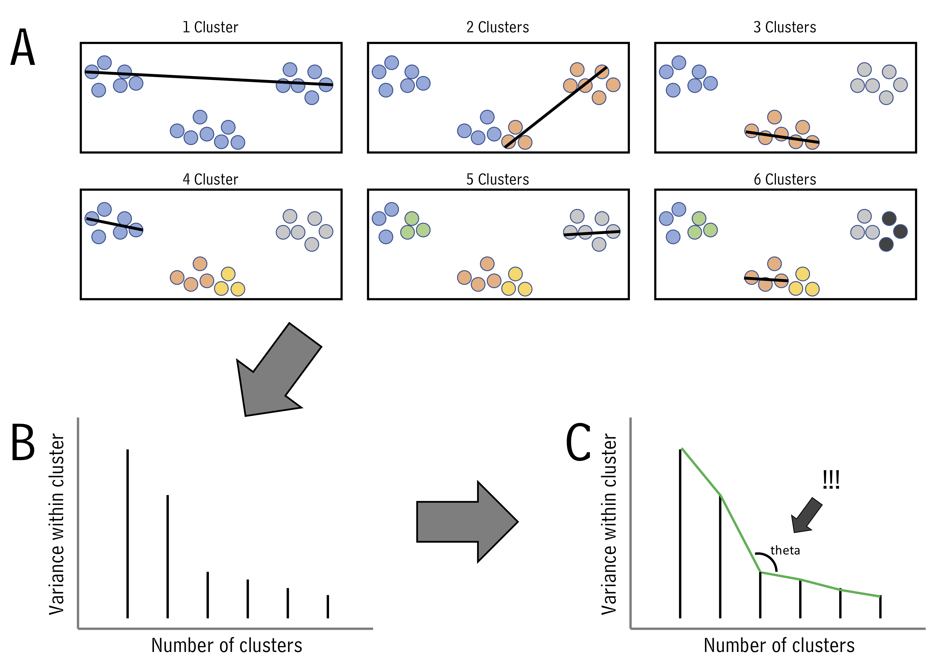
One we know within-group variances, we find the “elbow” point - the point with minimum angle theta - thus picking the outcome with a good balance of cluster number and within-cluster variance (illustrated above in B and C.)
Let’s try k-means using runMatrixAnalysis. For this example, let’s run it on the PCA projection of the alaska lakes data set. We can set analysis = "kmeans". When we do this, an application will load that will show us the threshold value for the number of clusters we want. We set the number of clusters and then close the app. In the context of markdown document, simply provide the number of clusters to the parameters argument:
alaska_lake_data %>%
  select(-element_type) %>%
  pivot_wider(names_from = "element", values_from = "mg_per_L") -> alaska_lake_data_wide

alaska_lake_data_pca <- runMatrixAnalyses(
    data = alaska_lake_data_wide,
    analysis = c("pca"),
    columns_w_values_for_single_analyte = colnames(alaska_lake_data_wide)[3:dim(alaska_lake_data_wide)[2]],
    columns_w_sample_ID_info = c("lake", "park")
)

alaska_lake_data_pca_clusters <- runMatrixAnalyses(
    data = alaska_lake_data_pca,
    analysis = c("kmeans"),
    parameters = c(5),
    columns_w_values_for_single_analyte = c("Dim.1", "Dim.2"),
    columns_w_sample_ID_info = "sample_unique_ID"
)

alaska_lake_data_pca_clusters <- left_join(alaska_lake_data_pca_clusters, alaska_lake_data_pca)
We can plot the results and color them according to the group that kmeans suggested. We can also highlight groups using geom_mark_ellipse. Note that it is recommended to specify both fill and label for geom_mark_ellipse:
alaska_lake_data_pca_clusters$cluster <- factor(alaska_lake_data_pca_clusters$cluster)
ggplot() +
  geom_point(
    data = alaska_lake_data_pca_clusters,
    aes(x = Dim.1, y = Dim.2, fill = cluster), shape = 21, size = 5, alpha = 0.6
  ) +
  geom_mark_ellipse(
    data = alaska_lake_data_pca_clusters,
    aes(x = Dim.1, y = Dim.2, label = cluster, fill = cluster), alpha = 0.2
  ) +
  theme_classic() +
  coord_cartesian(xlim = c(-7,12), ylim = c(-4,5)) +
scale_fill_manual(values = discrete_palette) 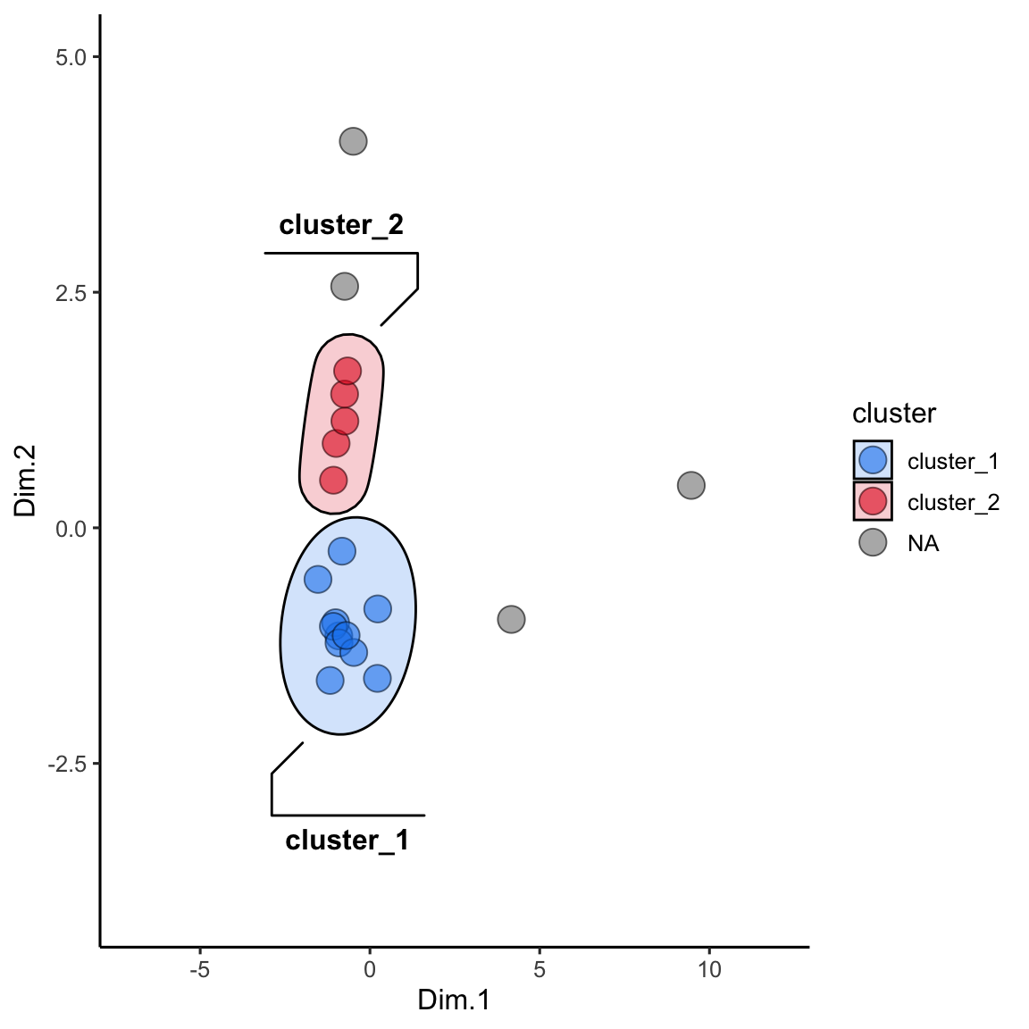
dbscan
There is another method to define clusters that we call dbscan. In this method, not all points are necessarily assigned to a cluster, and we define clusters according to a set of parameters, instead of simply defining the number of clusteres, as in kmeans. In interactive mode, runMatrixAnalysis() will again load an interactive means of selecting parameters for defining dbscan clusters (“k”, and “threshold”). In the context of markdown document, simply provide “k” and “threshold” to the parameters argument:
alaska_lake_data_pca <- runMatrixAnalyses(
    data = alaska_lake_data_wide,
    analysis = c("pca"),
    columns_w_values_for_single_analyte = colnames(alaska_lake_data_wide)[3:dim(alaska_lake_data_wide)[2]],
    columns_w_sample_ID_info = c("lake", "park")
)

alaska_lake_data_pca_clusters <- runMatrixAnalyses(
    data = alaska_lake_data_pca,
    analysis = c("dbscan"),
    parameters = c(4, 0.45),
    columns_w_values_for_single_analyte = c("Dim.1", "Dim.2"),
    columns_w_sample_ID_info = "sample_unique_ID"
)

alaska_lake_data_pca_clusters <- left_join(alaska_lake_data_pca_clusters, alaska_lake_data_pca)
We can make the plot in the same way, but please note that to get geom_mark_ellipse to omit the ellipse for NAs you need to feed it data without NAs:
alaska_lake_data_pca_clusters$cluster <- factor(alaska_lake_data_pca_clusters$cluster)
ggplot() +
  geom_point(
    data = alaska_lake_data_pca_clusters,
    aes(x = Dim.1, y = Dim.2, fill = cluster), shape = 21, size = 5, alpha = 0.6
  ) +
  geom_mark_ellipse(
    data = drop_na(alaska_lake_data_pca_clusters),
    aes(x = Dim.1, y = Dim.2, label = cluster, fill = cluster), alpha = 0.2
  ) +
  theme_classic() +
  coord_cartesian(xlim = c(-7,12), ylim = c(-4,5)) +
scale_fill_manual(values = discrete_palette) 
summarize by cluster
One more important point: when using kmeans or dbscan, we can use the clusters as groupings for summary statistics. For example, suppose we want to see the differences in abundances of certain chemicals among the clusters:
alaska_lake_data_pca <- runMatrixAnalysis(
  data = alaska_lake_data_wide,
  analysis = c("pca"),
  columns_w_values_for_single_analyte = colnames(alaska_lake_data_wide)[3:dim(alaska_lake_data_wide)[2]],
  columns_w_sample_ID_info = c("lake", "park")
)

alaska_lake_data_pca_clusters <- runMatrixAnalyses(
  data = alaska_lake_data_pca,
  analysis = c("dbscan"),
  parameters = c(4, 0.45),
  columns_w_values_for_single_analyte = c("Dim.1", "Dim.2"),
  columns_w_sample_ID_info = "sample_unique_ID"
)

alaska_lake_data_pca_clusters <- left_join(alaska_lake_data_pca_clusters, alaska_lake_data_pca)

alaska_lake_data_pca_clusters %>%
  select(cluster, S, Ca) %>%
  pivot_longer(cols = c(2,3), names_to = "analyte", values_to = "mg_per_L") %>%
  drop_na() %>%
  group_by(cluster, analyte) -> alaska_lake_data_pca_clusters_clean

plot_2 <- ggplot() +
  geom_col(
    data = summarize(
      alaska_lake_data_pca_clusters_clean,
      mean = mean(mg_per_L), sd = sd(mg_per_L)
    ),
    aes(x = cluster, y = mean, fill = cluster),
    color = "black", alpha = 0.6
  ) +
  geom_errorbar(
    data = summarize(
      alaska_lake_data_pca_clusters_clean,
      mean = mean(mg_per_L), sd = sd(mg_per_L)
    ),
    aes(x = cluster, ymin = mean-sd, ymax = mean+sd, fill = cluster),
    color = "black", alpha = 0.6, width = 0.5, size = 1
  ) +
  facet_grid(.~analyte) + theme_bw() +
  geom_jitter(
    data = alaska_lake_data_pca_clusters_clean,
    aes(x = cluster, y = mg_per_L, fill = cluster), width = 0.05,
    shape = 21
  ) +
  scale_fill_manual(values = discrete_palette)

plot_1<- ggplot() +
  geom_point(
    data = alaska_lake_data_pca_clusters,
    aes(x = Dim.1, y = Dim.2, fill = cluster), shape = 21, size = 5, alpha = 0.6
  ) +
  geom_mark_ellipse(
    data = drop_na(alaska_lake_data_pca_clusters),
    aes(x = Dim.1, y = Dim.2, label = cluster, fill = cluster), alpha = 0.2
  ) +
  theme_classic() + coord_cartesian(xlim = c(-7,12), ylim = c(-4,5)) +
  scale_fill_manual(values = discrete_palette)

plot_1 + plot_2
further reading
DBSCAN Clustering in R. STHDA’s tutorial walks through the DBSCAN algorithm, explains how
epsandMinPtscontrol density-based clusters, and demonstrates complete R examples using thedbscanandfpcpackages.Hierarchical and Density-Based Clustering. Ryan Wingate compares agglomerative methods with DBSCAN, showing how linkage choices and parameter tuning change the resulting partitions and offering intuition for when to use each approach.
Hierarchical clustering dendrogram reference. A color-coded dendrogram figure from the accompanying tutorial that distills the merge sequence, making it easy to visualize where to cut the tree when defining flat clusters.
DBSCAN Clustering in R Programming. GeeksforGeeks’ step-by-step R workflow for running DBSCAN, visualizing clusters, and understanding how adjusting
epsandMinPtsaffects noise handling.