figures & captions
figures
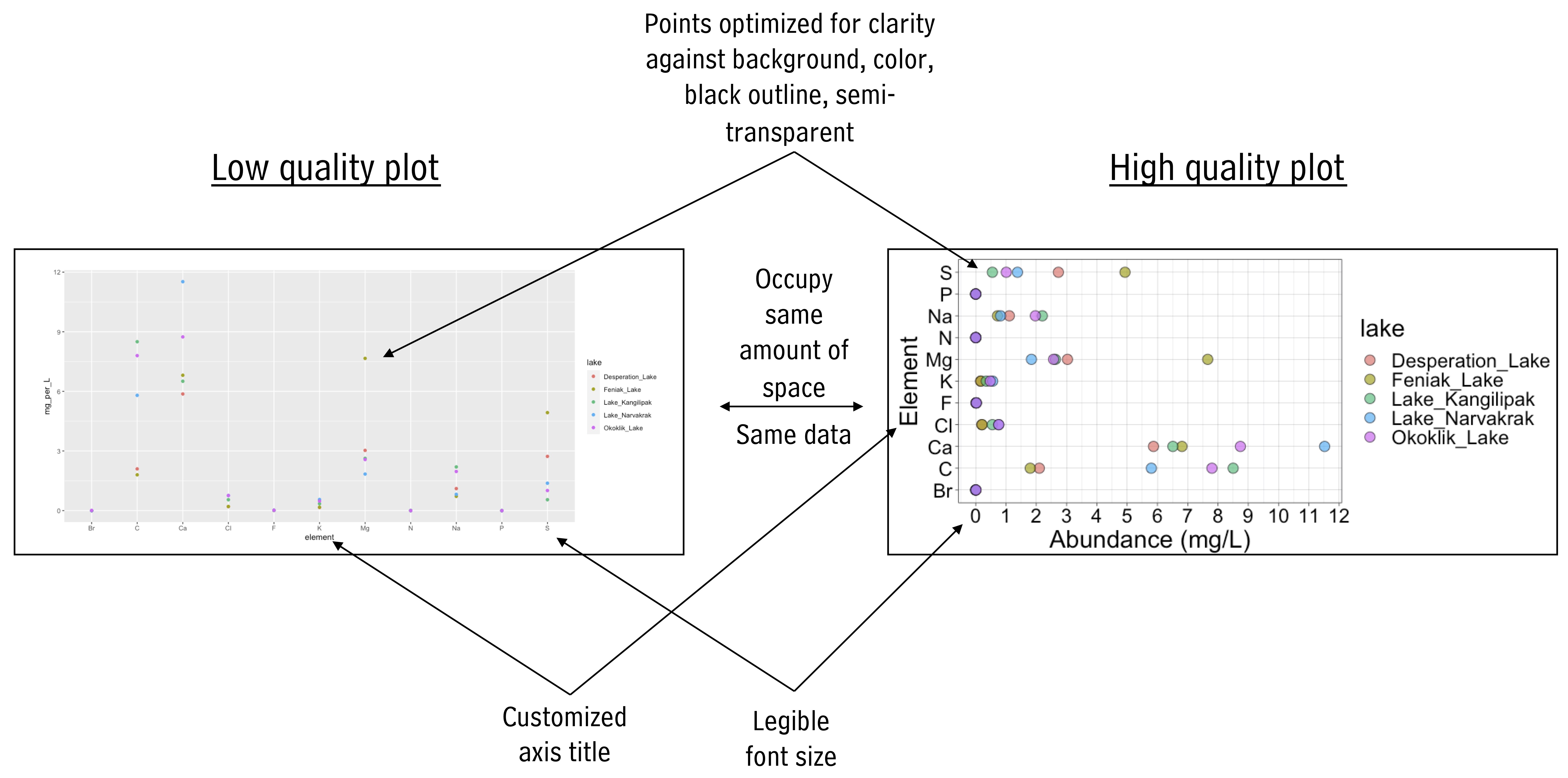
One of the first components in preparing a scientific manuscript is creating high quality figures. Considering the following for your figures:
- General Appearance:
Create plots that are clean, professional, and easy to view from a distance. Ensure axes tick labels are clear, non-overlapping, and utilize the available space efficiently for enhanced readability and precision. Use an appealing (and color blind-friendly) color palette to differentiate data points or categories. Tailor axes labels to be descriptive, and select an appropriate theme that complements the data and maintains professionalism.
- Representing Data:
Appropriate Geoms and Annotations: Choose geoms that best represent the data and help the viewer evaluate the hypothesis or make the desired comparison. Include raw data points where possible for detailed data distribution understanding. Consider apply statistical transformations like smoothing lines or histograms where appropriate to provide deeper insights into the data. Consider using facets for visualizing multiple categories or groups, allowing for easier comparison while maintaining a consistent scale and layout. Adhere to specific standards or conventions relevant to your field, including the representation of data, error bars, or statistical significance markers.
insets
Zoom in on certain plot regions
p <- ggplot(mpg, aes(displ, hwy, colour = factor(cyl))) +
  geom_point()

data.tb <-
  tibble(x = 7, y = 44,
         plot = list(p +
                       coord_cartesian(xlim = c(4.9, 6.2),
                                       ylim = c(13, 21)) +
                       labs(x = NULL, y = NULL) +
                       theme_bw(8) +
                       scale_colour_discrete(guide = "none")))

ggplot(mpg, aes(displ, hwy, colour = factor(cyl))) +
  geom_plot(data = data.tb, aes(x, y, label = plot)) +
  annotate(geom = "rect",
           xmin = 4.9, xmax = 6.2, ymin = 13, ymax = 21,
           linetype = "dotted", fill = NA, colour = "black") +
geom_point() 
Plot insets
p <- ggplot(mpg, aes(factor(cyl), hwy, fill = factor(cyl))) +
  stat_summary(geom = "col", fun = mean, width = 2/3) +
  labs(x = "Number of cylinders", y = NULL, title = "Means") +
  scale_fill_discrete(guide = "none")

data.tb <- tibble(x = 7, y = 44,
                  plot = list(p +
                                theme_bw(8)))

ggplot(mpg, aes(displ, hwy, colour = factor(cyl))) +
  geom_plot(data = data.tb, aes(x, y, label = plot)) +
  geom_point() +
  labs(x = "Engine displacement (l)", y = "Fuel use efficiency (MPG)",
       colour = "Engine cylinders\n(number)") +
  theme_bw()
Image insets
Isoquercitin_synthase <- magick::image_read("https://thebustalab.github.io/integrated_bioanalytics/images/homology2.png")
grobs.tb <- tibble(x = c(0, 10, 20, 40), y = c(4, 5, 6, 9),
                   width = c(0.05, 0.05, 0.01, 1),
                   height =  c(0.05, 0.05, 0.01, 0.3),
                   grob = list(grid::circleGrob(),
                               grid::rectGrob(),
                               grid::textGrob("I am a Grob"),
                               grid::rasterGrob(image = Isoquercitin_synthase)))

ggplot() +
  geom_grob(data = grobs.tb,
            aes(x, y, label = grob, vp.width = width, vp.height = height),
            hjust = 0.7, vjust = 0.55) +
  scale_y_continuous(expand = expansion(mult = 0.3, add = 0)) +
  scale_x_continuous(expand = expansion(mult = 0.2, add = 0)) +
  theme_bw(12)
paneled figures
Many high quality figures are paneled figures in which there is more than one panel. Here is a simple way to make such figures in R. First, make each component of the paneled figure and send the plot to a new object:
color_palette <- RColorBrewer::brewer.pal(11, "Paired")
names(color_palette) <- unique(alaska_lake_data$element)

plot1 <- ggplot(
  data = filter(alaska_lake_data, element_type == "bound"),
  aes(y = lake, x = mg_per_L)
) +
  geom_col(
    aes(fill = element), size = 0.5, position = "dodge",
    color = "black"
  ) +
  facet_grid(park~., scales = "free", space = "free") +
  theme_bw() +
  scale_fill_manual(values = color_palette) +
  scale_y_discrete(name = "Lake Name") +
  scale_x_continuous(name = "Abundance mg/L)") +
  theme(
    text = element_text(size = 14)
  )

plot2 <- ggplot(
  data = filter(alaska_lake_data, element_type == "free"),
  aes(y = lake, x = mg_per_L)
) +
  geom_col(
    aes(fill = element), size = 0.5, position = "dodge",
    color = "black"
  ) +
  facet_grid(park~., scales = "free", space = "free") +
  theme_bw() +
  scale_fill_manual(values = color_palette) +
  scale_y_discrete(name = "Lake Name") +
  scale_x_continuous(name = "Abundance mg/L)") +
  theme(
    text = element_text(size = 14)
  )
Now, add them together to lay them out. Let’s look at various ways to lay this out:
plot_grid(plot1, plot2)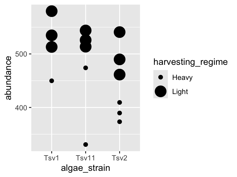
plot_grid(plot1, plot2, ncol = 1)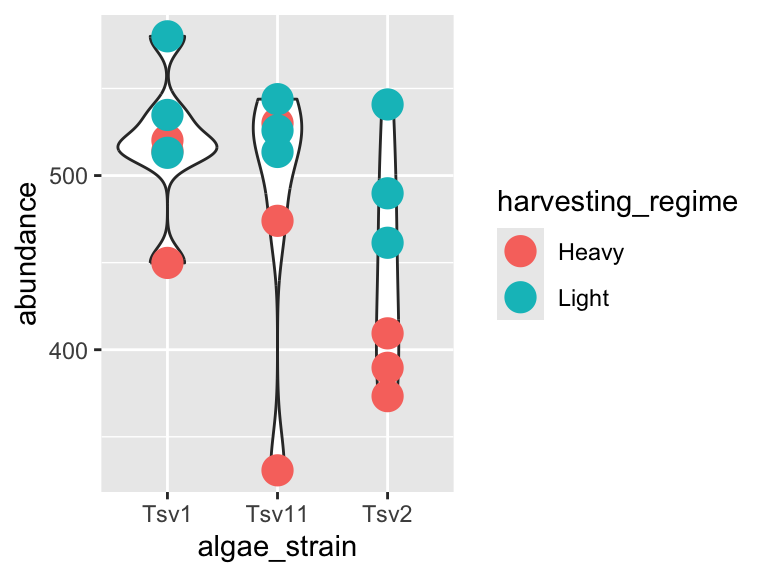
plot_grid(plot_grid(plot1,plot2), plot1, ncol = 1)
exporting graphics
To export graphics from R, consider the code below. The
captions
Figures are critical tools for clearly and effectively communicating scientific results. However, as Reviewer 2 will tell you, a figure is only as good as its caption. Captions provide essential context, guiding the reader through the significance, structure, and details of the visual information presented. Below are some guidelines to help you craft informative captions. The recommendations are organized into categories, covering essential components like figure titles, panel descriptions, variable definitions, data representation details, statistical analyses, and data sources. Some example captions and a helpful interactive tool (buildCaption()) are also included to streamline caption construction and ensure consistency in your scientific communication.
title and text
Figure Title:
Provide a concise, descriptive title that summarizes the overall message or purpose of the figure.
Ensure the title quickly informs the reader about the main topic, experimental system, or hypothesis addressed by the figure.
In All Caption Text:
Avoid using unexplained abbreviations or jargon. If abbreviations are necessary, provide definitions at first use.
panel-by-panel descriptions
-
Panel Identification:
- Label each panel (e.g., A, B, C, etc.) and refer to these labels consistently in the caption.
-
Graph Type and Layout:
- State the type of plot (line plot, bar chart, scatter plot, histogram, etc.). When in doubt, “plot” is okay.
- Describe any special features such as insets, overlays, or embedded plots (e.g., zoomed regions, additional mini-panels).
-
Axes and Variables:
- Clearly define what is on each axis (x vs. y) in descriptive terms, including units of measurement (e.g., time in seconds, concentration in µM).
- Explain if additional dimensions (such as color coding, marker sizes, or symbols) are used to represent extra variables.
-
Data Representation Details:
- Describe what the individual data points, bars, or error bars represent. For example:
- Data Points/Bars: Explain whether they indicate individual measurements, means, medians, or other summary statistics.
- Error Bars: Specify whether these indicate standard error, standard deviation, 95% confidence intervals, or another metric.
- Note any graphical elements like trend lines or regression lines and what model or fit has been applied.
- Describe what the individual data points, bars, or error bars represent. For example:
-
Sample Size and Replicates:
- Indicate the number of independent samples or experimental replicates underlying each element of the graph.
-
Statistical Analysis and Comparisons:
- Describe any control experiments or baseline data presented in the figure, including how they were used to validate or compare with experimental results.
- State any statistical tests used (e.g., t-test, ANOVA, regression analysis) and the significance level(s).
- Describe how statistical significance is indicated in the figure (e.g., asterisks, brackets, p-value annotations).
- Provide any necessary details about data normalization, transformation, or curve fitting that influence data interpretation.
- For figures with scale bars or reference markers (e.g., microscopy images), specify the scale explicitly.
data source and methodology
-
Data Origins and Methodology:
- Clearly state where the data come from (e.g., experimental assays, clinical samples, simulations, or databases).
- If the data are derived from previously published work or a public repository, include proper references or accession numbers, if reasonable / possible.
- Consider including a summary of the methods used to obtain or generate the data. This is standard practice in some fields - have a look at what articles from your field typically include.
- Consider including information on experimental conditions (e.g., treatment concentrations, temperature, environmental conditions) or computational parameters (e.g., algorithm settings), assuming these weren’t already mentioned when describing the axes.
- Mention any image processing steps (e.g., brightness/contrast adjustments, background subtraction) if these steps are critical for understanding the visual data.
example captions
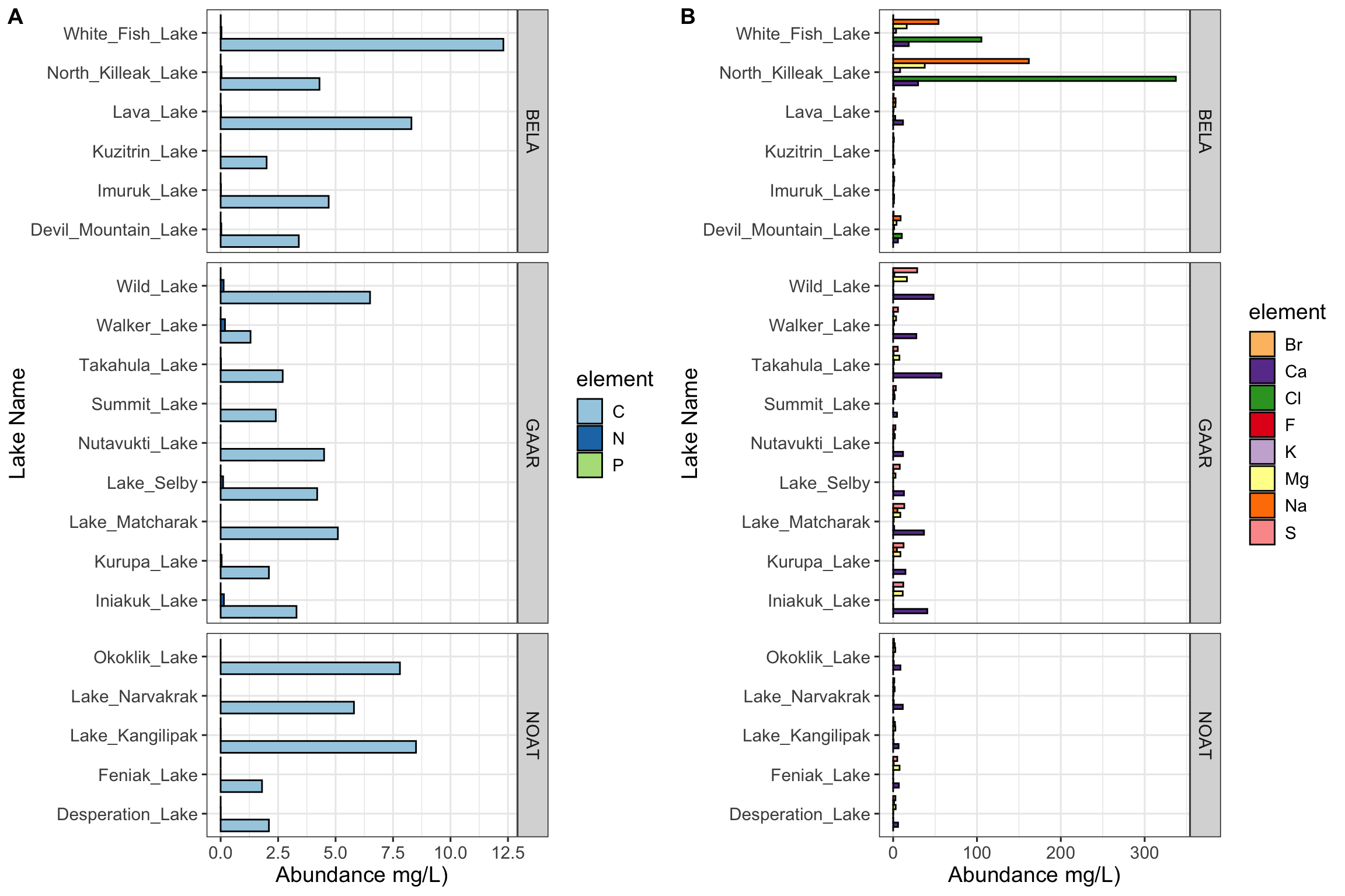
Figure 4.1: Figure 1: Carbon, nitrogen, and phosphorous in Alaskan lakes. A) A bar chart showing the abundance (in mg per L, x-axis) of the bound elements (C, N, and P) in various Alaskan lakes (lake names on y-axis) that are located in one of three parks in Alaska (park names on right y groupings). B) A bar chart showing the abundance (in mg per L, x-axis) of the free elements (Cl, S, F, Br, Na, K, Ca, and Mg) in various Alaskan lakes (lake names on y-axis) that are located in one of three parks in Alaska (park names on right y groupings). The data are from a public chemistry data repository. Each bar represents the result of a single measurement of a single analyte, the identity of which is coded using color as shown in the color legend. Abbreviations: BELA - Bering Land Bridge National Preserve, GAAR - Gates Of The Arctic National Park & Preserve, NOAT - Noatak National Preserve.
further reading
Grammar extensions and insets with
ggpp
This article explains how to use theggppextension to add insets and annotations toggplot2graphics in R. It introduces grammar extensions that allow you to insert subplots, highlight specific regions, and incorporate custom graphical elements in a composable and expressive way. Particularly useful for emphasizing detail or providing context within complex figures.Patchwork: Simple plot layout with ggplot2
Patchworkis an elegant and intuitive package for arranging multipleggplot2plots into a single composite figure. With a minimal syntax that mirrors mathematical layout expressions, it allows users to combine plots vertically, horizontally, or in nested arrangements—ideal for creating figure panels for publications or presentations.Cowplot: Versatile plot composition
Cowplotis another popular package for composing multipleggplot2plots. It offers more control and customization thanpatchwork, particularly for aligning plots, adjusting spacing, and embedding annotations. This makes it well-suited for fine-tuned figure design when preparing publication-quality graphics.