numerical models

model use
Next on our quest to develop our abilities in analytical data exploration is modeling. We will discuss two main ways to use numerical models: for inferential uses and predictive uses.
Inferential uses aim to understand and quantify the relationships between variables, focusing on the significance, direction, and strength of these relationships to draw conclusions about the data. When using inferential models we care a lot about the exact inner workings of the model because those inner workings are how we understand relationships between variables.
Predictive uses are designed with the primary goal of forecasting future outcomes or behaviors based on historical data. When using predictive models we often care much less about the exact inner workings of the model and instead care about accuracy. In other words, we don’t really care how the model works as long as it is accurate.
In the preceding section, we explored inferential models, highlighting the significance of grasping the quantitative aspects of the model’s mechanisms in order to understand relationships between variables. Now we will look at predictive models. Unlike inferential models, predictive models are typically more complex, often making it challenging to fully comprehend their internal processes. That is okay though, because when using predictive models we usually care most about their predictive accuracy, and are willing to sacrifice our quantitative understanding of the model’s inner workings to achieve higher accuracy.
Interestingly, increasingly complex predictive models do not always have higher accuracy. If a model is too complex we say that the model is ‘overfitted’ which means that the model is capturing noise and random fluctuations in the input data and using those erroneous patterns in its predictions. On the other hand, if a model is not complex enough then it will not be able to capture important true patterns in the data that are required to make accurate predictions. This means that we have to build models with the right level of complexity.
To build a model with the appropriate level of complexity we usually use this process: (i) separate out 80% of our data and call it the training data, (ii) build a series of models with varying complexity using the training data, (iii) use each of the models to make predictions about the remaining 20% of the data (the testing data), (iv) whichever model has the best predictive accuracy on the remaining 20% is the model with the appropriate level of complexity.
In this course, we will build both types of models using a function called buildModel. To use it, we simply give it our data, and tell it which to sets of values we want to compare. To tell it what we want to compare, we need to specify (at least) two things:
input_variables: the input variables (sometimes called “features” or “predictors”) the model should use as inputs for the prediction. Depending on the model, these could be continuous or categorical variables.
output_variable: the variable that the model should predict. Depending on the model, it could be a continuous value (regression) or a category/class (classification).
For model building, we also need to talk about handling missing data. If we have missing data in our data set, we need to one way forward is to impute it. This means that we need to fill in the missing values with something. There are many ways to do this, but we will use the median value of each column. We can do this using the impute function from the rstatix package. Let’s do that now:
single linear regression
We will start with some of the simplest models - linear models. There are a variety of ways to build linear models in R, but we will use buildModel, as mentioned above. First, we will use least squares regression to model the relationship between input and output variables. Suppose we want to know if the abundances of iso-Leucine and Valine are related in our metabolomics dataset:
ggplot(metabolomics_data) +
  geom_point(aes(x = `iso-Leucine`, y = Valine))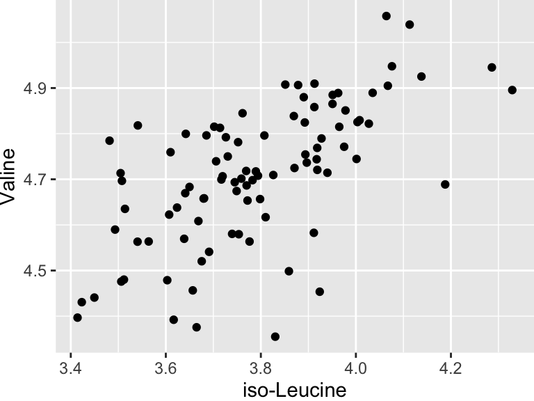
It looks like there might be a relationship! Let’s build an linear regression model and use it inferentially to examine the details of that that relationship:
basic_regression_model <- buildModel2(
  data = metabolomics_data,
  model_type = "linear_regression",
  input_variables = "iso-Leucine",
  output_variable = "Valine"
)
names(basic_regression_model)
## [1] "model_type" "model"      "metrics"
The output of buildModel consists of three things: the model_type, the model itself, and the metric describing certain aspects of the model and/or its performance. Let’s look at the model:
basic_regression_model$model
##
## Call:
## lm(formula = formula, data = data, model = TRUE, x = TRUE, y = TRUE,
##     qr = TRUE)
##
## Coefficients:
##   (Intercept)  `iso-Leucine`
##         2.784          0.508
This is a linear model stored inside a special object type inside R called an lm. They can be a bit tricky to work with, but we have a way to make it easier - we’ll look at that in a second. Before that, let’s look at the metrics.
basic_regression_model$metrics
##               variable  value std_err        type p_value
## 1            r_squared 0.4034      NA   statistic      NA
## 2    total_sum_squares 2.1545      NA   statistic      NA
## 3 residual_sum_squares 1.2855      NA   statistic      NA
## 4          (Intercept) 2.7843  0.2459 coefficient       0
## 5        `iso-Leucine` 0.5080  0.0648 coefficient       0
##   p_value_adj
## 1          NA
## 2          NA
## 3          NA
## 4           0
## 5           0
It shows us the r-squared, the total and residual sum of squares, the intercept (b in y = mx + b), and the coefficient for iso-Leucine (i.e. the slope, m), as well some other things (we will talk about them in a second).
We can also use a function called predictWithModel to make some predictions using the model. Let’s try that for iso-Leucine and Valine. What we do is give it the model, and then tell it what values we want to predict for. In this case, we want to predict the abundance of Valine for each value of iso-Leucine in our data set. We can do that like this:
predicted_Valine_values <- predictWithModel(
  data = metabolomics_data,
  model_type = "linear_regression",
  model = basic_regression_model$model
)
head(predicted_Valine_values)
## # A tibble: 6 × 1
##   value
##   <dbl>
## 1  4.61
## 2  4.80
## 3  4.96
## 4  4.78
## 5  4.66
## 6  4.69
So, predictWithModel is using the model to predict Valine values from iso-Leucine. However, note that we have the measured Valine values in our data set. We can compare the predicted values to the measured values to see how well our model is doing. We can do that like this:
predictions_from_basic_linear_model <- data.frame(
    iso_Leucine_values = metabolomics_data$`iso-Leucine`,
    predicted_Valine_values = predicted_Valine_values,
    measured_Valine_values = metabolomics_data$Valine
)
names(predictions_from_basic_linear_model)[2] <- "predicted_Valine_values"

plot1 <- ggplot() +
    geom_line(
        data = predictions_from_basic_linear_model,
        aes(x = iso_Leucine_values, y = predicted_Valine_values), color = "red"
    ) +
    geom_point(
        data = predictions_from_basic_linear_model,
        aes(x = iso_Leucine_values, y = predicted_Valine_values), color = "red"
    ) +
    geom_point(
        data = metabolomics_data,
        aes(x = `iso-Leucine`, y = Valine), color = "blue"
    )
plot1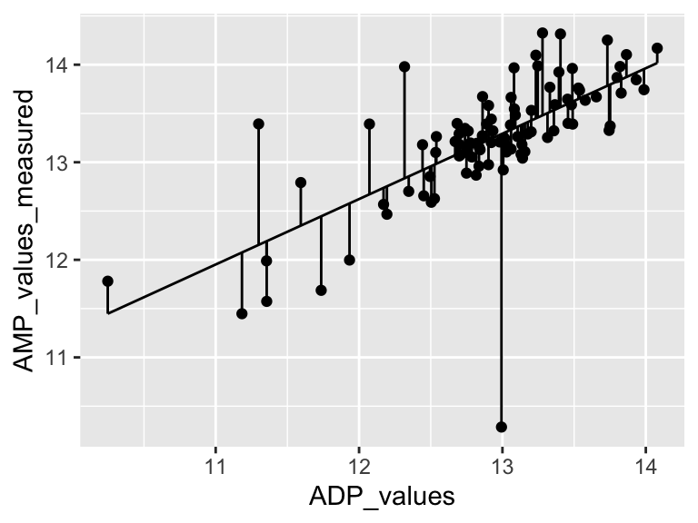
Very good. Now let’s talk about evaluating the quality of our model. For this we need some means of assessing how well our line fits our data. We will use residuals - the distance between each of our points and our line.
ggplot(predictions_from_basic_linear_model) +
  geom_point(aes(x = iso_Leucine_values, y = measured_Valine_values)) +
  geom_line(aes(x = iso_Leucine_values, y = predicted_Valine_values)) +
  geom_segment(aes(x = iso_Leucine_values, y = measured_Valine_values, xend = iso_Leucine_values, yend = predicted_Valine_values))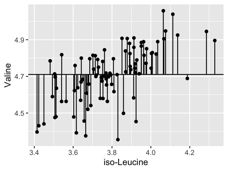
We can calculate the sum of the squared residuals:
sum(
  (predictions_from_basic_linear_model$measured_Valine_values - predictions_from_basic_linear_model$predicted_Valine_values)^2
, na.rm = TRUE)
## [1] 1.285459
Cool! Let’s call that the “residual sum of the squares”. So… does that mean our model is good? I don’t know. We have to compare that number to something. Let’s compare it to a super simple model that is just defined by the mean y value of the input data.
ggplot(metabolomics_data) +
  geom_point(aes(x = `iso-Leucine`, y = Valine)) +
  geom_hline(aes(yintercept = mean(Valine, na.rm = TRUE)))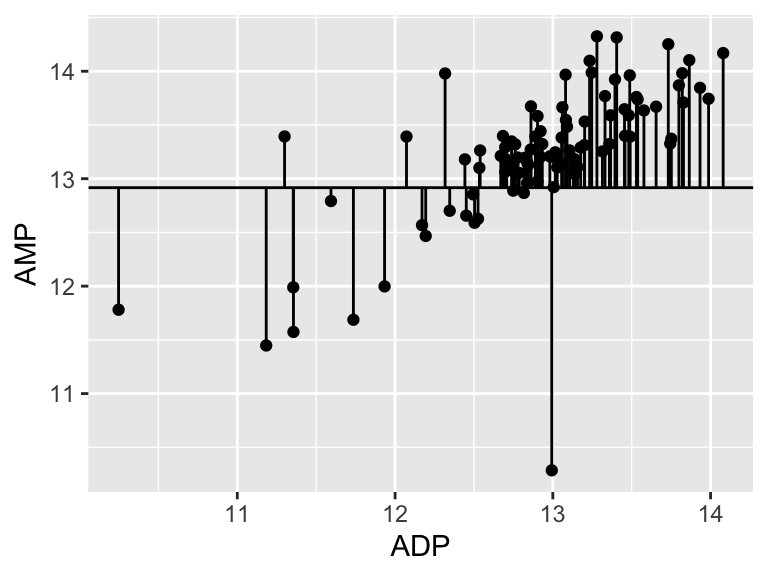
A pretty bad model, I agree. How much better is our linear model that the flat line model? Let’s create a measure of the distance between each point and the point predicted for that same x value on the model:
ggplot(metabolomics_data) +
  geom_point(aes(x = `iso-Leucine`, y = Valine)) +
  geom_hline(aes(yintercept = mean(Valine, na.rm = TRUE))) +
  geom_segment(aes(x = `iso-Leucine`, y = Valine, xend = `iso-Leucine`, yend = mean(Valine, na.rm = TRUE)))
sum(
  (metabolomics_data$Valine - mean(metabolomics_data$Valine, na.rm = TRUE))^2
, na.rm = TRUE)
## [1] 2.154464
Cool. Let’s call that the “total sum of the squares”, and now we can compare that to our “residual sum of the squares”:
residual_sum_of_squares <- sum(
  (predictions_from_basic_linear_model$measured_Valine_values - predictions_from_basic_linear_model$predicted_Valine_values)^2,
  na.rm = TRUE
)
total_sum_of_squares <- sum(
  (metabolomics_data$Valine - mean(metabolomics_data$Valine, na.rm = TRUE))^2,
  na.rm = TRUE
)
1 - (residual_sum_of_squares / total_sum_of_squares)
## [1] 0.403351
Alright. That is our R squared value. It is equal to 1 minus the ratio of the “residual sum of the squares” to the “total sum of the squares”. You can think of the R squared value as: - The amount of variance in the response explained by the dependent variable. - How much better the line of best fit describes the data than the flat line. Now, let’s put it all together and make it pretty:
top <- ggplot() +
    geom_line(
        data = predictions_from_basic_linear_model,
        aes(x = iso_Leucine_values, y = predicted_Valine_values), color = "red"
    ) +
    geom_point(
        data = predictions_from_basic_linear_model,
        aes(x = iso_Leucine_values, y = predicted_Valine_values), color = "red"
    ) +
    geom_point(
        data = metabolomics_data,
        aes(x = `iso-Leucine`, y = Valine), color = "blue"
    ) +
    annotate(geom = "table",
      x = 3.25,
      y = 5,
      label = list(select(basic_regression_model$metrics, variable, value))
    ) +
    coord_cartesian(ylim = c(4.25,5.25)) +
    theme_bw()

bottom <- ggplot(predictions_from_basic_linear_model) +
  geom_col(
    aes(x = iso_Leucine_values, y = measured_Valine_values - predicted_Valine_values),
    width = 0.03, color = "black", position = "dodge", alpha = 0.5
  ) +
  theme_bw()

cowplot::plot_grid(top, bottom, ncol = 1, labels = "AUTO", rel_heights = c(2,1))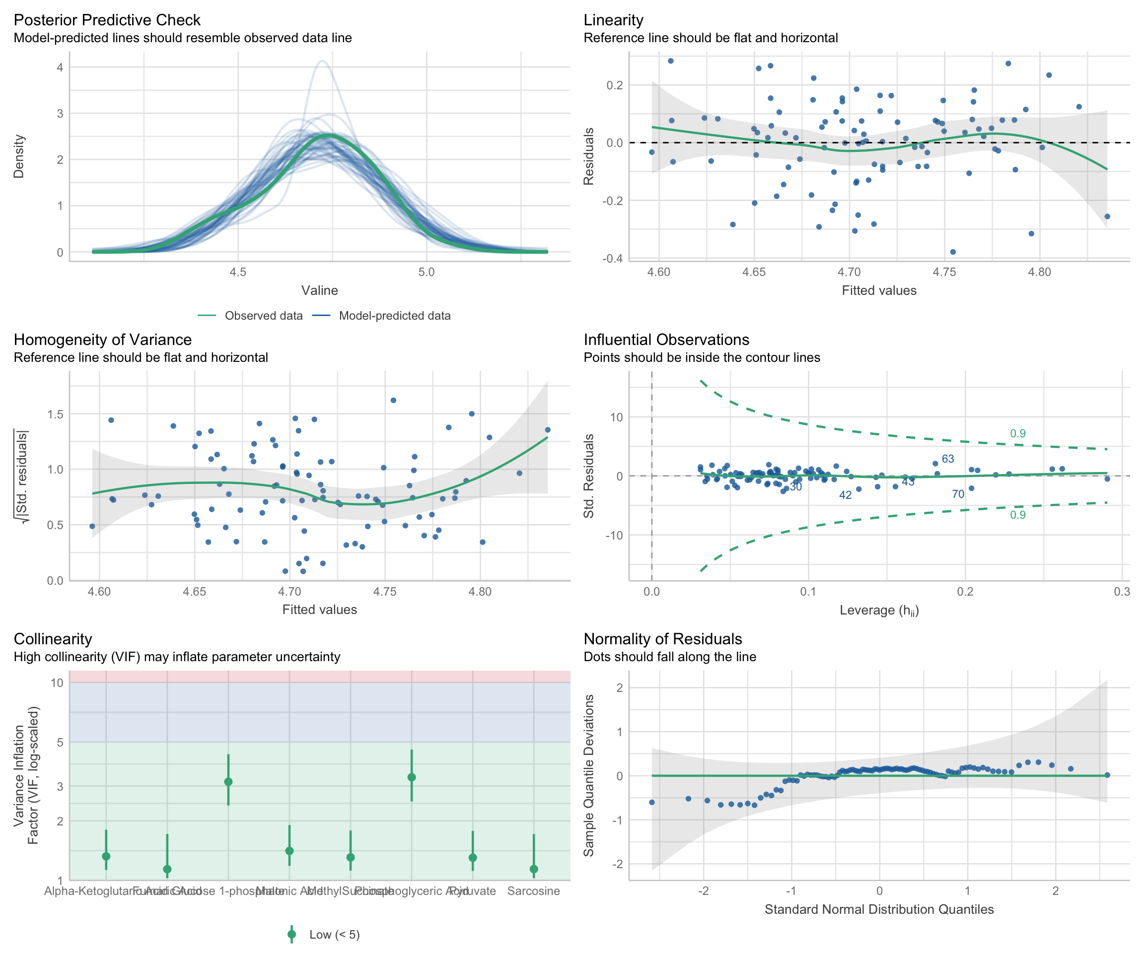
multiple linear regression
Cool! Now let’s try a multiple linear regression model. This is the same as a simple linear regression model, but with more than one predictor variable. Simple and multiple linear regression are both statistical methods used to explore the relationship between one or more independent variables (predictor variables) and a dependent variable (outcome variable). Simple linear regression involves one independent variable to predict the value of one dependent variable, utilizing a linear equation of the form y = mx + b. Multiple linear regression extends this concept to include two or more independent variables, with a typical form of y = m1x1 + m2x2 + … + b, allowing for a more complex representation of relationships among variables. While simple linear regression provides a straight-line relationship between the independent and dependent variables, multiple linear regression can model a multi-dimensional plane in the variable space, providing a more nuanced understanding of how the independent variables collectively influence the dependent variable. The complexity of multiple linear regression can offer more accurate predictions and insights, especially in scenarios where variables interact or are interdependent, although it also requires a more careful consideration of assumptions and potential multicollinearity among the independent variables. Let’s try it with the first 30 metabolites in our data set:
single_input_regression_model <- buildModel2(
  data = metabolomics_data,
  model_type = "linear_regression",
  input_variables = "iso-Leucine",
  output_variable = "Valine"
)

single_input_regression_model$metrics %>%
  filter(type == "coefficient") %>%
  arrange(desc(abs(value)))
##        variable  value std_err        type p_value
## 1   (Intercept) 2.7843  0.2459 coefficient       0
## 2 `iso-Leucine` 0.5080  0.0648 coefficient       0
##   p_value_adj
## 1           0
## 2           0

multiple_input_regression_model <- buildModel2(
  data = metabolomics_data,
  model_type = "linear_regression",
  input_variables = colnames(metabolomics_data)[3:32],
  output_variable = "Valine"
)

multiple_input_regression_model$metrics %>% filter(type == "statistic")
##               variable  value std_err      type p_value
## 1            r_squared 0.8942      NA statistic      NA
## 2    total_sum_squares 2.1545      NA statistic      NA
## 3 residual_sum_squares 0.2280      NA statistic      NA
##   p_value_adj
## 1          NA
## 2          NA
## 3          NA

multiple_input_regression_model$metrics %>%
  filter(type == "coefficient") %>%
  arrange(desc(abs(value)))
##                        variable   value std_err        type
## 1                   (Intercept) -8.4392  2.1225 coefficient
## 2         `5-Aminovaleric Acid`  0.8629  0.0584 coefficient
## 3                  Homocysteine -0.1139  0.0558 coefficient
## 4     `Alpha-Ketoglutaric Acid` -0.0882  0.0780 coefficient
## 5           `Pyroglutamic Acid`  0.0750  0.0507 coefficient
## 6                    Cadaverine -0.0636  0.0531 coefficient
## 7                     Glycerate -0.0594  0.0544 coefficient
## 8                     Sarcosine  0.0547  0.0276 coefficient
## 9                     Carnitine  0.0521  0.0433 coefficient
## 10        `Glucose 1-phosphate`  0.0490  0.0361 coefficient
## 11       `Phosphoglyceric Acid` -0.0465  0.0227 coefficient
## 12              MethylSuccinate  0.0394  0.0508 coefficient
## 13                     Tyramine  0.0264  0.0556 coefficient
## 14                     Pyruvate  0.0183  0.0302 coefficient
## 15                   Pipecolate  0.0175  0.0507 coefficient
## 16   `2-Hydroxyisovaleric Acid` -0.0145  0.0198 coefficient
## 17                      Betaine -0.0144  0.0244 coefficient
## 18                      Taurine -0.0144  0.0394 coefficient
## 19            `isoValeric Acid` -0.0141  0.0789 coefficient
## 20          `1-Methylhistidine`  0.0137  0.0091 coefficient
## 21                   Cysteamine  0.0116  0.0123 coefficient
## 22     `2-Aminoisobutyric acid` -0.0106  0.0400 coefficient
## 23             Guanidinoacetate  0.0105  0.0285 coefficient
## 24               `Malonic Acid`  0.0093  0.0137 coefficient
## 25                     Creatine  0.0087  0.0173 coefficient
## 26            `N-AcetylGlycine` -0.0087  0.0161 coefficient
## 27          `1-Methylhistamine` -0.0034  0.0140 coefficient
## 28 `3-Methyl-2-Oxovaleric Acid`  0.0030  0.0152 coefficient
## 29               `Fumaric Acid` -0.0026  0.0129 coefficient
## 30                   Creatinine -0.0024  0.0381 coefficient
## 31           `4-Hydroxyproline`  0.0001  0.0173 coefficient
##       p_value p_value_adj
## 1  0.00018570    0.005571
## 2  0.00000000    0.000000
## 3  0.04539385    1.000000
## 4  0.26252957    1.000000
## 5  0.14424229    1.000000
## 6  0.23545690    1.000000
## 7  0.27908387    1.000000
## 8  0.05203798    1.000000
## 9  0.23333675    1.000000
## 10 0.17966959    1.000000
## 11 0.04448459    1.000000
## 12 0.44116148    1.000000
## 13 0.63648128    1.000000
## 14 0.54731576    1.000000
## 15 0.73164052    1.000000
## 16 0.46726689    1.000000
## 17 0.55755863    1.000000
## 18 0.71615475    1.000000
## 19 0.85827398    1.000000
## 20 0.13825735    1.000000
## 21 0.34897953    1.000000
## 22 0.79070612    1.000000
## 23 0.71355085    1.000000
## 24 0.50039850    1.000000
## 25 0.61601809    1.000000
## 26 0.59213968    1.000000
## 27 0.81043509    1.000000
## 28 0.84546515    1.000000
## 29 0.84339908    1.000000
## 30 0.95064942    1.000000
## 31 0.99539331    1.000000
Even though the multiple-input model predicts Valine more accurately overall (based on r-squared values), it is helpful to quantify which metabolites drive that improvement. The regression summary (multiple_input_regression_model$metrics) reports the coefficient estimate, standard error, and p-value for each predictor. To decide which variables are the most important contributors:
- Coefficient value: magnitude and sign describe the expected change in the output when that predictor moves by one unit while all other variables are held constant. However, please note that because our predictors are on different scales, centering and scaling them (e.g., with
metabolomics_data %>% mutate(across(3:32, scale))) lets us compare the absolute size of coefficients directly. -
p_value(or an adjusted p-value when many metabolites are examined at once) is the p-value obtained by testing whether the predictors coefficient is significantly different from zero. Small p-values highlight predictors that are likely to matter after accounting for the rest of the variables.
In this Valine model, 5-Aminovaleric Acid has the largest absolute coefficient, so the third panel below plots its raw relationship with Valine alongside the two sets of predictions to highlight why it stands out in the summary table.
model_comparison_data <- data.frame(
  measured_Valine_values = metabolomics_data$Valine,
  single_input_predicted_Valine_values = predictWithModel(
    data = metabolomics_data,
    model_type = "linear_regression",
    model = basic_regression_model$model
  )$value,
  multiple_input_predicted_Valine_values = predictWithModel(
    data = metabolomics_data,
    model_type = "linear_regression",
    model = multiple_input_regression_model$model
  )$value,
  measured_5AA_values = metabolomics_data$`5-Aminovaleric Acid`
)

plot1 <- ggplot(model_comparison_data) + geom_point(aes(
  x = measured_Valine_values, y = single_input_predicted_Valine_values
))

plot2 <- ggplot(model_comparison_data) + geom_point(aes(
  x = measured_Valine_values, y = multiple_input_predicted_Valine_values
))

plot3 <- ggplot(model_comparison_data) + geom_point(aes(
  x = measured_Valine_values, y = measured_5AA_values
))

plot_grid(plot1, plot2, plot3, nrow = 1)
assessing regression models
There are three aspects of a regression model that we should check on, to make sure the model isn’t violating and assumptions that we make when declaring the model to be valid:
-
Residual-Based Assumptions. These checks are specifically about the behavior of residuals, which are the differences between observed values and model predictions. This group includes:
Linearity: Examines if residuals show a random scatter around zero, indicating a linear relationship between predictors and the response variable. Patterns or curves in this plot may indicate that the model does not adequately capture the true relationship, suggesting potential non-linearity.
Homoscedasticity (Homogeneity of Variance): Looks at the spread of residuals to confirm that variance is consistent across fitted values. In other words, the spread of the residuals should be uniform regardless of the fitted values. To assess homoscedasticity, residuals are plotted against fitted values. A horizontal band of residuals indicates that the variance is consistent, supporting the homoscedasticity assumption. Conversely, patterns such as a funnel shape, where residuals spread out or contract as fitted values increase, suggest heteroscedasticity, indicating that the variance of errors changes with the level of the independent variables.
Normality of Residuals: Assesses whether residuals follow a normal distribution, crucial for statistical inference in regression. To check this characteristic, a Quantile-Quantile (Q-Q) plot is used, where the residuals are plotted against a theoretical normal distribution. If the residuals are normally distributed, the points will align closely along a straight line. Significant deviations from this line indicate departures from normality, which may affect the reliability of statistical inferences drawn from the model.
-
Predictor Relationships: This check pertains to relationships among the predictor/input variables themselves, rather than their relationship with the response/output variable. In this case:
- Collinearity: Assesses multicollinearity, which occurs when predictors are highly correlated with each other. This can lead to inflated variances of regression coefficients, making it challenging to attribute effects to individual predictors. This check helps ensure that predictors are independent enough to provide clear, interpretable results for each variable’s influence on the response.
-
Model Fit and Influence: These checks look at the overall fit of the model and assess if specific data points have undue influence on the model’s results. This group includes:
Posterior Predictive Check: This checks if model predictions align well with observed data, indicating a good overall fit. While not directly a residual analysis, it’s a comprehensive check for how well the model captures data patterns.
Influential Observations: Identifies data points that might disproportionately affect the model. High-leverage points can distort model estimates, so it’s important to verify that no single observation is overly influential.
We can assess all of these using:
multiple_regression_model <- buildModel2(
  data = metabolomics_data,
  model_type = "linear_regression",
  input_variables = colnames(metabolomics_data)[3:10],
  output_variable = "Valine"
)

check_model(multiple_regression_model$model)
random forests
Random forests are collections of decision trees that can be used for predicting categorical variables (i.e. a ‘classification’ task) and for predicting numerical variables (a ‘regression’ task). Random forests are built by constructing multiple decision trees, each using a randomly selected subset of the training data, to ensure diversity among the trees. At each node of each tree, a number of input variables are randomly chosen as candidates for splitting the data, introducing further randomness beyond the data sampling. Among the variables randomly selected as candidates for splitting at each node, one is chosen for that node based on a criterion, such as maximizing purity in the tree’s output, or minimizing mean squared error for regression tasks, guiding the construction of a robust ensemble model. The forest’s final prediction is derived either through averaging the outputs (for regression) or a majority vote (for classification).
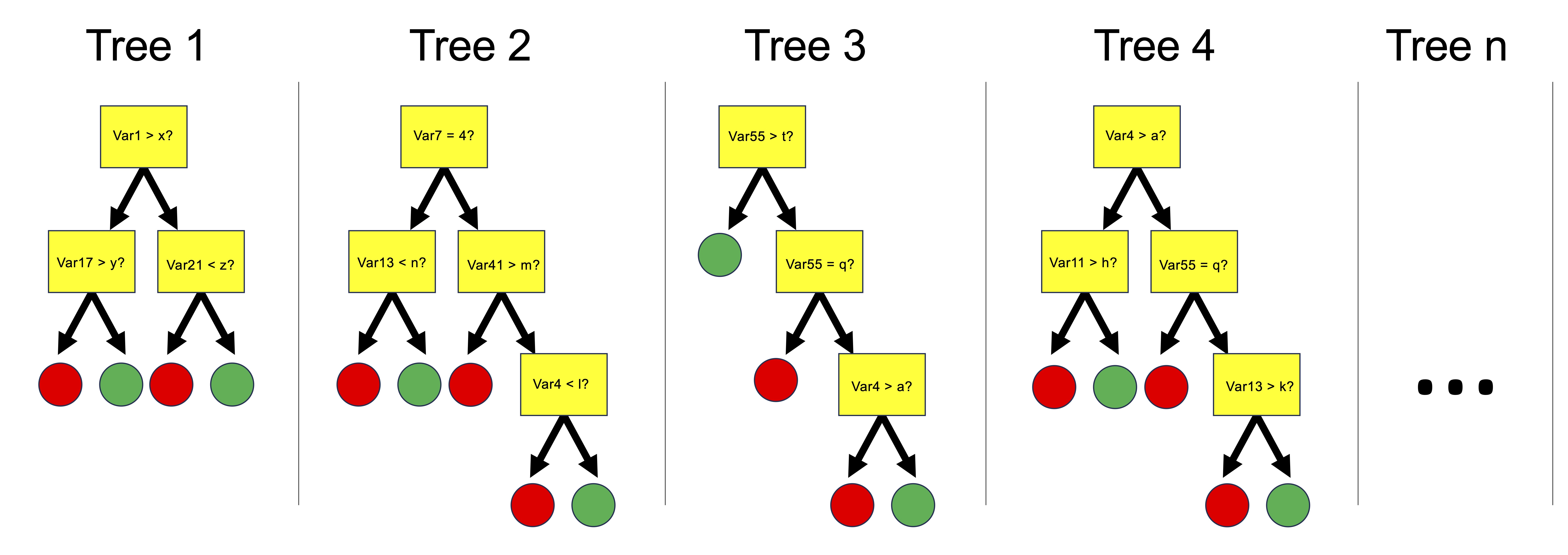
We can use the buildModel() function to make a random forest model. We need to specify data, a model type, input and output variables, and in the case of a random forest model, we also need to provide a list of optimization parameters: n_vars_tried_at_split, n_trees, and min_n_leaves. Here is more information on those parameters:
n_vars_at_split (often called “mtry” in other implementations): this parameter specifies the number of variables that are randomly sampled as candidate features at each split point in the construction of a tree. The main idea behind selecting a subset of features (variables) is to introduce randomness into the model, which helps in making the model more robust and less likely to overfit to the training data. By trying out different numbers of features, the model can find the right level of complexity, leading to more generalized predictions. A smaller value of n_vars_at_split increases the randomness of the forest, potentially increasing bias but decreasing variance. Conversely, a larger mtry value makes the model resemble a bagged ensemble of decision trees, potentially reducing bias but increasing variance.
n_trees (often referred to as “num.trees” or “n_estimators” in other implementations): this parameter defines the number of trees that will be grown in the random forest. Each individual tree predicts the outcome based on the subset of features it considers, and the final prediction is typically the mode (for classification tasks) or average (for regression tasks) of all individual tree predictions. Increasing the number of trees generally improves the model’s performance because it averages more predictions, which tends to reduce overfitting and makes the model more stable. However, beyond a certain point, adding more trees offers diminishing returns in terms of performance improvement and can significantly increase computational cost and memory usage without substantial gains.
min_n_leaves (often referred to as “min_n” in other implementations, default value is 1): This parameter sets the minimum number of samples that must be present in a node for it to be split further. Increasing this value makes each tree in the random forest less complex by reducing the depth of the trees, leading to larger, more generalized leaf nodes. This can help prevent overfitting by ensuring that the trees do not grow too deep or too specific to the training data. By carefully tuning this parameter, you can strike a balance between the model’s ability to capture the underlying patterns in the data and its generalization to unseen data.
buildModel() is configured to allow you to explore a number of settings for both n_vars_at_split and n_trees, then pick the combination with the highest predictive accuracy. In this function:
-
dataspecifies the dataset to be used for model training, here metabolomics_data. -
model_typedefines the type of model to build, with “random_forest_regression” indicating a random forest model for regression tasks. -
input_variablesselects the features or predictors for the model, here using columns 3 to 32 from metabolomics_data as predictors. -
output_variableis the target variable for prediction, in this case, “Valine”.
The optimization_parameters argument takes a list to define the grid of parameters for optimization, including n_vars_tried_at_split, n_trees, and min_leaf_size. The seq() function generates sequences of numbers and is used here to create ranges for each parameter:
-
n_vars_tried_at_split= seq(1,24,3) generates a sequence for the number of variables tried at each split, starting at 1, ending at 24, in steps of 3 (e.g., 1, 4, 7, …, 24). -
n_trees= seq(1,40,2) creates a sequence for the number of trees in the forest, from 1 to 40 in steps of 2. -
min_leaf_size= seq(1,3,1) defines the minimal size of leaf nodes, ranging from 1 to 3 in steps of 1.
This setup creates a grid of parameter combinations where each combination of n_vars_tried_at_split, n_trees, and min_leaf_size defines a unique random forest model. The function will test each combination within this grid to identify the model that performs best according to a given evaluation criterion, effectively searching through a defined parameter space to optimize the random forest’s performance. This approach allows for a systematic exploration of how different configurations affect the model’s ability to predict the output variable, enabling the selection of the most effective model configuration based on the dataset and task at hand.
random_forest_model <- buildModel2(
    data = metabolomics_data,
    model_type = "random_forest_regression",
    input_variables = colnames(metabolomics_data)[3:32],
    output_variable = "Valine",
    optimization_parameters = list(
      n_vars_tried_at_split = seq(1,20,5),
      n_trees = seq(1,40,10),
      min_leaf_size = seq(1,3,1)
    )
)

names(random_forest_model)
## [1] "model_type" "metrics"    "model"
The above code builds our random forest model. It’s output provides both the model itself and key components indicating the performance and configuration of the model. Here’s a breakdown of each part of the output:
$model_type tells us what type of model this is.
$model shows the configuration of the best random forest model that was created.
$metrics provides detailed results of model performance across different combinations of the random forest parameters n_vars_tried_at_split (the number of variables randomly sampled as candidates at each split) and n_trees (the number of trees in the forest). For each combination, it shows:
- n_vars_tried_at_split and n_trees: The specific values used in that model configuration.
- .metric: The performance metric used, here it’s accuracy, which measures how often the model correctly predicts the patient status.
- .estimator: Indicates the type of averaging used for the metric, here it’s binary for binary classification tasks.
- mean: The average accuracy across the cross-validation folds.
- fold_cross_validation: Indicates the number of folds used in cross-validation, here it’s 3 for all models.
- std_err: The standard error of the mean accuracy, providing an idea of the variability in model performance.
- .config: A unique identifier for each model configuration tested.
We can thus inspect the performance of the model based on the specific parameters used during configuration. This can help us understand if we are exploring the right parameter space - do we have good values for n_vars_tried_at_split and n_trees? In this case we are doing regression, and the performance metric reported is RMSE: root mean squared error. We want that value to be small! So smaller values for that metric indicate a better model.
random_forest_model$metrics %>%
    ggplot(aes(x = n_vars_tried_at_split, y = n_trees, fill = mean)) +
    facet_grid(.~min_leaf_size) +
    scale_fill_viridis(direction = -1) +
    geom_tile() +
    theme_bw()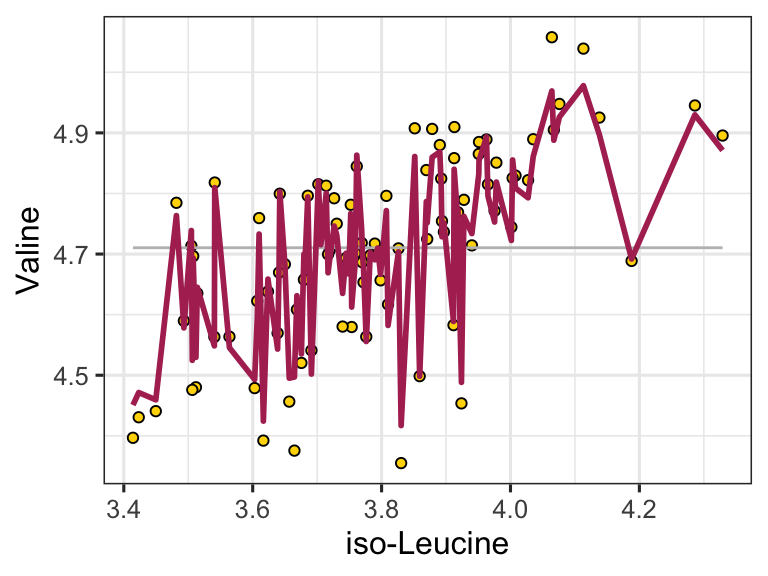
We can easily use the model to make predictions by using the predictWithModel() function:
ggplot() +
  geom_point(
    data = metabolomics_data,
    aes(x = `iso-Leucine`, y = Valine), fill = "gold", shape = 21, color = "black"
  ) +
  geom_line(aes(
    x = metabolomics_data[["iso-Leucine"]],
    y = mean(metabolomics_data$Valine)
  ), color = "grey") +
  geom_line(aes(
    x = metabolomics_data[["iso-Leucine"]],
    y = unlist(predictWithModel(
      data = metabolomics_data,
      model_type = "random_forest_regression",
      model = random_forest_model$model
    ))),
    color = "maroon", size = 1
  ) +
  theme_bw()
In addition to regression modeling, random forests can also be used to do classification modeling. In classification modeling, we are trying to predict a categorical outcome variable from a set of predictor variables. For example, we might want to predict whether a patient has a disease or not based on their metabolomics data. All we have to do is set the model_type to “random_forest_classification” instead of “random_forest_regression”. Let’s try that now:
set.seed(123)
unknown <- metabolomics_data[35:40,]

rfc <- buildModel2(
  data = metabolomics_data[c(1:34, 41:93),],
  model_type = "random_forest_classification",
  input_variables = colnames(metabolomics_data)[3:75],
  output_variable = "patient_status",
  optimization_parameters = list(
    n_vars_tried_at_split = seq(5,50,5),
    n_trees = seq(10,100,10),
    min_leaf_size = seq(1,3,1)
  )
)
rfc$metrics %>% arrange(desc(mean))
## # A tibble: 300 × 9
##    n_vars_tried_at_split n_trees min_leaf_size .metric
##                    <dbl>   <dbl>         <dbl> <chr>
##  1                    25      20             2 accuracy
##  2                     5      50             1 accuracy
##  3                    10      60             2 accuracy
##  4                     5      80             2 accuracy
##  5                    10     100             2 accuracy
##  6                     5      60             3 accuracy
##  7                    10      70             3 accuracy
##  8                    30      20             1 accuracy
##  9                    25      50             2 accuracy
## 10                    20      90             2 accuracy
## # ℹ 290 more rows
## # ℹ 5 more variables: .estimator <chr>, mean <dbl>,
## #   std_err <dbl>, .config <chr>,
## #   fold_cross_validation <int>
Cool! Our best settings lead to a model with >90% accuracy! We can also make predictions on unknown data with this model:
rfc$metrics %>%
    ggplot(aes(x = n_vars_tried_at_split, y = n_trees, fill = mean)) +
    facet_grid(.~min_leaf_size) +
    scale_fill_viridis(direction = -1) +
    geom_tile() +
    theme_bw()
predictions <- predictWithModel(
  data = unknown,
  model_type = "random_forest_classification",
  model = rfc$model
)

data.frame(
  real_status = metabolomics_data[35:40,]$patient_status,
  predicted_status = unlist(predictions)
)
##                          real_status predicted_status
## .pred_healthy1               healthy             0.90
## .pred_healthy2               healthy             0.80
## .pred_healthy3               healthy             0.90
## .pred_healthy4        kidney_disease             0.10
## .pred_healthy5        kidney_disease             0.00
## .pred_healthy6        kidney_disease             0.05
## .pred_kidney_disease1        healthy             0.10
## .pred_kidney_disease2        healthy             0.20
## .pred_kidney_disease3        healthy             0.10
## .pred_kidney_disease4 kidney_disease             0.90
## .pred_kidney_disease5 kidney_disease             1.00
## .pred_kidney_disease6 kidney_disease             0.95
further reading
More on assessing regression models: performance R package. The performance package helps check how well your statistical models work by providing simple tools to evaluate things like fit quality and performance. It offers easy ways to spot problems in models, like if they’re too complex or not fitting the data properly, and works with different types of models, including mixed-effects and Bayesian ones.
common machine learning tasks. Machine learning involves using algorithms to learn from data, with key tasks including classification, regression, and clustering. Classification categorizes data, such as recognizing images of animals, regression predicts continuous values like sales forecasts, and clustering groups data based on similarities without prior labels.
Classification with random forests: - http://www.rebeccabarter.com/blog/2020-03-25_machine_learning/ - https://hansjoerg.me/2020/02/09/tidymodels-for-machine-learning/ - https://towardsdatascience.com/dials-tune-and-parsnip-tidymodels-way-to-create-and-tune-model-parameters-c97ba31d6173
Ridge regression (regularization; different from simple/multiple linear regression): https://gallantlab.org/voxelwise_tutorials/notebooks/shortclips/04_understand_ridge_regression.html. This walks through why ridge stabilizes coefficients when predictors are correlated and shows how the penalty trades bias for variance. It is a good conceptual bridge between OLS and modern predictive modeling. Use it when you want stable coefficients without variable selection.
Elastic net (regularization; different from simple/multiple linear regression): https://rpubs.com/jmkelly91/881590. This tutorial shows how elastic net blends ridge and lasso behavior to handle collinearity while allowing variable selection. It includes tuning tips and interpretability notes in an applied workflow. Use it when you want a shortlist of predictors but still respect grouped signals.
Partial least squares regression (regularization; different from simple/multiple linear regression): https://allmodelsarewrong.github.io/regular.html. This resource frames PLSR in the broader context of regularization and dimension reduction for predictive modeling. It emphasizes latent components and how they relate to prediction, which is key for high-dimensional data. Use it when interpreting components is acceptable and prediction is the priority.