dimensional reduction

Figure 3.1: Overview of dimensional reduction. The schematic shows how high-dimensional measurements are projected into a lower-dimensional space so that dominant trends among samples can be visualized and interpreted.
In the previous chapters, we looked at how to explore our data sets by visualizing many variables and manually identifying trends. Sometimes, we encounter data sets with so many variables, that it is not reasonable to manually select certain variables with which to create plots and manually search for trends. In these cases, we need dimensionality reduction - a set of techniques that helps us identify which variables are driving differences among our samples. In this course, we will conduct dimensionality reduction using runMatrixAnalyses(), a function that is loaded into your R Session when you run the source() command.
Matrix analyses can be a bit tricky to set up. There are two things that we can do to help us with this: (i) we will use a template for runMatrixAnalyses() (see below) and (ii) it is critical that we think about our data in terms of samples and analytes. Let’s consider our Alaska lakes data set:
alaska_lake_data
## # A tibble: 220 × 7
##    lake              park  water_temp    pH element mg_per_L
##    <chr>             <chr>      <dbl> <dbl> <chr>      <dbl>
##  1 Devil_Mountain_L… BELA        6.46  7.69 C          3.4
##  2 Devil_Mountain_L… BELA        6.46  7.69 N          0.028
##  3 Devil_Mountain_L… BELA        6.46  7.69 P          0
##  4 Devil_Mountain_L… BELA        6.46  7.69 Cl        10.4
##  5 Devil_Mountain_L… BELA        6.46  7.69 S          0.62
##  6 Devil_Mountain_L… BELA        6.46  7.69 F          0.04
##  7 Devil_Mountain_L… BELA        6.46  7.69 Br         0.02
##  8 Devil_Mountain_L… BELA        6.46  7.69 Na         8.92
##  9 Devil_Mountain_L… BELA        6.46  7.69 K          1.2
## 10 Devil_Mountain_L… BELA        6.46  7.69 Ca         5.73
## # ℹ 210 more rows
## # ℹ 1 more variable: element_type <chr>
We can see that this dataset is comprised of measurements of various analytes (i.e. several chemical elements, as well as water_temp, and pH), in different samples (i.e. lakes). We need to tell the runMatrixAnalyses() function how each column relates to this samples and analytes structuree
pca
“Which analytes are driving differences among my samples?” “Which analytes in my data set are correlated?”
theory
PCA looks at all the variance in a high dimensional data set and chooses new axes within that data set that align with the directions containing highest variance. These new axes are called principal components. Let’s look at an example:
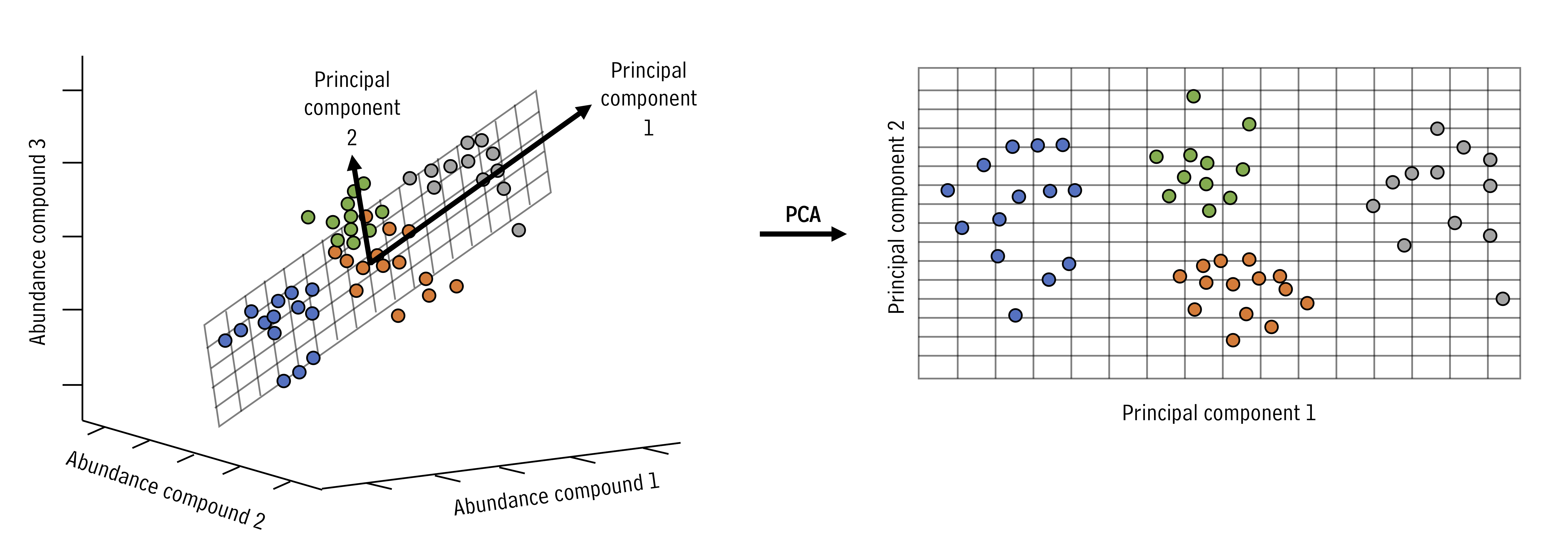
Figure 3.2: Principal component rotation illustrated. The bold axes denote the new principal components that capture the largest variance directions, enabling us to describe complex data with fewer coordinates.
In the example above, the three dimensional space can be reduced to a two dimensional space with the principal components analysis. New axes (principal components) are selected (bold arrows on left) that become the x and y axes in the principal components space (right).
We can run and visualize principal components analyses using the runMatrixAnalyses() function as in the example below. As you can see in the output, the command provides the sample_IDs, sample information, then the coordinates for each sample in the 2D projection (the “PCA plot”) and the raw data, in case you wish to do further processing.
alaska_lake_data_wide <- pivot_wider(alaska_lake_data[,1:6], names_from = "element", values_from = "mg_per_L")
alaska_lake_data_wide
## # A tibble: 20 × 15
##    lake      park  water_temp    pH     C     N     P     Cl
##    <chr>     <chr>      <dbl> <dbl> <dbl> <dbl> <dbl>  <dbl>
##  1 Devil_Mo… BELA        6.46  7.69   3.4 0.028 0      10.4
##  2 Imuruk_L… BELA       17.4   6.44   4.7 0.013 0       1.18
##  3 Kuzitrin… BELA        8.06  7.45   2   0     0       0.67
##  4 Lava_Lake BELA       20.2   7.42   8.3 0.017 0.001   2.53
##  5 North_Ki… BELA       11.3   8.04   4.3 0.037 0.001 337.
##  6 White_Fi… BELA       12.0   7.82  12.3 0.034 0.006 105.
##  7 Iniakuk_… GAAR        9.1   7.01   3.3 0.141 0       0.22
##  8 Kurupa_L… GAAR        9.3   7.03   2.1 0.043 0       0.13
##  9 Lake_Mat… GAAR       10.2   6.95   5.1 0     0       1.25
## 10 Lake_Sel… GAAR       15.1   7.15   4.2 0.107 0       0.11
## 11 Nutavukt… GAAR       17.6   6.88   4.5 0     0.001   0.18
## 12 Summit_L… GAAR       11.9   6.45   2.4 0     0.001   0.08
## 13 Takahula… GAAR        9.9   6.88   2.7 0.014 0       0.23
## 14 Walker_L… GAAR       15.3   7.22   1.3 0.19  0.001   0.19
## 15 Wild_Lake GAAR        5.5   6.98   6.5 0.13  0.001   0.31
## 16 Desperat… NOAT        2.95  6.34   2.1 0.005 0       0.2
## 17 Feniak_L… NOAT        4.51  7.24   1.8 0     0       0.21
## 18 Lake_Kan… NOAT        5.36  6.56   8.5 0.005 0       0.55
## 19 Lake_Nar… NOAT       18.3   7.31   5.8 0     0       0.76
## 20 Okoklik_… NOAT        6.46  6.87   7.8 0     0       0.76
## # ℹ 7 more variables: S <dbl>, F <dbl>, Br <dbl>, Na <dbl>,
## #   K <dbl>, Ca <dbl>, Mg <dbl>

AK_lakes_pca <- runMatrixAnalyses(
  data = alaska_lake_data_wide,
  analysis = "pca",
  columns_w_values_for_single_analyte = colnames(alaska_lake_data_wide)[3:15],
  columns_w_sample_ID_info = c("lake", "park")
)
head(AK_lakes_pca)
## # A tibble: 6 × 18
##   sample_unique_ID      lake  park   Dim.1  Dim.2 water_temp
##   <chr>                 <chr> <chr>  <dbl>  <dbl>      <dbl>
## 1 Devil_Mountain_Lake_… Devi… BELA   0.229 -0.861       6.46
## 2 Imuruk_Lake_BELA      Imur… BELA  -1.17  -1.62       17.4
## 3 Kuzitrin_Lake_BELA    Kuzi… BELA  -0.918 -1.15        8.06
## 4 Lava_Lake_BELA        Lava… BELA   0.219 -1.60       20.2
## 5 North_Killeak_Lake_B… Nort… BELA   9.46   0.450      11.3
## 6 White_Fish_Lake_BELA  Whit… BELA   4.17  -0.972      12.0
## # ℹ 12 more variables: pH <dbl>, C <dbl>, N <dbl>, P <dbl>,
## #   Cl <dbl>, S <dbl>, F <dbl>, Br <dbl>, Na <dbl>,
## #   K <dbl>, Ca <dbl>, Mg <dbl>
Let’s plot the 2D projection of the Alaska lakes data:
ggplot(data = AK_lakes_pca, aes(x = Dim.1, y = Dim.2)) +
  geom_point(aes(fill = park), shape = 21, size = 4, alpha = 0.8) +
  geom_label_repel(aes(label = lake), alpha = 0.5) +
  theme_classic()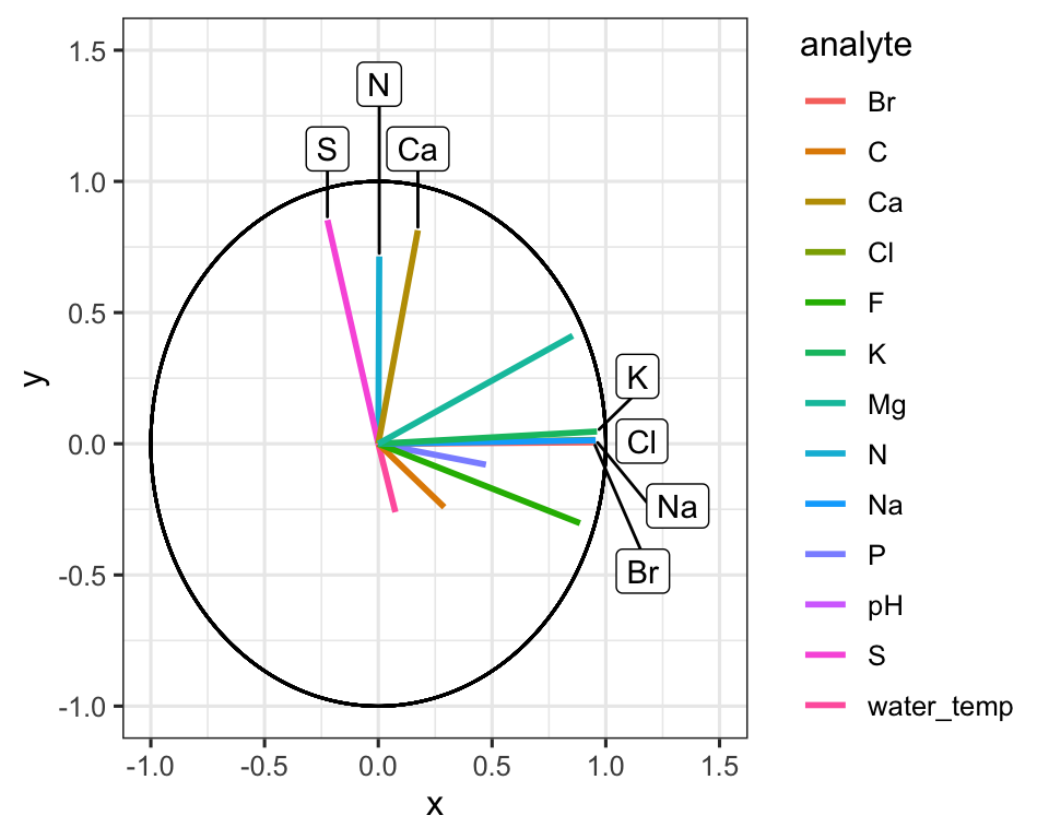
Figure 3.3: PCA scores for Alaskan lake chemistry. Points show each lake positioned by the first two principal components, with fill encoding the park and labels highlighting chemically distinct sites; distances capture multivariate differences across the analyte panel.
Great! In this plot we can see that White Fish Lake and North Killeak Lake, both in BELA park, are quite different from the other parks (they are separated from the others along dimension 1, i.e. the first principal component). At the same time, Wild Lake, Iniakuk Lake, Walker Lake, and several other lakes in GAAR park are different from all the others (they are separated from the others along dimension 2, i.e. the second principal component).
Important question: what makes the lakes listed above different from the others? Certainly some aspect of their chemistry, since that’s the data that this analysis is built upon, but how do we determine which analyte(s) are driving the differences among the lakes that we see in the PCA plot?
ordination plots
Let’s look at how to access the information about which analytes are major contributors to each principal component. This is important because it will tell you which analytes are associated with particular dimensions, and by extension, which analytes are associated with (and are markers for) particular groups in the PCA plot. This can be determined using an ordination plot. Let’s look at an example. We can obtain the ordination plot information using runMatrixAnalyses() with analysis = "pca_ord":
## # A tibble: 6 × 3
##   analyte      Dim.1   Dim.2
##   <chr>        <dbl>   <dbl>
## 1 water_temp 0.0750  -0.261
## 2 pH         0.686    0.0185
## 3 C          0.290   -0.242
## 4 N          0.00435  0.714
## 5 P          0.473   -0.0796
## 6 Cl         0.953    0.0148
We can now visualize the ordination plot using our standard ggplot plotting techniques. Note the use of geom_label_repel() and filter() to label certain segments in the ordination plot. You do not need to use geom_label_repel(), you could use the built in geom_label(), but geom_label_repel() can make labelling your segments easier.
# AK_lakes_pca_ord <- runMatrixAnalysis(
#   data = alaska_lake_data,
#   analysis = c("pca_ord"),
#   column_w_names_of_multiple_analytes = "element",
#   column_w_values_for_multiple_analytes = "mg_per_L",
#   columns_w_values_for_single_analyte = c("water_temp", "pH"),
#   columns_w_additional_analyte_info = "element_type",
#   columns_w_sample_ID_info = c("lake", "park")
# )
# head(AK_lakes_pca_ord)

ggplot(AK_lakes_pca_ord) +
  geom_segment(aes(x = 0, y = 0, xend = Dim.1, yend = Dim.2, color = analyte), size = 1) +
  geom_circle(aes(x0 = 0, y0 = 0, r = 1)) +
  geom_label_repel(
    data = filter(AK_lakes_pca_ord, Dim.1 > 0.9, Dim.2 < 0.1, Dim.2 > -0.1),
    aes(x = Dim.1, y = Dim.2, label = analyte), xlim = c(1,1.5)
  ) +
  geom_label_repel(
    data = filter(AK_lakes_pca_ord, Dim.2 > 0.5),
    aes(x = Dim.1, y = Dim.2, label = analyte), direction = "y", ylim = c(1,1.5)
  ) +
  coord_cartesian(xlim = c(-1,1.5), ylim = c(-1,1.5)) +
  theme_bw()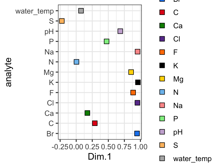
Figure 3.4: Circular ordination plot for Alaskan lakes. Arrows mark analyte loadings scaled to the correlation circle, and labels flag the elements that dominate each principal axis so we can connect chemistry to lake groupings.
Great! Here is how to read the ordination plot:
When considering one analyte’s vector: the vector’s projected value on an axis shows how much its variance is aligned with that principal component.
When considering two analyte vectors: the angle between two vectors indicates how correlated those two variables are. If they point in the same direction, they are highly correlated. If they meet each other at 90 degrees, they are not very correlated. If they meet at ~180 degrees, they are negatively correlated. If say that one analyte is “1.9” with respect to dimension 2 and another is “-1.9” with respect to dimension 2. Let’s also say that these vectors are ~“0” with respect to dimension 1.
With the ordination plot above, we can now see that the abundances of K, Cl, Br, and Na are the major contributors of variance to the first principal component (or the first dimension). The abundances of these elements are what make White Fish Lake and North Killeak Lake different from the other lakes. We can also see that the abundances of N, S, and Ca are the major contributors to variance in the second dimension, which means that these elements ar what set Wild Lake, Iniakuk Lake, Walker Lake, and several other lakes in GAAR park apart from the rest of the lakes in the data set. It slightly easier to understand this if we look at an overlay of the two plots, which is often called a “biplot”:
# AK_lakes_pca <- runMatrixAnalysis(
#   data = alaska_lake_data,
#   analysis = c("pca"),
#   column_w_names_of_multiple_analytes = "element",
#   column_w_values_for_multiple_analytes = "mg_per_L",
#   columns_w_values_for_single_analyte = c("water_temp", "pH"),
#   columns_w_additional_analyte_info = "element_type",
#   columns_w_sample_ID_info = c("lake", "park"),
#   scale_variance = TRUE
# )
#
# AK_lakes_pca_ord <- runMatrixAnalysis(
#   data = alaska_lake_data,
#   analysis = c("pca_ord"),
#   column_w_names_of_multiple_analytes = "element",
#   column_w_values_for_multiple_analytes = "mg_per_L",
#   columns_w_values_for_single_analyte = c("water_temp", "pH"),
#   columns_w_additional_analyte_info = "element_type",
#   columns_w_sample_ID_info = c("lake", "park")
# )

ggplot() +
  geom_point(
    data = AK_lakes_pca,
    aes(x = Dim.1, y = Dim.2, fill = park), shape = 21, size = 4, alpha = 0.8
  ) +
  # geom_label_repel(aes(label = lake), alpha = 0.5) +
  geom_segment(
    data = AK_lakes_pca_ord,
    aes(x = 0, y = 0, xend = Dim.1, yend = Dim.2, color = analyte),
    size = 1
  ) +
  scale_color_manual(values = discrete_palette) +
  theme_classic()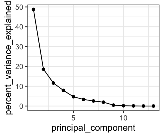
Figure 3.5: PCA biplot combining scores and loadings. Lakes are plotted as points coloured by park while analyte vectors overlay the same coordinate system, helping us link sample groupings to the drivers of chemical variance.
Note that you do not have to plot ordination data as a circular layout of segments. Sometimes it is much easier to plot (and interpret!) alternatives:
AK_lakes_pca_ord %>%
  ggplot(aes(x = Dim.1, y = analyte)) +
    geom_point(aes(fill = analyte), shape = 22, size = 3) +
    scale_fill_manual(values = discrete_palette) +
    theme_bw()
Figure 3.6: Analyte loadings by principal component. The dot plot re-expresses the PCA loadings as coordinates along Dim.1, making it easy to compare how each element contributes relative to the others.
principal components
We also can access information about the how much of the variance in the data set is explained by each principal component, and we can plot that using ggplot:
AK_lakes_pca_dim <- runMatrixAnalyses(
  data = alaska_lake_data_wide,
  analysis = c("pca_dim"),
  columns_w_values_for_single_analyte = colnames(alaska_lake_data_wide)[3:15],
  columns_w_sample_ID_info = c("lake", "park")
)
head(AK_lakes_pca_dim)
## # A tibble: 6 × 2
##   principal_component percent_variance_explained
##                 <dbl>                      <dbl>
## 1                   1                      48.8
## 2                   2                      18.6
## 3                   3                      11.6
## 4                   4                       7.88
## 5                   5                       4.68
## 6                   6                       3.33

ggplot(
  data = AK_lakes_pca_dim,
  aes(x = principal_component, y = percent_variance_explained)
) +
  geom_line() +
  geom_point() +
  theme_bw()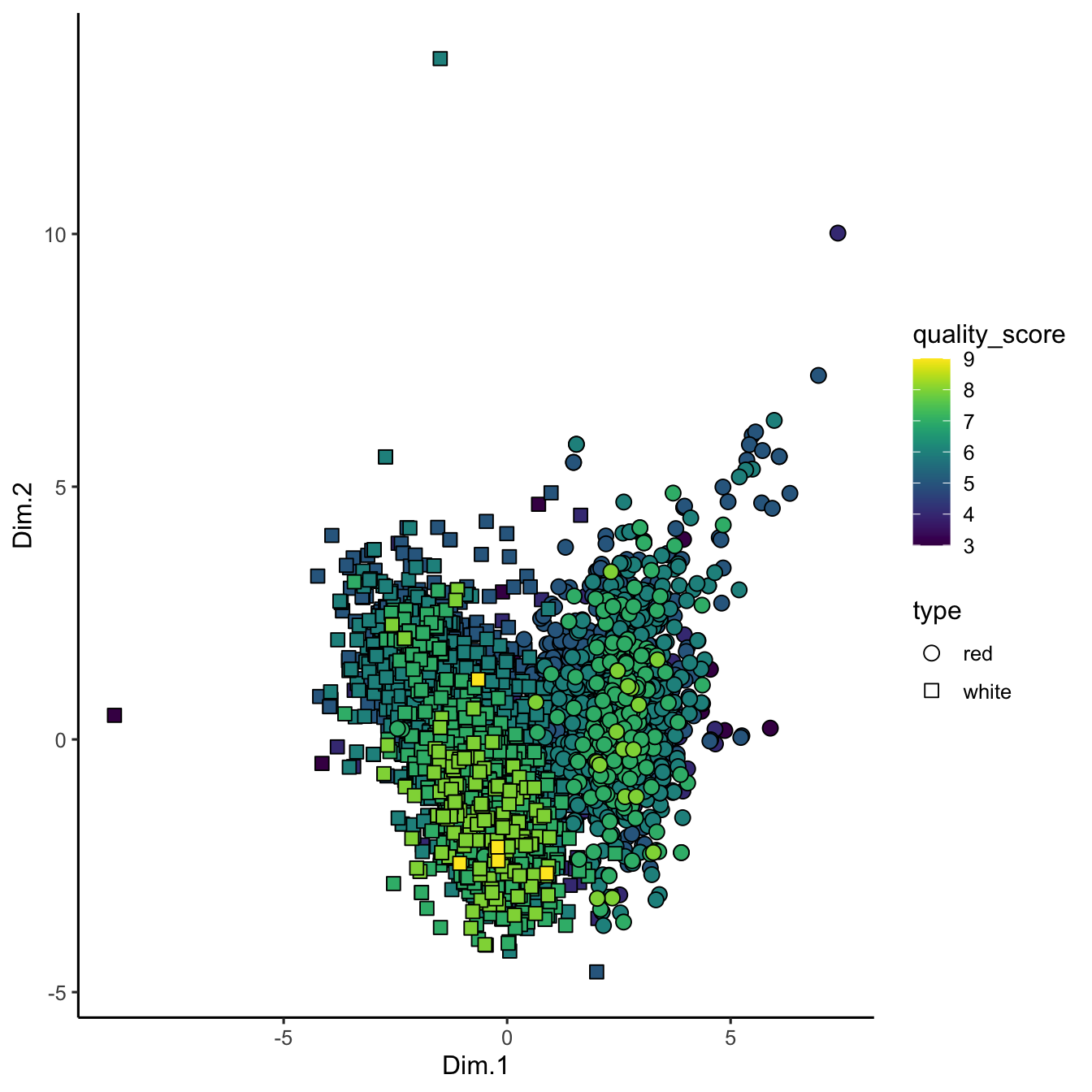
Figure 3.7: Variance explained by principal components. The scree curve shows how much of the total chemical variability is captured by each component, informing how many dimensions to retain.
Cool! We can see that the first principal component retains nearly 50% of the variance in the original dataset, while the second dimension contains only about 20%. We can derive an important notion about PCA visualization from this: the scales on the two axes need to be the same for distances between points in the x and y directions to be comparable. This can be accomplished using coord_fixed() as an addition to your ggplots.
pcaVisualizer
Static plots are great for reporting, but exploring PCA interactively can make it easier to understand the relationships between your samples and analytes. Our source() command provides an interactive app helper called pcaVisualizer() that wraps runMatrixAnalyses() and assembles a dashboard with coordinated plots.
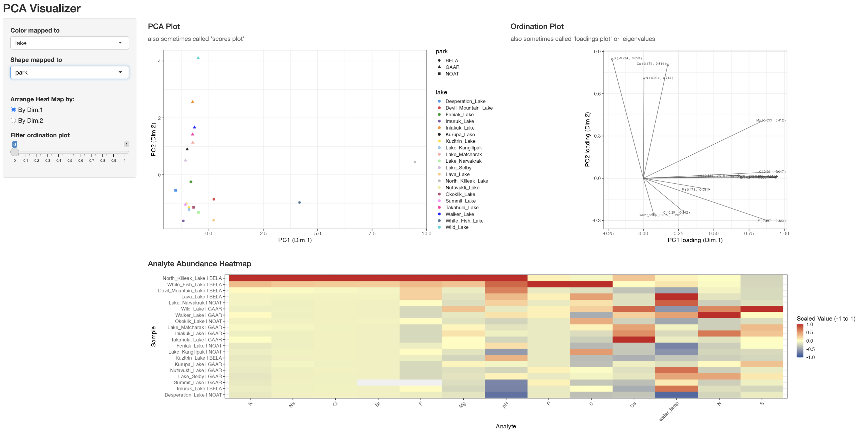
Figure 3.8: Screenshot of the pcaVisualizer() dashboard showing the linked scores plot, loadings plot, and heatmap panels used to explore PCA interactively.
The function takes three key arguments:
-
data: a data frame that contains both the sample identifiers and the numeric analyte columns. -
columns_w_sample_ID_info: the column names that identify each sample (for examplec("lake", "park")). -
columns_w_values_for_single_analyte: the numeric columns that should be analysed (for examplecolnames(alaska_lake_data_wide)[3:15]).
To launch the app for the Alaska lakes example:
pcaVisualizer(
  data = alaska_lake_data_wide,
  columns_w_sample_ID_info = c("lake", "park"),
  columns_w_values_for_single_analyte = colnames(alaska_lake_data_wide)[3:15]
)
This opens a browser window (or RStudio viewer) with three linked panels:
-
PCA Plot – the familiar scores plot. Use the sidebar dropdowns to map any sample ID column to colour or shape; the app reuses the
discrete_palettedefined earlier so colours stay consistent with the rest of this chapter. - Ordination Plot – the loadings plot. Adjust the Filter ordination plot slider to hide vectors whose combined PC1/PC2 loading magnitude falls below your chosen threshold, making it easier to focus on the analytes that matter.
- Analyte Abundance Heatmap – a scaled (z-scored) heatmap for the analytes that pass the loading filter. You can order rows by Dim.1 or Dim.2 so the heatmap aligns with the direction of separation you care about in the scores plot.
Because pcaVisualizer() calls runMatrixAnalyses() under the hood, any transformations you perform on your data before launching the app (scaling, filtering, subsetting) carry through automatically. Use it as a quick sanity check while you are refining preprocessing steps, and once you are satisfied, you can reproduce the final view with scripted ggplot code for publication-quality figures.
umap and tsne
“How do non-linear dimensionality reduction techniques reveal hidden structure in my data?” “Can I identify clusters or subtle gradients in my dataset that might be missed by PCA?”
UMAP (Uniform Manifold Approximation and Projection) is a non-linear dimensionality reduction technique that, unlike PCA, can capture both local and global data structure. It is especially useful when your data might have clusters or manifold structures that aren’t well-represented by linear combinations of features. You can think of umap as a technique that “unwinds” a dataset, rather than projecting it onto a plane. Compared with PCA, UMAP often reveals tighter clusters and curved trajectories because it optimizes neighborhood relationships rather than a straight-line variance objective. That flexibility is powerful, but it comes with trade-offs: UMAP axes have no direct numerical interpretation, results depend on hyperparameters such as n_neighbors and min_dist, and the algorithm is stochastic, so repeated runs can vary slightly. PCA, in contrast, is deterministic and easier to interpret because each principal component is a weighted combination of the original variables, but it may miss nonlinear structure that UMAP highlights.
We will work here with the wine_quality dataset. Our wine quality dataset doesn’t come with unique sample identifiers, which are essential for any matrix analysis. We can create these identifiers by adding a new column called ID to our data frame. The code below demonstrates how to do this:
In this command, the dollar sign ($) is used to access (or create) the ID column within the wine_quality data frame. The seq() function generates a sequence of numbers starting at 1 and ending at the number of rows in the dataset (given by dim(wine_quality)[1]), with an increment of 1. This way, every sample is uniquely identified.
Before starting with non-linear techniques, it can be helpful to see how a linear method like PCA clusters our samples. We run the analysis using runMatrixAnalysis(), specifying the relevant columns that contain our continuous variables (columns 4 to 14), and passing along our sample identifier along with additional information such as wine type, quality_score, and quality_category.
wq <- runMatrixAnalyses(
  data = wine_quality,
  analysis = "pca",
  columns_w_values_for_single_analyte = colnames(wine_quality)[4:14],
  columns_w_sample_ID_info = c("ID", "type", "quality_score", "quality_category")
)
wq %>%
  arrange(quality_score) %>%
  ggplot(aes(x = Dim.1, y = Dim.2)) +
  geom_point(size = 3, aes(shape = type, fill = quality_score)) +
  scale_shape_manual(values = c(21, 22)) +
  scale_fill_viridis() +
  theme_classic()
Figure 3.9: PCA projection of wine chemistry. Samples are positioned by the first two components, with point shape distinguishing red and white wines and fill showing sensory quality scores; the layout highlights gradients that PCA captures.
In this PCA plot, each point represents a wine sample, with its position determined by the first two principal components. We’re using quality_score to fill the points with color, and different shapes to distinguish the wine type. This serves as a baseline for comparing how non-linear methods handle our data.
We can perform UMAP on the wine quality dataset just as easily as PCA. The code below shows how to run UMAP using runMatrixAnalysis():
runMatrixAnalyses(
  data = wine_quality,
  analysis = "umap",
  columns_w_values_for_single_analyte = colnames(wine_quality)[4:14],
  columns_w_sample_ID_info = c("ID", "type", "quality_score", "quality_category")
) %>%
  arrange(quality_score) %>%
  ggplot(aes(x = Dim_1, y = Dim_2)) +
  geom_point(size = 3, aes(shape = type, fill = quality_score)) +
  scale_shape_manual(values = c(21, 22)) +
  scale_fill_viridis() +
  theme_classic()
Figure 3.10: UMAP embedding of wine chemistry. The non-linear projection preserves neighbourhood relationships, revealing clusters driven by wine type and quality scores that complement the PCA view.
In the UMAP plot, each point’s coordinates (Dim_1 and Dim_2) are derived from UMAP’s algorithm, which strives to preserve the overall topology of the data. As a result, UMAP might reveal clusters or continuous gradients related to wine quality and type that aren’t as apparent with PCA.
t‑SNE (t‑Distributed Stochastic Neighbor Embedding) is another popular non-linear dimensionality reduction technique. It excels at revealing clusters but can sometimes distort the global structure in favor of preserving local relationships. Although we’re not showing a full t‑SNE example here, you can run t‑SNE using the runMatrixAnalysis() function by specifying analysis = “tsne” (see below). Note that tsne fails with samples that have duplicate analyte values, so we have to filter out any duplicates.
wine_quality_deduplicated <- wine_quality[!duplicated(wine_quality[4:14]),]
tsne_results <- runMatrixAnalyses(
  data = wine_quality_deduplicated,
  analysis = "tsne",
  columns_w_values_for_single_analyte = colnames(wine_quality)[4:14],
  columns_w_sample_ID_info = c("ID", "type", "quality_score", "quality_category")
)
From there, you could plot the t‑SNE dimensions in a similar fashion to the PCA and UMAP examples.
Both UMAP and t‑SNE provide powerful alternatives to PCA when your data’s structure is non-linear. They can help uncover hidden patterns and clusters by focusing on preserving local relationships—UMAP while maintaining a sense of global structure, and t‑SNE by emphasizing the neighborhood structure of the data.
exercises
Based on the chemical measurements in the beer components dataset, which is more similar to hops, hop oil or hop extract? Note that, for simplicity, you may wish to ignore the columns “analyte_odor” and “analyte_class” in your analysis.
What are the top two markers for red versus white wine in the wine_quality dataset? Note that you may need to assign each bottle a unique ID as follows:
wine_quality <- select(mutate(wine_quality, ID = seq(1,6497,1)), ID, everything()).
further reading
StatQuest: Principal Component Analysis (PCA), Step-by-Step. A visually intuitive YouTube explanation of PCA that breaks down the algorithm step by step using clear graphics, part of a curated playlist on statistical analysis.
Understanding UMAP. A Pair Code blog post covering both the intuition and practical applications of UMAP, bridging the gap between the algorithm’s theoretical foundations and real-world use cases.
UMAP: Mathematical Details. A YouTube video that walks through the mathematical underpinnings of UMAP in an accessible way, for viewers who want to understand how the algorithm works behind the scenes.