specialized plots and maps
This appendix collects plot types that are useful but specialized. None of them is part of the main sequence of the book — each is a self-contained recipe you can come back to when your data happens to have the shape it fits. Three of them (3D scatter, Venn, ternary) are unusual chart forms; the fourth, mapping, is a larger topic in its own right.
These sections were the tail of the former “data visualization III” chapter, which was dissolved on 2026-08-27: its network material became chapter 7, its distribution material moved into the comparing-means chapter, and what remained is here.
specialized plots
3D scatter plots
phylochemistry contains a function to help you make somewhat decent 3D scatter plots. Let’s look at an example (see below). For this, we use the function points3D. We give it a data argument that gives it vectors of data that should be on the x, y, and z axes, along with a vector that uniquely identifies each observation. We also tell it the angle of the z axis that we want, the integer to which ticks should be rounded, and the tick intervals. The function returns data that we can pass to ggplot to make a 3D plot.
pivot_wider(hawaii_aquifers, names_from = "analyte", values_from = "abundance") %>%
  mutate(sample_unique_ID = paste0(aquifer_code, "_", well_name)) -> aquifers

output <- points3D(
  data = data.frame(
    x = aquifers$SiO2,
    y = aquifers$Cl,
    z = aquifers$Mg,
    sample_unique_ID = aquifers$sample_unique_ID
  ),
  angle = pi/2.4,
  tick_round = 10,
  x_tick_interval = 10,
  y_tick_interval = 20,
  z_tick_interval = 20
)

str(output)
## List of 6
##  $ grid          :'data.frame':  14 obs. of  4 variables:
##   ..$ y   : num [1:14] 0 0 0 0 0 ...
##   ..$ yend: num [1:14] 96.6 96.6 96.6 96.6 96.6 ...
##   ..$ x   : num [1:14] 10 20 30 40 50 ...
##   ..$ xend: num [1:14] 35.9 45.9 55.9 65.9 75.9 ...
##  $ ticks         :'data.frame':  37 obs. of  4 variables:
##   ..$ y   : num [1:37] 0 0 0 0 0 0 0 0 0 0 ...
##   ..$ yend: num [1:37] 1.93 1.93 1.93 1.93 1.93 ...
##   ..$ x   : num [1:37] 10 20 30 40 50 60 70 80 10 20 ...
##   ..$ xend: num [1:37] 10.5 20.5 30.5 40.5 50.5 ...
##  $ labels        :'data.frame':  29 obs. of  3 variables:
##   ..$ y    : num [1:29] -11.2 -11.2 -11.2 -11.2 -11.2 -11.2 -11.2 -11.2 0 20 ...
##   ..$ x    : num [1:29] 7.2 17.2 27.2 37.2 47.2 57.2 67.2 77.2 4.4 4.4 ...
##   ..$ label: num [1:29] 10 20 30 40 50 60 70 80 0 20 ...
##  $ axes          :'data.frame':  3 obs. of  4 variables:
##   ..$ x   : num [1:3] 10 10 80
##   ..$ xend: num [1:3] 80 10 106
##   ..$ y   : num [1:3] 0 0 0
##   ..$ yend: num [1:3] 0 280 96.6
##  $ point_segments:'data.frame':  106 obs. of  4 variables:
##   ..$ x   : num [1:106] 13 33.1 39.4 53.1 22.5 ...
##   ..$ xend: num [1:106] 13 33.1 39.4 53.1 22.5 ...
##   ..$ y   : num [1:106] 27.3 81.6 82.6 109.5 19.5 ...
##   ..$ yend: num [1:106] 7.34 11.59 12.56 15.45 5.51 ...
##  $ points        :'data.frame':  106 obs. of  3 variables:
##   ..$ x               : num [1:106] 13 33.1 39.4 53.1 22.5 ...
##   ..$ y               : num [1:106] 27.3 81.6 82.6 109.5 19.5 ...
##   ..$ sample_unique_ID: chr [1:106] "aquifer_1_Alewa_Heights_Spring" "aquifer_1_Beretania_High_Service" "aquifer_1_Beretania_Low_Service" "aquifer_1_Kuliouou_Well" ...
The output from points3D contains a grid, axes, and ticks, which should all be plotted using geom_segment. It also contains points that should be plotted with geom_point, and point segments that should be plotted with geom_segment. We can take the output from points3D and join it with the original data, which will occur according to our sample_unique_ID column. Then, we can also plot point metadata:
output$points <- left_join(output$points, aquifers)
## Joining with `by = join_by(sample_unique_ID)`

ggplot() +
  geom_segment(
    data = output$grid, aes(x = x, xend = xend, y = y, yend = yend),
    color = "grey80"
  ) +
  geom_segment(data = output$axes, aes(x = x, xend = xend, y = y, yend = yend)) +
  geom_segment(data = output$ticks, aes(x = x, xend = xend, y = y, yend = yend)) +
  geom_text(
    data = output$labels, aes(x = x, y = y, label = label),
    hjust = 0.5
  ) +
  geom_segment(
    data = output$point_segments,
    aes(x = x, xend = xend, y = y, yend = yend),
    linetype = "dotted", color = "black"
  ) +
  geom_point(
    data = output$points, aes(x = x, y = y, fill = aquifer_code),
    size = 3, shape = 21
  ) +
  theme_void() +
  scale_fill_manual(values = discrete_palette)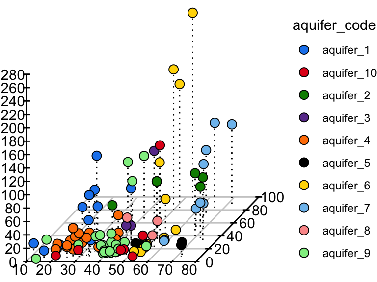
venn diagrams
df <- data.frame(
  plant1 = sample(c(TRUE, FALSE), 24, replace = TRUE),
  plant2 = sample(c(TRUE, FALSE), 24, replace = TRUE),
  plant3 = sample(c(TRUE, FALSE), 24, replace = TRUE),
  attribute_name = sample(letters, 24, replace = FALSE)
)

vennAnalysis(df[,1:3]) %>%
  ggplot() +
    geom_circle(
      aes(x0 = x, y0 = y, r = r, fill = category),
      alpha = 0.4
    ) +
  scale_fill_brewer(palette = "Set1") +
  theme_void()
ternary plots
Ternary plots come from the ggtern package. Note that it is called with ggtern:: in front of it
rather than being attached with library(ggtern): attaching ggtern replaces several of ggplot2’s
own functions, including ggplot() itself, so every ordinary plot made afterwards in the same R
session goes through ggtern instead. Calling it with ggtern:: gets the ternary plot without that
side effect.
alaska_lake_data %>%
  pivot_wider(names_from = "element", values_from = "mg_per_L") %>%
  ggtern::ggtern(aes(
    x = Ca,
    y = S,
    z = Na,
    color = park,
    size = pH
    )) +
geom_point() 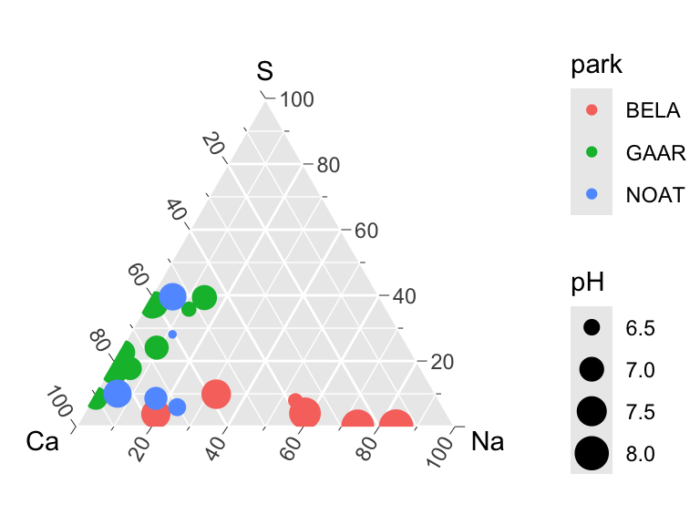
map data
Geographic data is really its own subject, and what follows is an introduction rather than a treatment of it. The point to take away is that a map is a plot like any other — the coordinates happen to be longitude and latitude, and the one genuinely new idea is the projection, which is the decision about how to flatten a curved surface onto a page. Every projection distorts something; choosing one is a decision with consequences, not a default.
plotting boundaries
There is a simple way to plot maps with ggplot. The map data comes with ggplot2! Let’s have a look. See below some of the data sets included. Options included with ggplot are: world, world2, usa, state (US), county (US), nz, italy, and france. geom_polygon() is useful for plotting these, at (at least to me) seems more intuitive than geom_map().
head(map_data("world"))
##        long      lat group order region subregion
## 1 -69.89912 12.45200     1     1  Aruba      <NA>
## 2 -69.89571 12.42300     1     2  Aruba      <NA>
## 3 -69.94219 12.43853     1     3  Aruba      <NA>
## 4 -70.00415 12.50049     1     4  Aruba      <NA>
## 5 -70.06612 12.54697     1     5  Aruba      <NA>
## 6 -70.05088 12.59707     1     6  Aruba      <NA>
head(map_data("state"))
##        long      lat group order  region subregion
## 1 -87.46201 30.38968     1     1 alabama      <NA>
## 2 -87.48493 30.37249     1     2 alabama      <NA>
## 3 -87.52503 30.37249     1     3 alabama      <NA>
## 4 -87.53076 30.33239     1     4 alabama      <NA>
## 5 -87.57087 30.32665     1     5 alabama      <NA>
## 6 -87.58806 30.32665     1     6 alabama      <NA>
head(map_data("county"))
##        long      lat group order  region subregion
## 1 -86.50517 32.34920     1     1 alabama   autauga
## 2 -86.53382 32.35493     1     2 alabama   autauga
## 3 -86.54527 32.36639     1     3 alabama   autauga
## 4 -86.55673 32.37785     1     4 alabama   autauga
## 5 -86.57966 32.38357     1     5 alabama   autauga
## 6 -86.59111 32.37785     1     6 alabama   autauga
head(map_data("france"))
##       long      lat group order region subregion
## 1 2.557093 51.09752     1     1   Nord      <NA>
## 2 2.579995 51.00298     1     2   Nord      <NA>
## 3 2.609101 50.98545     1     3   Nord      <NA>
## 4 2.630782 50.95073     1     4   Nord      <NA>
## 5 2.625894 50.94116     1     5   Nord      <NA>
## 6 2.597699 50.91967     1     6   Nord      <NA>
Cool! We can see that lat, lon, group, order, region, and subregion are included. That makes plotting easy. Note that coord_map() can help preserve aspect ratios:
ggplot(map_data("world")) +
  geom_point(aes(x = long, y = lat, color = group), size = 0.5) +
  theme_void() +
  coord_map()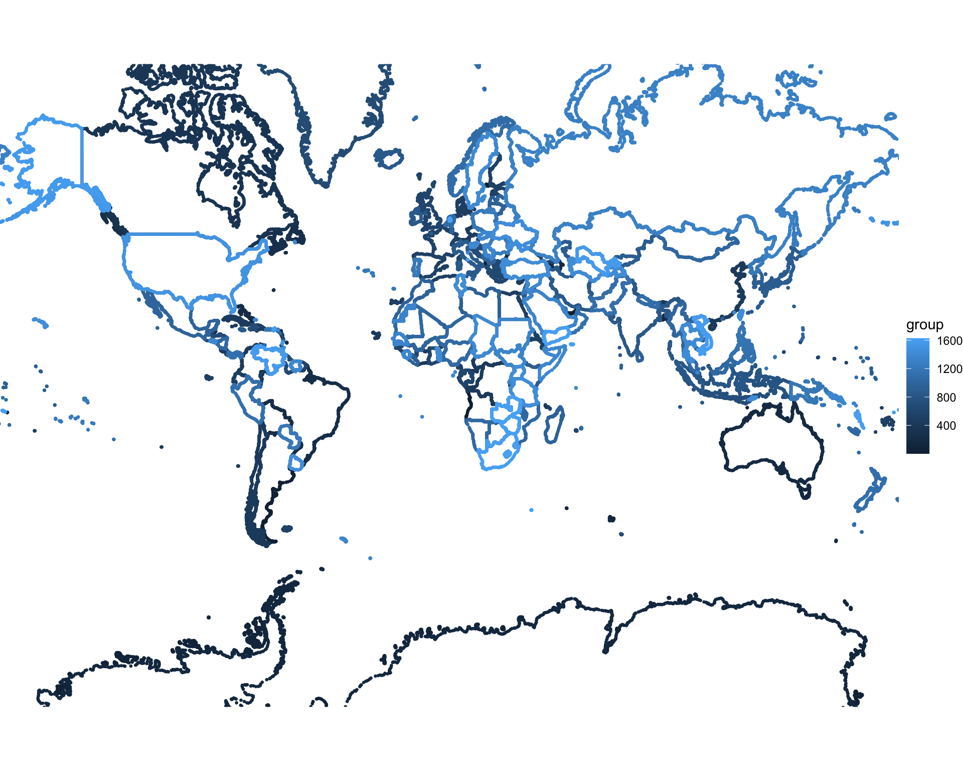
Note that we can use coord_map() to do some pretty cool things!
ggplot(map_data("world")) +
  geom_point(aes(x = long, y = lat, color = group), size = 0.5) +
  theme_void() +
  coord_map(projection = "albers", lat0 = 39, lat1 = 45)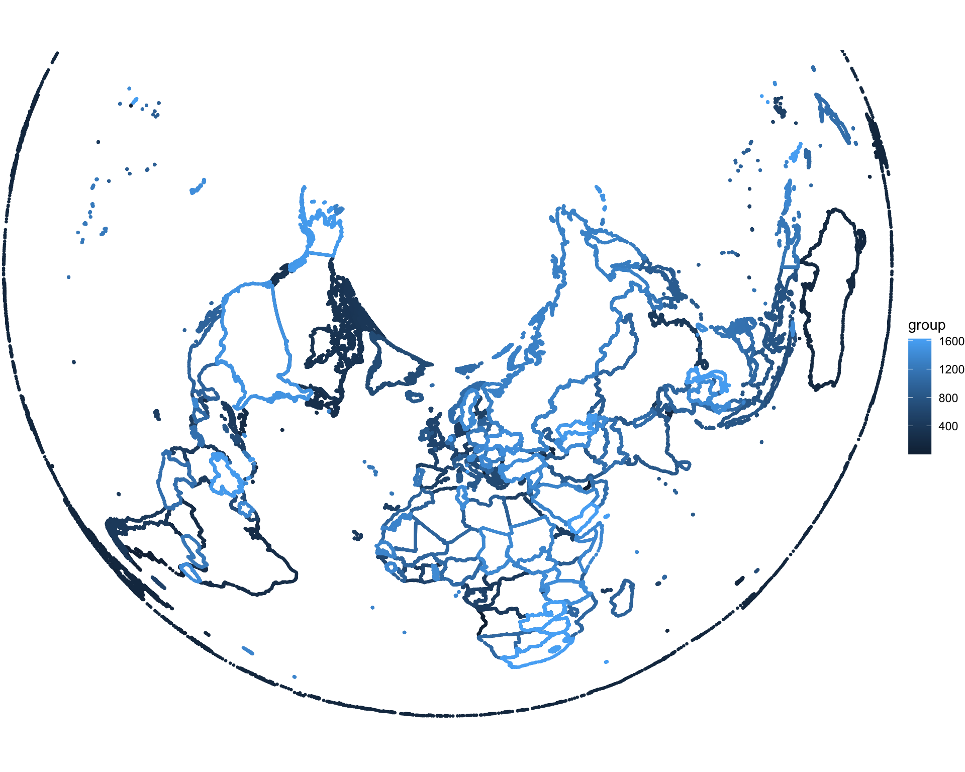
We can use filtering to produce maps of specific regions.
ggplot() +
  geom_polygon(
    data = filter(map_data("county"), region == "minnesota"),
    aes(x = long, y = lat, group = subregion, fill = subregion),
    color = "black"
  ) +
  theme_void() +
  coord_map()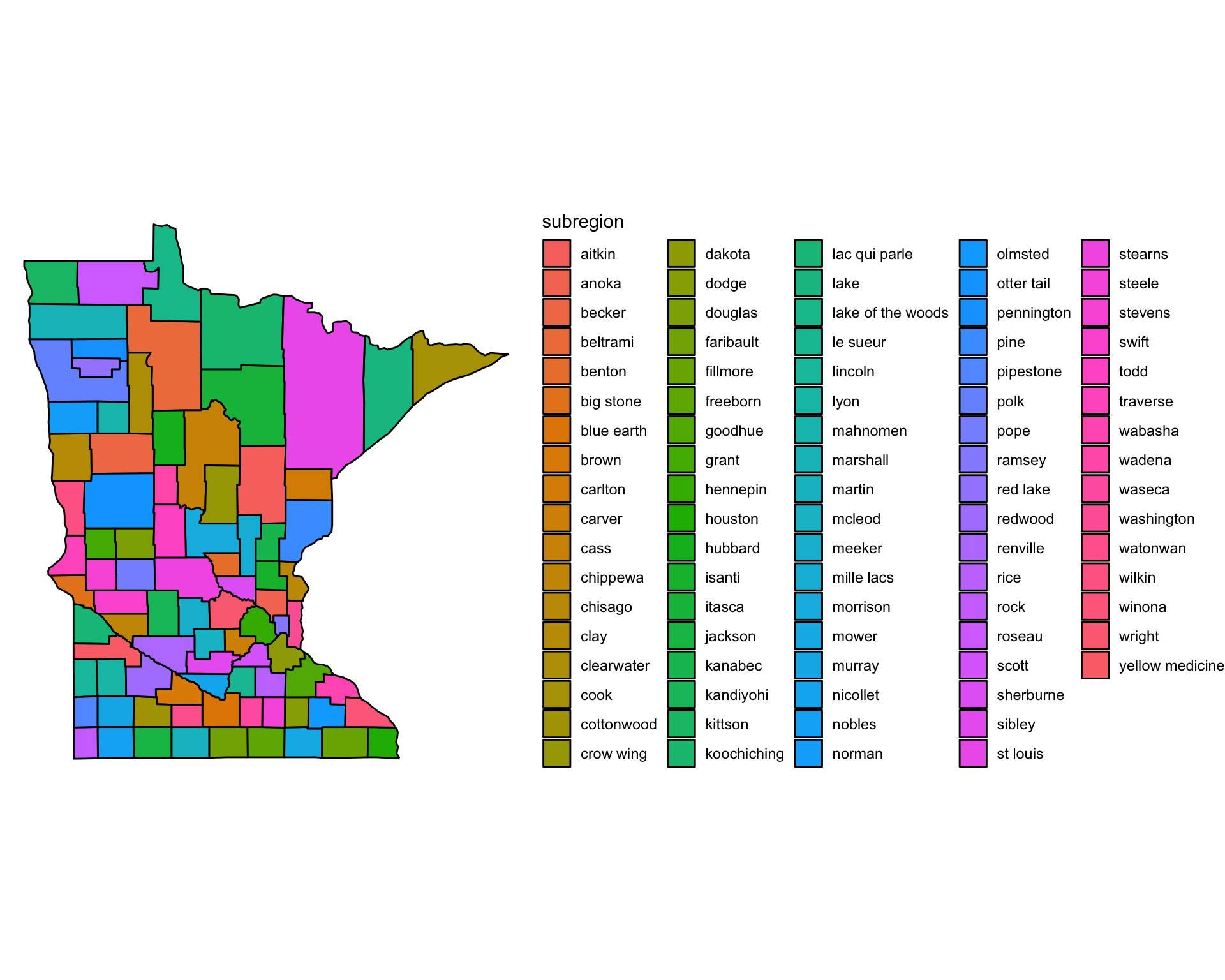
maps with plots
Please note that the Great Lakes are in map_data()!
filter(map_data("lakes"), region == "Great Lakes", subregion == "Superior") %>%
    ggplot() +
      geom_path(aes(x = long, y = lat)) +
      coord_map() +
      theme_minimal()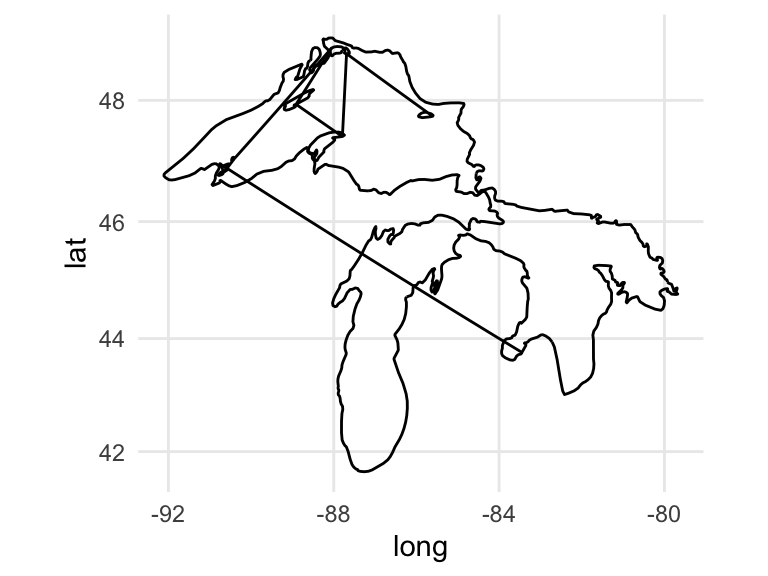
We can clean up the map by making different groups for geom_path() whenever two consecutive points are far apart:
# Step 1: Filter and prepare your data for Lake Superior (though yes, that includes Michigan and Huron)
lake_superior <- map_data("lakes") %>%
  filter(region == "Great Lakes", subregion == "Superior") %>%
  arrange(order)

# Step 2: Calculate distances between consecutive points
lake_superior <- lake_superior %>%
  mutate(lag_long = lag(long),
         lag_lat = lag(lat),
         dist_to_prev = geosphere::distHaversine(cbind(long, lat), cbind(lag_long, lag_lat))) # distHaversine calculates distances

# Step 3: Define a threshold (e.g., 50 km) and create the "distance_group"
threshold <- 50000  # 50 km
lake_superior <- lake_superior %>%
  mutate(distance_group = cumsum(ifelse(dist_to_prev > threshold | is.na(dist_to_prev), 1, 0)))

# Step 4: Plot the map with `distance_group`
ggplot(lake_superior, aes(x = long, y = lat, group = distance_group)) +
  geom_path() +
  coord_map() +
  theme_minimal()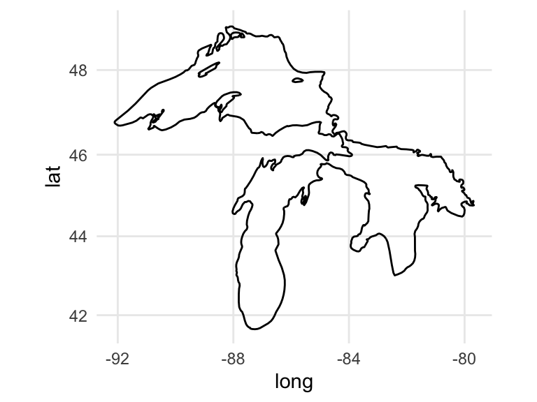
Now we could add some data. The next few examples use a dataset of per- and polyfluoroalkyl substance (PFAS) measurements from sites around Lake Superior. Note: these are unpublished data from ongoing lab research, included here purely to illustrate the plotting techniques. The file is not distributed with the course, so the code below is shown for reference and will not run on your machine — focus on the mapping and layering approach rather than reproducing the figure. We could do something simple like plot total abundances as the size of a point:
lake_superior_PFAS <- readMonolist(Sys.getenv("PFAS_DATA"))
lake_superior_PFAS %>%
  group_by(site, lon, lat) %>%
  summarize(total = sum(abundance)) -> lake_superior_PFAS_summarized

ggplot() +
  geom_path(
    data = filter(lake_superior, lat > 46, long < -84),
    aes(x = long, y = lat, group = distance_group)
  ) +
  geom_point(
    data =  lake_superior_PFAS_summarized,
    aes(x = lon, y = lat, size = total),
    color = "black"
  ) +
  coord_map() +
  theme_cowplot()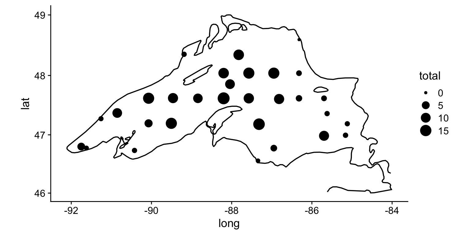
Or we could do something more sophisticated like add pie charts at each point:
lake_superior_PFAS <- readMonolist(Sys.getenv("PFAS_DATA"))

grouped_by_site <- filter(lake_superior_PFAS, component == "PFBA")
site_less_than_90lon <- filter(grouped_by_site, lon <= -90)
site_more_than_90lon <- filter(grouped_by_site, lon >= -90)

unique_sites <- unique(lake_superior_PFAS$site)
dataframe_of_pies <- list()
for (i in 1:length(unique_sites)) { #i=1
  this_site <- filter(lake_superior_PFAS, site == unique_sites[i])
  this_site %>%
    ggplot()+
    geom_col(aes(x = 1, y = abundance, fill = class_name), color = "black") +
    coord_polar(theta = "y") +
    theme_void() +
    scale_fill_brewer(palette = "Set1", guide = "none") -> this_sites_pie
  dataframe_of_pies[[i]] <- tibble(x = this_site$lon[1], y = this_site$lat[1], plot = list(this_sites_pie))
}
dataframe_of_pies <- do.call(rbind, dataframe_of_pies)

ggplot() +
  geom_path(
    data = filter(lake_superior, lat > 46, long < -84),
    aes(x = long, y = lat, group = distance_group)
  ) +
  geom_point(
    data =  lake_superior_PFAS,
    aes(x = lon, y = lat),
    color = "black"
  ) +
  geom_plot(
    data = dataframe_of_pies, aes(x = x, y = y, label = plot),
    vp.width = 1/20, hjust = 0.5, vjust = 0.5, alpha = 0.5
  ) +
  geom_label_repel(data = site_less_than_90lon, aes(x = lon, y = lat, label = site), size = 2.5,min.segment.length = 0.01) +
  geom_label(data = site_more_than_90lon, aes(x = lon, y = lat, label = site), size = 2.5) +
  coord_map() +
  theme_cowplot()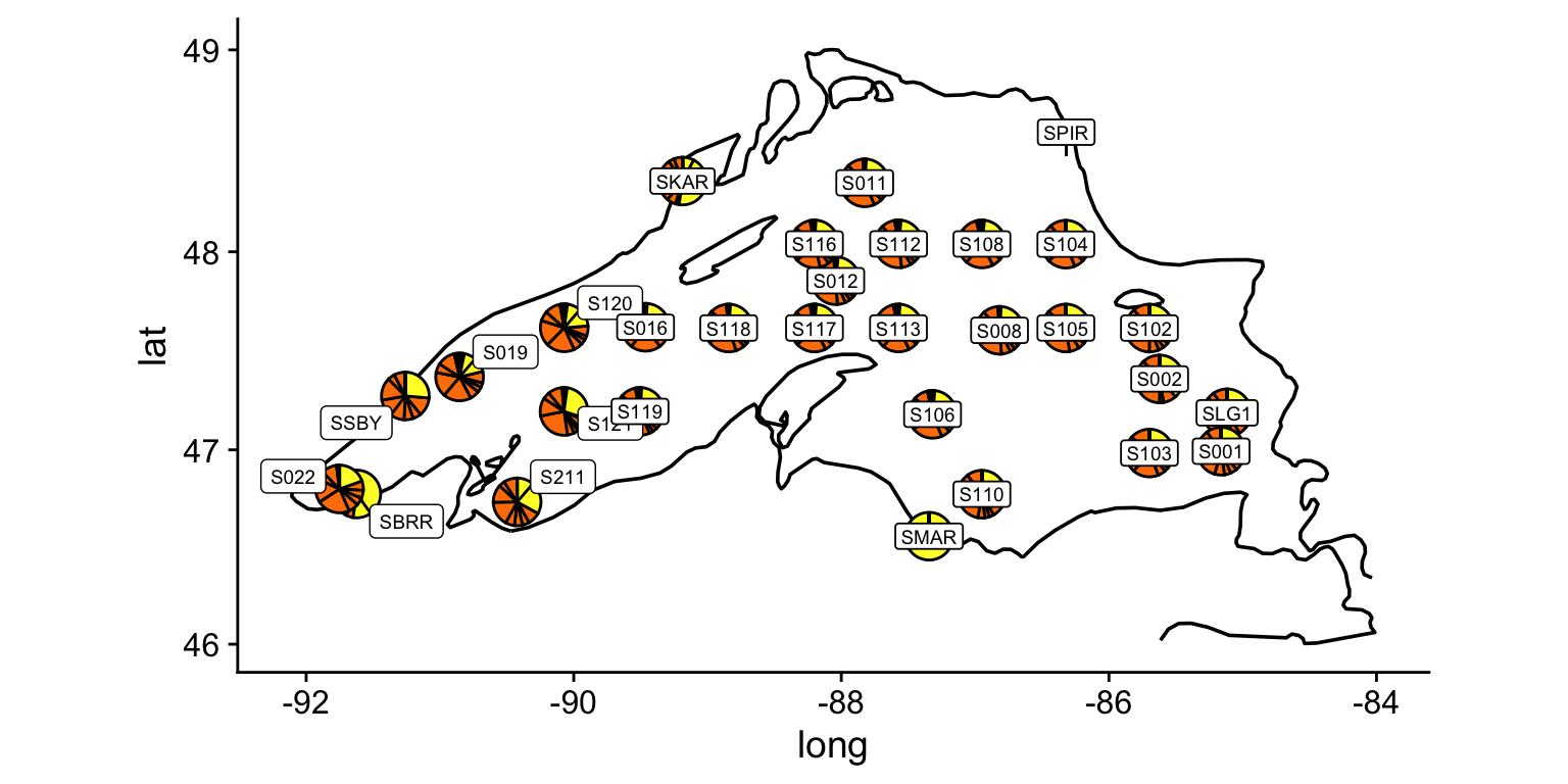
You can also access a high resolution shoreline dataset for Lake Superior directly from the source() command as lake_superior_shoreline:
shore <- lake_superior_shoreline

wide_view <- ggplot(shore) +
    geom_point(aes(y = lat, x = lon), size = 0.01) +
    coord_map() +
    theme_minimal()

zoom_view <- ggplot(filter(shore, lat < 47.2, lat > 46.6, lon < -90)) +
    geom_point(aes(y = lat, x = lon), size = 0.01) +
    coord_map() +
    theme_minimal()

plot_grid(wide_view, zoom_view, nrow = 1, rel_widths = c(1,2))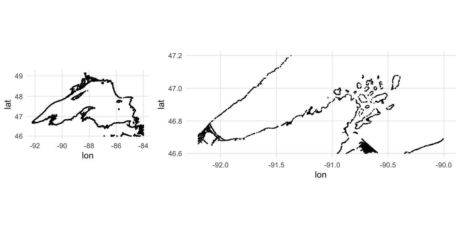
further reading
State and County Maps in R with ggplot2. A step-by-step tutorial showing how to create US state and county level choropleth maps using ggplot2 and the
map_data()function.Drawing beautiful maps programmatically with R, sf and ggplot2. A tutorial from the r-spatial project demonstrating how to use the
sfpackage with ggplot2’sgeom_sf()to create publication-quality maps from spatial data.ggtern: A package for the creation of ternary diagrams. The Journal of Statistical Software article introducing ggtern, which extends ggplot2 to support ternary diagrams for visualizing three-component compositional data.