models

Next on our quest to develop our abilities in analytical data exploration is modeling. We will discuss two main types of numerical models: inferential and predictive.
Inferential models aim to understand and quantify the relationships between variables, focusing on the significance, direction, and strength of these relationships to draw conclusions about the data. When using inferential models we care a lot about the exact inner workings of the model because those inner workings are how we understand relationships between variables.
Predictive models are designed with the primary goal of forecasting future outcomes or behaviors based on historical data. When using predictive models we often care much less about the exact inner workings of the model and instead care about accuracy. In other words, we don’t really care how the model works as long as it is accurate.
In this course, we will build both types of models using a function called buildModel. To use it, we simply give it our data, and tell it which to sets of values we want to compare. To tell it what we want to compare, we need to specify (at least) two things:
input_variables: the input variables (sometimes called “features” or “predictors”) the model should use as inputs for the prediction. Depending on the model, these could be continuous or categorical variables.
output_variable: the variable that the model should predict. Depending on the model, it could be a continuous value (regression) or a category/class (classification).
For model building, we also need to talk about handling missing data. If we have missing data in our data set, we need to one way forward is to impute it. This means that we need to fill in the missing values with something. There are many ways to do this, but we will use the median value of each column. We can do this using the impute function from the rstatix package. Let’s do that now:
any(is.na(metabolomics_data))
## [1] TRUE
metabolomics_data[] <- lapply(metabolomics_data, function(x) Hmisc::impute(x, mean(x, na.rm = TRUE)))
any(is.na(metabolomics_data))
## [1] FALSE
inferential models
single linear regression
We will start with some of the simplest models - linear models. There are a variety of ways to build linear models in R, but we will use buildModel, as mentioned above. First, we will use least squares regression to model the relationship between input and output variables. Suppose we want to know if the abundances of ADP and AMP are related in our metabolomics dataset:
ggplot(metabolomics_data) +
  geom_point(aes(x = ADP, y = AMP))
## Don't know how to automatically pick scale for object of
## type <impute>. Defaulting to continuous.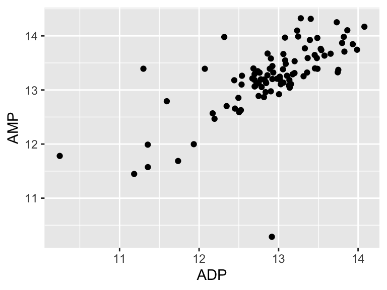
It looks like there might be a relationship! Let’s build an inferential model to examine the details of that that relationship:
basic_regression_model <- buildModel2(
  data = metabolomics_data,
  model_type = "linear_regression",
  input_variables = "ADP",
  output_variable = "AMP"
)
names(basic_regression_model)
## [1] "model_type" "model"      "metrics"
The output of buildModel consists of three things: the model_type, the model itself, and the metric describing certain aspects of the model and/or its performance. Let’s look at the model:
basic_regression_model$model
##
## Call:
## lm(formula = formula, data = training_data, model = TRUE, x = TRUE,
##     y = TRUE, qr = TRUE)
##
## Coefficients:
## (Intercept)          ADP
##      4.5021       0.6763
This is a linear model stored inside a special object type inside R called an lm. They can be a bit tricky to work with, but we have a way to make it easier - we’ll look at that in a second. Before that, let’s look at the metrics.
basic_regression_model$metrics
##               variable   value std_err        type  p_value
## 1            r_squared  0.4774      NA   statistic       NA
## 2    total_sum_squares 38.6346      NA   statistic       NA
## 3 residual_sum_squares 20.1904      NA   statistic       NA
## 4          (Intercept)  4.5021  0.9593 coefficient 9.46e-06
## 5                  ADP  0.6763  0.0742 coefficient 0.00e+00
##   p_value_adj
## 1          NA
## 2          NA
## 3          NA
## 4    9.46e-06
## 5    0.00e+00
It shows us the r-squared, the total and residual sum of squares, the intercept (b in y = mx + b), and the coefficient for AMP (i.e. the slope, m), as well some other things (we will talk about them in a second).
We can also use a function called predictWithModel to make some predictions using the model. Let’s try that for ADP and AMP. What we do is give it the model, and then tell it what values we want to predict for. In this case, we want to predict the abundance of ADP for each value of AMP in our data set. We can do that like this:
AMP_values_predicted_from_ADP_values <- predictWithModel(
  data = metabolomics_data,
  model_type = "linear_regression",
  model = basic_regression_model$model
)
head(AMP_values_predicted_from_ADP_values)
##        1        2        3        4        5        6
## 13.18473 13.35509 13.48334 13.42981 12.57305 13.18377
So, predictWithModel is using the model to predict AMP values from ADP. However, note that we have the measured AMP values in our data set. We can compare the predicted values to the measured values to see how well our model is doing. We can do that like this:
ADP_values <- metabolomics_data$ADP

predictions_from_basic_linear_model <- data.frame(
    ADP_values = ADP_values,
    AMP_values_predicted_from_ADP_values = AMP_values_predicted_from_ADP_values,
    AMP_values_measured = metabolomics_data$AMP
)

plot1 <- ggplot() +
    geom_line(
        data = predictions_from_basic_linear_model,
        aes(x = ADP_values, y = AMP_values_predicted_from_ADP_values), color = "red"
    ) +
    geom_point(
        data = predictions_from_basic_linear_model,
        aes(x = ADP_values, y = AMP_values_predicted_from_ADP_values), color = "red"
    ) +
    geom_point(
        data = metabolomics_data,
        aes(x = ADP, y = AMP), color = "blue"
    )
plot1
## Don't know how to automatically pick scale for object of
## type <impute>. Defaulting to continuous.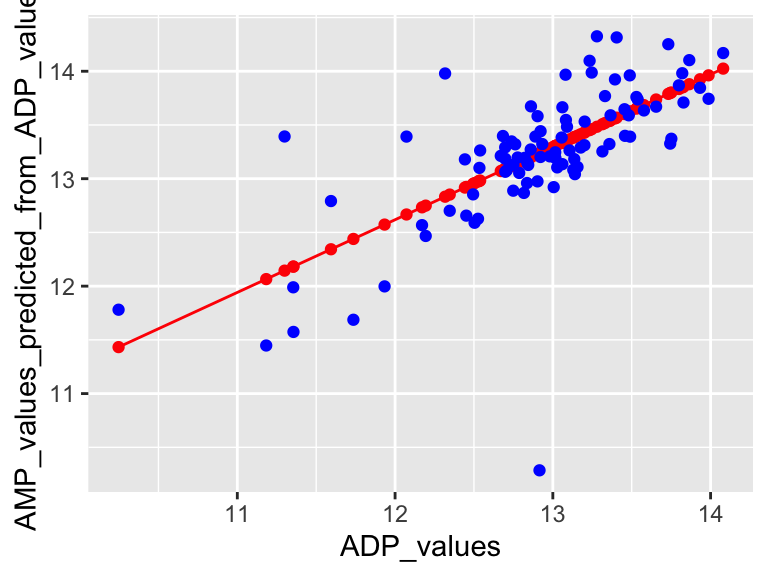
Very good. Now let’s talk about evaluating the quality of our model. For this we need some means of assessing how well our line fits our data. We will use residuals - the distance between each of our points and our line.
ggplot(predictions_from_basic_linear_model) +
  geom_point(aes(x = ADP_values, y = AMP_values_measured)) +
  geom_line(aes(x = ADP_values, y = AMP_values_predicted_from_ADP_values)) +
  geom_segment(aes(x = ADP_values, y = AMP_values_measured, xend = ADP_values, yend = AMP_values_predicted_from_ADP_values))
## Don't know how to automatically pick scale for object of
## type <impute>. Defaulting to continuous.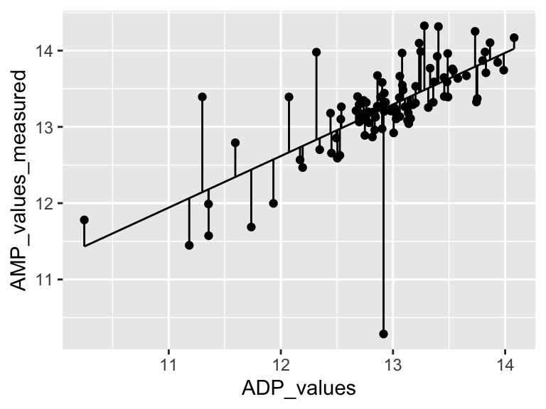
We can calculate the sum of the squared residuals:
sum(
  (predictions_from_basic_linear_model$AMP_values_measured - predictions_from_basic_linear_model$AMP_values_predicted_from_ADP_values)^2
, na.rm = TRUE)
## [1] 20.1904
Cool! Let’s call that the “residual sum of the squares”. So… does that mean our model is good? I don’t know. We have to compare that number to something. Let’s compare it to a super simple model that is just defined by the mean y value of the input data.
ggplot(metabolomics_data) +
  geom_point(aes(x = ADP, y = AMP)) +
  geom_hline(aes(yintercept = mean(AMP, na.rm = TRUE)))
## Don't know how to automatically pick scale for object of
## type <impute>. Defaulting to continuous.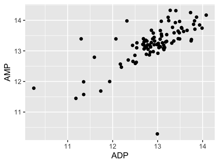
A pretty bad model, I agree. How much better is our linear model that the flat line model? Let’s create a measure of the distance between each point and the point predicted for that same x value on the model:
ggplot(metabolomics_data) +
  geom_point(aes(x = ADP, y = AMP)) +
  geom_hline(aes(yintercept = mean(ADP, na.rm = TRUE))) +
  geom_segment(aes(x = ADP, y = AMP, xend = ADP, yend = mean(ADP, na.rm = TRUE)))
## Don't know how to automatically pick scale for object of
## type <impute>. Defaulting to continuous.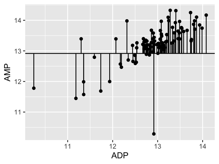
sum(
  (metabolomics_data$AMP - mean(metabolomics_data$AMP, na.rm = TRUE))^2
, na.rm = TRUE)
## [1] 38.63462
38.63! Wow. Let’s call that the “total sum of the squares”, and now we can compare that to our “residual sum of the squares”:
1-(20.1904/38.63)
## [1] 0.4773389
0.47! Alright. That is our R squared value. It is equal to 1 minus the ratio of the “residual sum of the squares” to the “total sum of the squares”. You can think of the R squared value as: - The amount of variance in the response explained by the dependent variable. - How much better the line of best fit describes the data than the flat line. Now, let’s put it all together and make it pretty:
top <- ggplot() +
    geom_line(
        data = predictions_from_basic_linear_model,
        aes(x = ADP_values, y = AMP_values_predicted_from_ADP_values), color = "red"
    ) +
    geom_point(
        data = predictions_from_basic_linear_model,
        aes(x = ADP_values, y = AMP_values_predicted_from_ADP_values), color = "red"
    ) +
    geom_point(
        data = metabolomics_data,
        aes(x = ADP, y = AMP), color = "blue"
    ) +
    annotate(geom = "table",
      x = 10,
      y = 15,
      label = list(select(basic_regression_model$metrics, variable, value))
    ) +
    coord_cartesian(ylim = c(10,16)) +
    theme_bw()
## Coordinate system already present. Adding new coordinate
## system, which will replace the existing one.

bottom <- ggplot(predictions_from_basic_linear_model) +
  geom_col(
    aes(x = ADP_values, y = AMP_values_measured-AMP_values_predicted_from_ADP_values),
    width = 0.03, color = "black", position = "dodge", alpha = 0.5
  ) +
  theme_bw()

cowplot::plot_grid(top, bottom, ncol = 1, labels = "AUTO", rel_heights = c(2,1))
## Don't know how to automatically pick scale for object of
## type <impute>. Defaulting to continuous.
## Don't know how to automatically pick scale for object of
## type <impute>. Defaulting to continuous.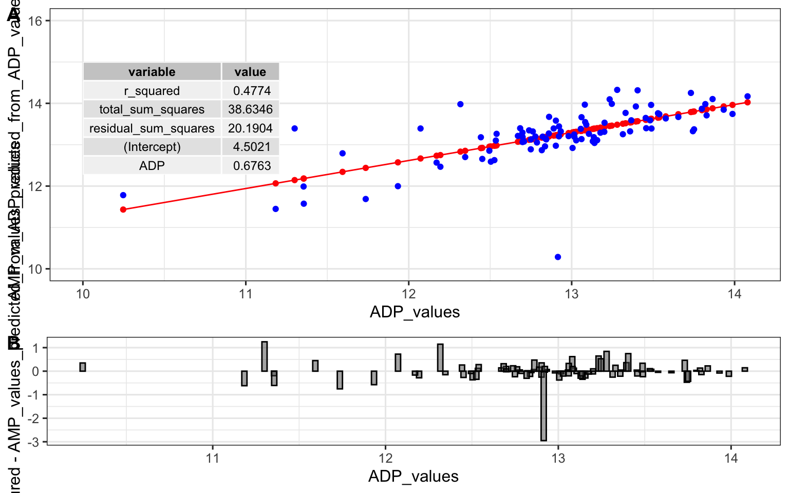
multiple linear regression
Cool! Now let’s try a multiple linear regression model. This is the same as a simple linear regression model, but with more than one predictor variable. Simple and multiple linear regression are both statistical methods used to explore the relationship between one or more independent variables (predictor variables) and a dependent variable (outcome variable). Simple linear regression involves one independent variable to predict the value of one dependent variable, utilizing a linear equation of the form y = mx + b. Multiple linear regression extends this concept to include two or more independent variables, with a typical form of y = m1x1 + m2x2 + … + b, allowing for a more complex representation of relationships among variables. While simple linear regression provides a straight-line relationship between the independent and dependent variables, multiple linear regression can model a multi-dimensional plane in the variable space, providing a more nuanced understanding of how the independent variables collectively influence the dependent variable. The complexity of multiple linear regression can offer more accurate predictions and insights, especially in scenarios where variables interact or are interdependent, although it also requires a more careful consideration of assumptions and potential multicollinearity among the independent variables. Let’s try it with the first 30 metabolites in our data set:
basic_regression_model <- buildModel2(
  data = metabolomics_data,
  model_type = "linear_regression",
  input_variables = "ADP",
  output_variable = "AMP"
)

multiple_regression_model <- buildModel2(
  data = metabolomics_data,
  model_type = "linear_regression",
  input_variables = colnames(metabolomics_data)[3:33],
  output_variable = "AMP"
)

ggplot() +
  geom_point(
    data = metabolomics_data,
    aes(x = ADP, y = AMP), fill = "gold", shape = 21, color = "black"
  ) +
  geom_line(aes(
    x = metabolomics_data$ADP,
    y = mean(metabolomics_data$AMP)
  ), color = "grey") +
  geom_line(aes(
    x = metabolomics_data$ADP,
    y = predictWithModel(
      data = metabolomics_data,
      model_type = "linear_regression",
      model = basic_regression_model$model
    )),
    color = "maroon", size = 1
  ) +
  geom_line(aes(
    x = metabolomics_data$ADP,
    y = predictWithModel(
      data = metabolomics_data,
      model_type = "linear_regression",
      model = multiple_regression_model$model
    )),
    color = "black", size = 1, alpha = 0.6
  ) +
  theme_bw()
## Don't know how to automatically pick scale for object of
## type <impute>. Defaulting to continuous.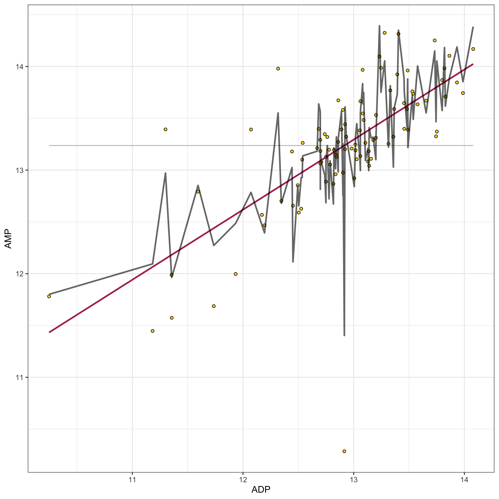
predictive models
In the preceding section, we explored inferential models, highlighting the significance of grasping the quantitative aspects of the model’s mechanisms in order to understand relationships between variables. Now we will look at predictive models. Unlike inferential models, predictive models are typically more complex, often making it challenging to fully comprehend their internal processes. That is okay though, because when using predictive models we usually care most about their predictive accuracy, and are willing to sacrifice our quantitative understanding of the model’s inner workings to achieve higher accuracy.
Interestingly, increasingly complex predictive models do not always have higher accuracy. If a model is too complex we say that the model is ‘overfitted’ which means that the model is capturing noise and random fluctuations in the input data and using those erroneous patterns in its predictions. On the other hand, if a model is not complex enough then it will not be able to capture important true patterns in the data that are required to make accurate predictions. This means that we have to build models with the right level of complexity.
To build a model with the appropriate level of complexity we usually use this process: (i) separate out 80% of our data and call it the training data, (ii) build a series of models with varying complexity using the training data, (iii) use each of the models to make predictions about the remaining 20% of the data (the testing data), (iv) whichever model has the best predictive accuracy on the remaining 20% is the model with the appropriate level of complexity.
We can use the training/testing approach described above to build many different types of models. Here, we will look at random forests.
random forests
Random forests are collections of decision trees that can be used for predicting categorical variables (i.e. a ‘classification’ task) and for predicting numerical variables (a ‘regression’ task). Random forests are built by constructing multiple decision trees, each using a randomly selected subset of the training data, to ensure diversity among the trees. At each node of each tree, a number of input variables are randomly chosen as candidates for splitting the data, introducing further randomness beyond the data sampling. Among the variables randomly selected as candidates for splitting at each node, one is chosen for that node based on a criterion, such as maximizing purity in the tree’s output, or minimizing mean squared error for regression tasks, guiding the construction of a robust ensemble model. The forest’s final prediction is derived either through averaging the outputs (for regression) or a majority vote (for classification).
We can use the buildModel() function to make a random forest model. We need to specify data, a model type, input and output variables, and in the case of a random forest model, we also need to provide a list of optimization parameters: n_vars_tried_at_split, n_trees, and min_n_leaves. Here is more information on those parameters:
n_vars_at_split (often called “mtry” in other implementations): this parameter specifies the number of variables that are randomly sampled as candidate features at each split point in the construction of a tree. The main idea behind selecting a subset of features (variables) is to introduce randomness into the model, which helps in making the model more robust and less likely to overfit to the training data. By trying out different numbers of features, the model can find the right level of complexity, leading to more generalized predictions. A smaller value of n_vars_at_split increases the randomness of the forest, potentially increasing bias but decreasing variance. Conversely, a larger mtry value makes the model resemble a bagged ensemble of decision trees, potentially reducing bias but increasing variance.
n_trees (often referred to as “num.trees” or “n_estimators” in other implementations): this parameter defines the number of trees that will be grown in the random forest. Each individual tree predicts the outcome based on the subset of features it considers, and the final prediction is typically the mode (for classification tasks) or average (for regression tasks) of all individual tree predictions. Increasing the number of trees generally improves the model’s performance because it averages more predictions, which tends to reduce overfitting and makes the model more stable. However, beyond a certain point, adding more trees offers diminishing returns in terms of performance improvement and can significantly increase computational cost and memory usage without substantial gains.
min_n_leaves (often referred to as “min_n” in other implementations, default value is 1): This parameter sets the minimum number of samples that must be present in a node for it to be split further. Increasing this value makes each tree in the random forest less complex by reducing the depth of the trees, leading to larger, more generalized leaf nodes. This can help prevent overfitting by ensuring that the trees do not grow too deep or too specific to the training data. By carefully tuning this parameter, you can strike a balance between the model’s ability to capture the underlying patterns in the data and its generalization to unseen data.
buildModel() is configured to allow you to explore a number of settings for both n_vars_at_split and n_trees, then pick the combination with the highest predictive accuracy. In this function:
-
dataspecifies the dataset to be used for model training, here metabolomics_data. -
model_typedefines the type of model to build, with “random_forest_regression” indicating a random forest model for regression tasks. -
input_variablesselects the features or predictors for the model, here using columns 3 to 33 from metabolomics_data as predictors. -
output_variableis the target variable for prediction, in this case, “AMP”.
The optimization_parameters argument takes a list to define the grid of parameters for optimization, including n_vars_tried_at_split, n_trees, and min_leaf_size. The seq() function generates sequences of numbers and is used here to create ranges for each parameter:
-
n_vars_tried_at_split= seq(1,24,3) generates a sequence for the number of variables tried at each split, starting at 1, ending at 24, in steps of 3 (e.g., 1, 4, 7, …, 24). -
n_trees= seq(1,40,2) creates a sequence for the number of trees in the forest, from 1 to 40 in steps of 2. -
min_leaf_size= seq(1,3,1) defines the minimal size of leaf nodes, ranging from 1 to 3 in steps of 1.
This setup creates a grid of parameter combinations where each combination of n_vars_tried_at_split, n_trees, and min_leaf_size defines a unique random forest model. The function will test each combination within this grid to identify the model that performs best according to a given evaluation criterion, effectively searching through a defined parameter space to optimize the random forest’s performance. This approach allows for a systematic exploration of how different configurations affect the model’s ability to predict the output variable, enabling the selection of the most effective model configuration based on the dataset and task at hand.
random_forest_model <- buildModel2(
    data = metabolomics_data,
    model_type = "random_forest_regression",
    input_variables = colnames(metabolomics_data)[3:33],
    output_variable = "AMP",
    optimization_parameters = list(
      n_vars_tried_at_split = seq(1,24,3),
      n_trees = seq(1,40,2),
      min_leaf_size = seq(1,3,1)
    )
)

names(random_forest_model)
## [1] "metrics" "model"
The above code builds our random forest model. It’s output provides both the model itself and key components indicating the performance and configuration of the model. Here’s a breakdown of each part of the output:
$model_type tells us what type of model this is.
$model shows the configuration of the best random forest model that was created.
$metrics provides detailed results of model performance across different combinations of the random forest parameters n_vars_tried_at_split (the number of variables randomly sampled as candidates at each split) and n_trees (the number of trees in the forest). For each combination, it shows:
- n_vars_tried_at_split and n_trees: The specific values used in that model configuration.
- .metric: The performance metric used, here it’s accuracy, which measures how often the model correctly predicts the patient status.
- .estimator: Indicates the type of averaging used for the metric, here it’s binary for binary classification tasks.
- mean: The average accuracy across the cross-validation folds.
- fold_cross_validation: Indicates the number of folds used in cross-validation, here it’s 3 for all models.
- std_err: The standard error of the mean accuracy, providing an idea of the variability in model performance.
- .config: A unique identifier for each model configuration tested.
We can thus inspect the performance of the model based on the specific parameters used during configuration. This can help us understand if we are exploring the right parameter space - do we have good values for n_vars_tried_at_split and n_trees? In this case we are doing regression, and the performance metric reported is RMSE: root mean squared error. We want that value to be small! So smaller values for that metric indicate a better model.
random_forest_model$metrics %>%
    ggplot(aes(x = n_vars_tried_at_split, y = n_trees, fill = mean)) +
    facet_grid(.~min_n) +
    scale_fill_viridis(direction = -1) +
    geom_tile() +
    theme_bw()
We can easily use the model to make predictions by using the predictWithModel() function:
ggplot() +
  geom_point(
    data = metabolomics_data,
    aes(x = ADP, y = AMP), fill = "gold", shape = 21, color = "black"
  ) +
  geom_line(aes(
    x = metabolomics_data$ADP,
    y = mean(metabolomics_data$AMP)
  ), color = "grey") +
  geom_line(aes(
    x = metabolomics_data$ADP,
    y = predictWithModel(
      data = metabolomics_data,
      model_type = "random_forest_regression",
      model = random_forest_model$model
    )),
    color = "maroon", size = 1
  ) +
  theme_bw()
## Don't know how to automatically pick scale for object of
## type <impute>. Defaulting to continuous.
In addition to regression modeling, random forests can also be used to do classification modeling. In classification modeling, we are trying to predict a categorical outcome variable from a set of predictor variables. For example, we might want to predict whether a patient has a disease or not based on their metabolomics data. All we have to do is set the model_type to “random_forest_classification” instead of “random_forest_regression”. Let’s try that now:
set.seed(123)
unknown <- metabolomics_data[35:40,]

rfc <- buildModel2(
  data = metabolomics_data[c(1:34, 41:93),],
  model_type = "random_forest_classification",
  input_variables = colnames(metabolomics_data)[3:126],
  output_variable = "patient_status",
  optimization_parameters = list(
    n_vars_tried_at_split = seq(5,50,5),
    n_trees = seq(10,100,10),
    min_leaf_size = seq(1,3,1)
  )
)
rfc$metrics %>% arrange(desc(mean))
## # A tibble: 300 × 9
##    n_vars_tried_at_split n_trees min_n .metric  .estimator
##                    <dbl>   <dbl> <dbl> <chr>    <chr>
##  1                    40      10     1 accuracy binary
##  2                    40      60     3 accuracy binary
##  3                    50      50     2 accuracy binary
##  4                    40      20     2 accuracy binary
##  5                    30     100     1 accuracy binary
##  6                    35      50     2 accuracy binary
##  7                     5      70     2 accuracy binary
##  8                    15      20     3 accuracy binary
##  9                    50     100     3 accuracy binary
## 10                    25      10     1 accuracy binary
## # ℹ 290 more rows
## # ℹ 4 more variables: mean <dbl>,
## #   fold_cross_validation <int>, std_err <dbl>,
## #   .config <chr>
Cool! Our best settings lead to a model with 90% accuracy! We can also make predictions on unknown data with this model:
rfc$metrics %>%
    ggplot(aes(x = n_vars_tried_at_split, y = n_trees, fill = mean)) +
    facet_grid(.~min_n) +
    scale_fill_viridis(direction = -1) +
    geom_tile() +
    theme_bw()
predictions <- predictWithModel(
  data = unknown,
  model_type = "random_forest_classification",
  model = rfc$model
)

data.frame(
  real_status = metabolomics_data[35:40,]$patient_status,
  predicted_status = predictions
)
##                 real_status predicted_status
## .pred_class1        healthy          healthy
## .pred_class2        healthy          healthy
## .pred_class3        healthy          healthy
## .pred_class4 kidney_disease   kidney_disease
## .pred_class5 kidney_disease   kidney_disease
## .pred_class6 kidney_disease   kidney_disease
exercises
To practice creating models, try the following:
Choose one of the datasets we have used so far, and run a principal components analysis on it. Note that the output of the analysis when you run “pca_ord” contains the Dimension 1 coordinate “Dim.1” for each sample, as well as the abundance of each analyte in that sample.
Using the information from the ordination plot, identify two analytes: one that has a variance that is strongly and positively correlated with the first principal component (i.e. dimension 1), and one that has a variance that is slightly less strongly, but still positively correlated with the first principal component. Using
buildModel, create and plot two linear regression models, one that regresses each of those analytes against dimension 1 (in other words, the x-axis should be the Dim.1 coordinate for each sample, and the y-axis should be the values for one of the two selected analytes). Which has the greater r-squared value? Based on what you know about PCA, does that make sense?Choose two analytes: one should be one of the analytes from question 2 above, the other should be an analyte that, according to your PCA ordination analysis, is negatively correlated with the first principal component. Using
buildModelandpredictWithModelcreate plots showing how those two analytes are correlated with dimension 1. One should be positively correlated, and the other negatively correlated.Have a look at the dataset
metabolomics_unknown. It is metabolomics data from patients with an unknown healthy/kidney disease status. Build a classification model using themetabolomics_datadata set and diagnose each patient inmetabolomics_unknown.
further reading
https://github.com/easystats/performance
Here is more information on common machine learning tasks: https://pythonprogramminglanguage.com/machine-learning-tasks/
Some major tasks include: Classification Regression Clustering
Classification with random forests: 1. http://www.rebeccabarter.com/blog/2020-03-25_machine_learning/ 2. https://hansjoerg.me/2020/02/09/tidymodels-for-machine-learning/ 3. https://towardsdatascience.com/dials-tune-and-parsnip-tidymodels-way-to-create-and-tune-model-parameters-c97ba31d6173
language models
In the last chapter, we looked at models that use numerical data to understand the relationships between different aspects of a data set (inferential models) and models that make predictions based on numerical data (predictive models). In this chapter, we will explore a set of models called language models that transform non-numerical data (such as written text and protein sequences) into the numerical domain, enabling the non-numerical data to be analyzed using the techniques we have already covered. Language models are algorithms that are trained on large amounts of text (or, in the case of protein language models, many sequences) and can perform a variety of tasks related to their training data. In particular, we will focus on embedding models, which convert language data into numerical data. An embedding is a numerical representation of data that captures its essential features in a lower-dimensional space or in a different domain. In the context of language models, embeddings transform text, such as words or sentences, into vectors of numbers, enabling machine learning models and other statistical methods to process and analyze the data more effectively.
A basic form of an embedding model is a neural network called an autoencoder. Autoencoders consist of two main parts: an encoder and a decoder. The encoder takes the input data and compresses it into a lower-dimensional representation, called an embedding. The decoder then reconstructs the original input from this embedding, and the output from the decoder is compared against the original input. The model (the encoder and the decoder) are then iteratively optimized with the objective of minimizing a loss function that measures the difference between the original input and its reconstruction, resulting in an embedding model that creates meaningful embeddings that capture the important aspects of the original input.
text embeddings
Here, we will create text embeddings using publication data from PubMed. Text embeddings are numerical representations of text that preserve important information and allow us to apply mathematical and statistical analyses to textual data. Below, we use a series of functions to obtain titles and abstracts from PubMed, create embeddings for their titles, and analyze them using principal component analysis.
First, we use the searchPubMed function to extract relevant publications from PubMed based on specific search terms. This function interacts with the PubMed website via a tool called an API. An API, or Application Programming Interface, is a set of rules that allows different software programs to communicate with each other. In this case, the API allows our code to access data from the PubMed database directly, without needing to manually search through the website. An API key is a unique identifier that allows you to authenticate yourself when using an API. It acts like a password, giving you permission to access the API services. Here, I am reading my API key from a local file. You can obtain by signing up for an NCBI account at https://pubmed.ncbi.nlm.nih.gov/. Once you have an API key, pass it to the searchPubMed function along with your search terms. Here I am using “beta-amyrin synthase,” “friedelin synthase,” “Sorghum bicolor,” and “cuticular wax biosynthesis.” I also specify that I want the results to be sorted according to relevance (as opposed to sorting by date) and I only want three results per term (the top three most relevant hits) to be returned:
searchPubMed <- function(search_terms, pubmed_api_key, sort = c("date", "relevance"), retmax_per_term = 20) {

  pm_entries <- character()
  term_vector <- character()

  for( i in 1:length(search_terms) ) { # i=1
      search_output <- rentrez::entrez_search(db = "pubmed", term = as.character(search_terms[i]), retmax = retmax_per_term, use_history = TRUE, sort = sort[1])
      query_output <- try(rentrez::entrez_fetch(db = "pubmed", web_history = search_output$web_history, rettype = "xml", retmax = retmax_per_term, api_key = pubmed_api_key))
      current_pm_entries <- XML::xmlToList(XML::xmlParse(query_output))
      pm_entries <- c(pm_entries, current_pm_entries)
      term_vector <- c(term_vector, rep(as.character(search_terms[i]), length(current_pm_entries)))
      Sys.sleep(4)
  }
  unique_indices <- !duplicated(pm_entries)
  pm_entries <- pm_entries[unique_indices]
  term_vector <- term_vector[unique_indices]

  pm_results <- list()
  for (i in 1:length(pm_entries)) { # i=1

      if (length(pm_entries[[i]]) == 1) { next }
      if (is.null(pm_entries[[i]]$MedlineCitation$Article$ELocationID$text)) { next }

      options <- which(names(pm_entries[[i]]$MedlineCitation$Article) == "ELocationID")
      for (option in options) { # option = 4
          if (grepl("10\\.", pm_entries[[i]]$MedlineCitation$Article[[option]]$text)) {
              doi <<- pm_entries[[i]]$MedlineCitation$Article[[option]]$text
              break
          } else {next}
      }

      pm_results[[i]] <- data.frame(
          entry_number = as.numeric(i),
          term = term_vector[[i]],
          date = lubridate::as_date(paste(
              pm_entries[[i]]$MedlineCitation$DateRevised$Year,
              pm_entries[[i]]$MedlineCitation$DateRevised$Month,
              pm_entries[[i]]$MedlineCitation$DateRevised$Day,
          sep = "-"
          )),
          journal = pm_entries[[i]]$MedlineCitation$Article$Journal$Title,
          title = paste0(pm_entries[[i]]$MedlineCitation$Article$ArticleTitle, collapse = ""),
          doi = doi,
          abstract = paste0(pm_entries[[i]]$MedlineCitation$Article$Abstract$AbstractText, collapse = "")
      )
  }
  return(as_tibble(do.call(rbind, pm_results)))
}
search_results <- searchPubMed(
  search_terms = c("beta-amyrin synthase", "friedelin synthase", "sorghum bicolor", "cuticular wax biosynthesis"),
  pubmed_api_key = readLines("/Users/bust0037/Documents/Science/Websites/pubmed_api_key.txt"),
  retmax_per_term = 3,
  sort = "relevance"
)
colnames(search_results)
## [1] "entry_number" "term"         "date"
## [4] "journal"      "title"        "doi"
## [7] "abstract"
select(search_results, term, title)
## # A tibble: 12 × 2
##    term                       title
##    <chr>                      <chr>
##  1 beta-amyrin synthase       β-Amyrin synthase from Conyza…
##  2 beta-amyrin synthase       Ginsenosides in Panax genus a…
##  3 beta-amyrin synthase       β-Amyrin biosynthesis: cataly…
##  4 friedelin synthase         Friedelin Synthase from Mayte…
##  5 friedelin synthase         Friedelin in Maytenus ilicifo…
##  6 friedelin synthase         The Methionine 549 and Leucin…
##  7 sorghum bicolor            Sorghum (Sorghum bicolor).
##  8 sorghum bicolor            Molecular Breeding of Sorghum…
##  9 sorghum bicolor            Proton-Coupled Electron Trans…
## 10 cuticular wax biosynthesis Regulatory mechanisms underly…
## 11 cuticular wax biosynthesis Update on Cuticular Wax Biosy…
## 12 cuticular wax biosynthesis Advances in Biosynthesis, Reg…
From the output here, you can see that we’ve retrieved records for various publications, each containing information such as the title, journal, and search term used. This gives us a dataset that we can further analyze to gain insights into the relationships between different research topics.
Next, we use the embedText function to create embeddings for the titles of the extracted publications. Just like PubMed, the Hugging Face API requires an API key, which acts as a unique identifier and grants you access to their services. You can obtain an API key by signing up at https://huggingface.co and following the instructions to generate your own key. Once you have your API key, you will need to specify it when using the embedText function. In the example below, I am reading the key from a local file for convenience.
To set up the embedText function, provide the dataset containing the text you want to embed (in this case, search_results, the output from the PubMed search above), the column with the text (title), and your Hugging Face API key. This function will then generate numerical embeddings for each of the publication titles. By default, the embeddings are generated using a pre-trained embedding language model called ‘BAAI/bge-small-en-v1.5’, available through the Hugging Face API at https://api-inference.huggingface.co/models/BAAI/bge-small-en-v1.5. This model is designed to create compact, informative numerical representations of text, making it suitable for a wide range of downstream tasks, such as clustering or similarity analysis. If you would like to know more about the model and its capabilities, you can visit the Hugging Face website at https://huggingface.co, where you will find detailed documentation and additional resources.
search_results_embedded <- embedText(
  df = search_results,
  column_name = "title",
  hf_api_key = readLines("/Users/bust0037/Documents/Science/Websites/hf_api_key.txt")
)
search_results_embedded[1:3,1:10]
## # A tibble: 3 × 10
##   entry_number term  date       journal title doi   abstract
##          <dbl> <chr> <date>     <chr>   <chr> <chr> <chr>
## 1            1 beta… 2019-11-20 FEBS o… β-Am… 10.1… Conyza …
## 2            2 beta… 2024-04-03 Acta p… Gins… 10.1… Ginseno…
## 3            3 beta… 2019-12-10 Organi… β-Am… 10.1… The enz…
## # ℹ 3 more variables: embedding_1 <dbl>, embedding_2 <dbl>,
## #   embedding_3 <dbl>
The output of the embedText function is a data frame where the first column contains the title and the subsequent 384 columns represent the embedding variables. These embeddings capture the key features of each publication title. You can join this data frame with the original input to create a complete dataset that includes both the original metadata (such as titles and journals) and the numerical embeddings. Below is an example of how to use the left_join function from the dplyr package in R to combine the original search_results data frame with the new embeddings. This merged dataset allows you to perform further analyses on both the original metadata and the generated embeddings.
search_results <- left_join(search_results, search_results_embedded, by = "title")
search_results[1:3, 1:10]
## # A tibble: 3 × 10
## entry_number.x term.x date.x journal.x title doi.x
## <dbl> <chr> <date> <chr> <chr> <chr>
## 1 1 beta-amyr… 2019-11-20 FEBS ope… β-Am… 10.1…
## 2 2 beta-amyr… 2024-04-03 Acta pha… Gins… 10.1…
## 3 3 beta-amyr… 2019-12-10 Organic … β-Am… 10.1…
## # ℹ 4 more variables: abstract.x <chr>,
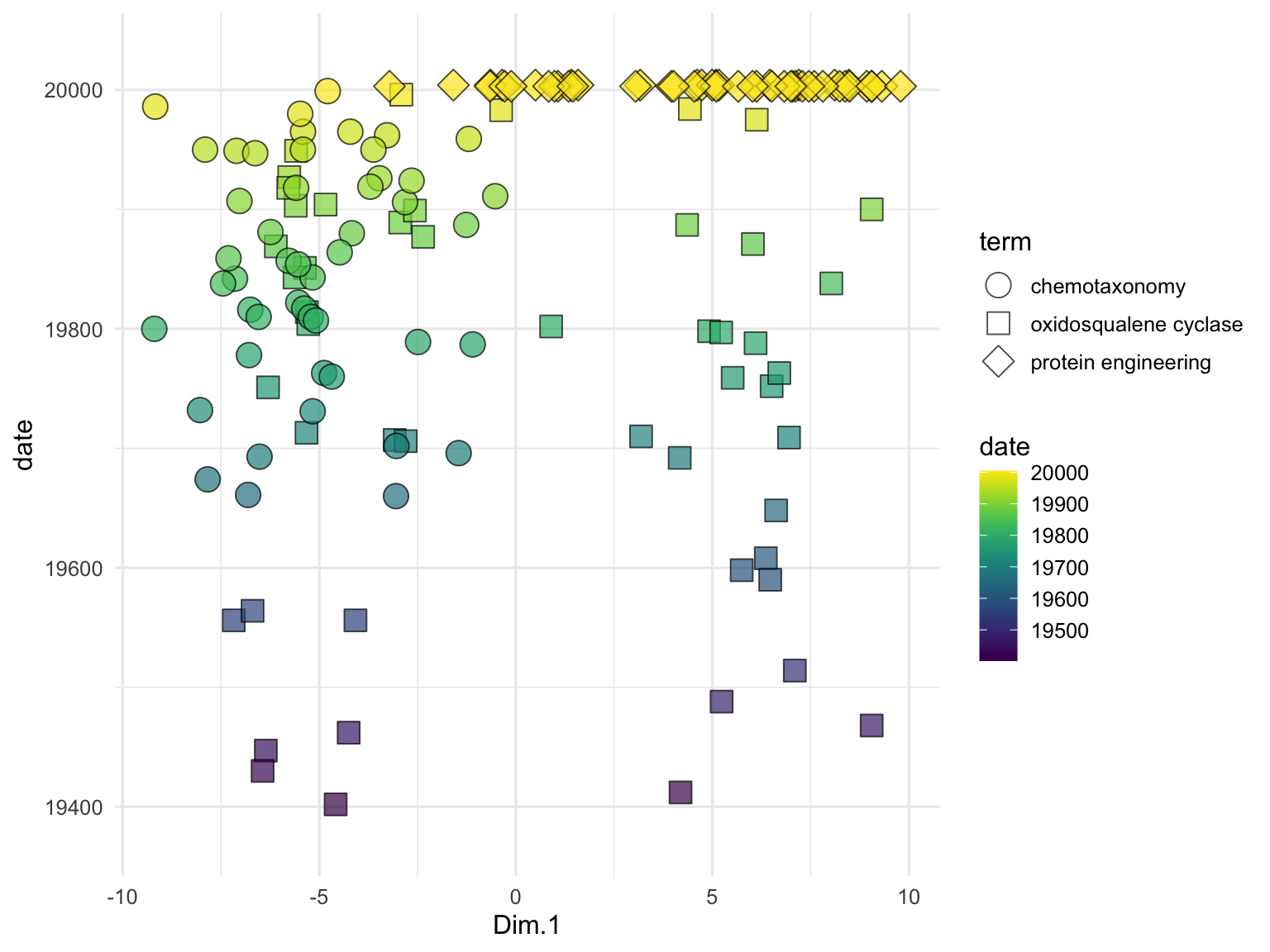
## # entry_number.y <dbl>, term.y <chr>, date.y <date>To examine the relationships between the publication titles, we perform PCA on the text embeddings. We use the runMatrixAnalysis function, specifying PCA as the analysis type and indicating which columns contain the embedding values. We visualize the results using a scatter plot, with each point representing a publication title, colored by the search term it corresponds to. The grep function is used here to search for all column names in the search_results data frame that contain the word ‘embed’. This identifies and selects the columns that hold the embedding values, which will be used as the columns with values for single analytes for the PCA and enable the visualization below. While we’ve seen lots of PCA plots over the course of our explorations, note that this one is different in that it represents the relationships between the meaning of text passages (!) as opposed to relationships between samples for which we have made many measurements of numerical attributes.
runMatrixAnalysis(
  data = search_results_embedded,
  analysis = "pca",
  columns_w_values_for_single_analyte = colnames(search_results)[grep("embed", colnames(search_results))],
  columns_w_sample_ID_info = c("title", "journal", "term")
) %>%
  ggplot() +
    geom_label_repel(
      aes(x = Dim.1, y = Dim.2, label = str_wrap(title, width = 35)),
      size = 2, min.segment.length = 0.5, force = 50
    ) +
    geom_point(aes(x = Dim.1, y = Dim.2, fill = term), shape = 21, size = 5, alpha = 0.7) +
    scale_fill_brewer(palette = "Set1") +
    scale_x_continuous(expand = c(0,1)) +
    scale_y_continuous(expand = c(0,5)) +
    theme_minimal()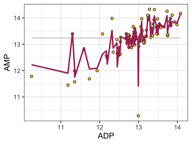
We can also use embeddings to examine data that are not full sentences but rather just lists of terms, such as the descriptions of odors in the beer_components dataset:
n <- 30

odor <- data.frame(
  sample = seq(1,n,1),
  odor = dropNA(unique(beer_components$analyte_odor))[sample(1:96, n)]
)

out <- embedText(
  odor, column_name = "odor",
  hf_api_key = readLines("/Users/bust0037/Documents/Science/Websites/hf_api_key.txt")
)

runMatrixAnalysis(
  data = out,
  analysis = "pca",
  columns_w_values_for_single_analyte = colnames(out)[grep("embed", colnames(out))],
  columns_w_sample_ID_info = c("sample", "odor")
) -> pca_out

pca_out$color <- rgb(
  scales::rescale(pca_out$Dim.1, to = c(0, 1)),
  0,
  scales::rescale(pca_out$Dim.2, to = c(0, 1))
)

ggplot(pca_out) +
  geom_label_repel(
    aes(x = Dim.1, y = Dim.2, label = str_wrap(odor, width = 35)),
    size = 2, min.segment.length = 0.5, force = 25
  ) +
  geom_point(aes(x = Dim.1, y = Dim.2), fill = pca_out$color, shape = 21, size = 3, alpha = 0.7) +
  # scale_x_continuous(expand = c(1,0)) +
  # scale_y_continuous(expand = c(1,0)) +
  theme_minimal()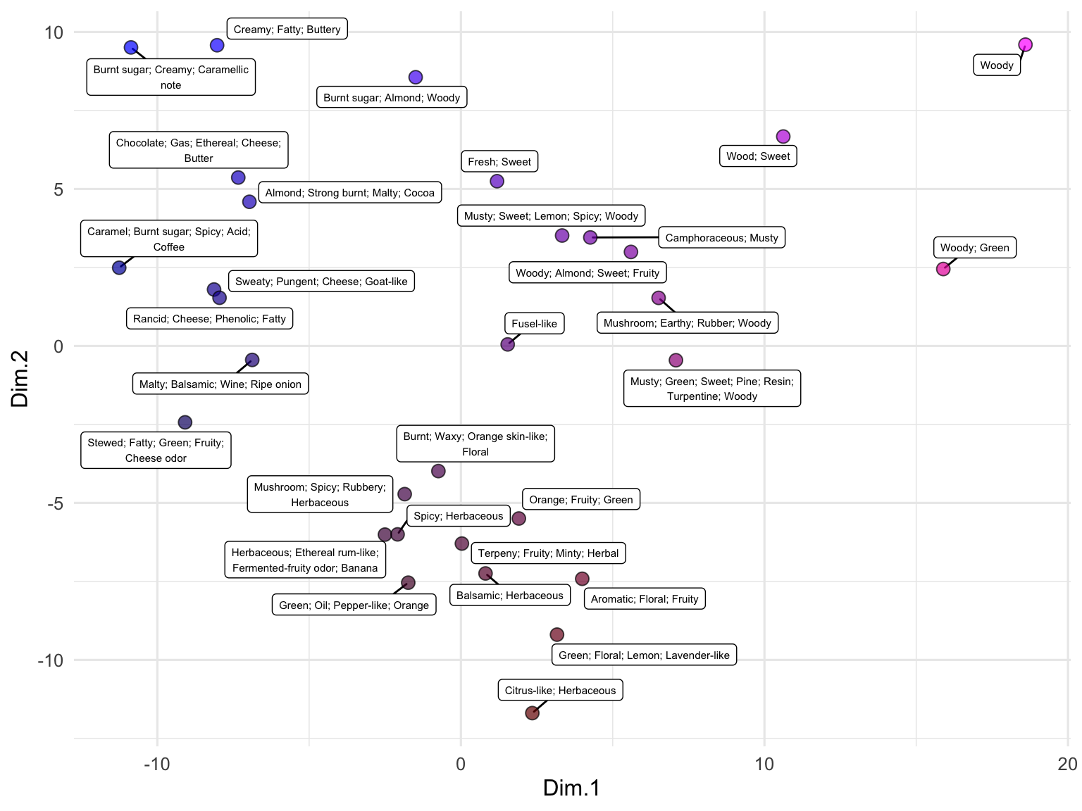
exercises
Recreate the PubMed search and subsequent analysis described in this chapter using search terms that relate to research you are involved in or are interested in.
Using the hops_components dataset, determine whether there are any major clusters of hops that are grouped by aroma. To do this, compute embeddings for the hop_aroma column of the dataset, then use a dimensionality reduction (pca, if you like) to determine if any clear clusters are present.
protein embeddings
Autoencoders can be trained to accept various types of inputs, such as text (as shown above), images, audio, videos, sensor data, and sequence-based information like peptides and DNA. Protein language models convert protein sequences into numerical representations that can be used for a variety of downstream tasks, such as structure prediction or function annotation. Protein language models, like their text counterparts, are trained on large datasets of protein sequences to learn meaningful patterns and relationships within the sequence data.
Protein language models offer several advantages over traditional approaches, such as multiple sequence alignments (MSAs). One major disadvantage of MSAs is that they are computationally expensive and become increasingly slow as the number of sequences grows. While language models are also computationally demanding, they are primarily resource-intensive during the training phase, whereas applying a trained language model is much faster. Additionally, protein language models can capture both local and global sequence features, allowing them to identify complex relationships that span across different parts of a sequence. Furthermore, unlike MSAs, which rely on evolutionary information, protein language models can be applied to proteins without homologous sequences, making them suitable for analyzing sequences where little evolutionary data is available. This flexibility broadens the scope of proteins that can be effectively studied using these models.
Beyond the benefits described above, protein language models have an additional, highly important capability: the ability to capture information about connections between elements in their input, even if those elements are very distant from each other in the sequence. This capability is achieved through the use of a model architecture called a transformer, which is a more sophisticated version of an autoencoder. For example, amino acids that are far apart in the primary sequence may be very close in the 3D, folded protein structure. Proximate amino acids in 3D space can play crucial roles in protein stability, enzyme catalysis, or binding interactions, depending on their spatial arrangement and interactions with other residues. Embedding models with transformer architecture can effectively capture these functionally important relationships.
By adding a mechanism called an “attention mechanism” to an autoencoder, we can create a simple form of a transformer. The attention mechanism works within the encoder and decoder, allowing each element of the input (e.g., an amino acid) to compare itself to every other element, generating attention scores that weigh how much attention one amino acid should give to another. This mechanism helps capture both local and long-range dependencies in protein sequences, enabling the model to focus on important areas regardless of their position in the sequence. Attention is beneficial because it captures interactions between distant amino acids, weighs relationships to account for protein folding and interactions, adjusts focus across sequences of varying lengths, captures different types of relationships like hydrophobic interactions or secondary structures, and provides contextualized embeddings that reflect the broader sequence environment rather than just local motifs.
In the following section, we will explore how to generate embeddings for protein sequences using a pre-trained protein language model and demonstrate how these embeddings can be used to analyze and visualize protein data effectively.
embedded_p450s <- embedAminoAcids(
  amino_acid_stringset = p450s,
  biolm_api_key = readLines("/Users/bust0037/Documents/Science/Websites/biolm_api_key.txt")
)
embedded_p450s$product <- tolower(gsub(".*_", "", embedded_p450s$name))
embedded_p450s <- select(embedded_p450s, name, product, everything())

runMatrixAnalysis(
  data = embedded_p450s,
  analysis = "pca",
  columns_w_values_for_single_analyte = colnames(embedded_p450s)[3:dim(embedded_p450s)[2]],
  columns_w_sample_ID_info = c("name", "product")
) %>%
  ggplot() +
    geom_jitter(
      aes(x = Dim.1, y = Dim.2, fill = product),
      shape = 21, size = 5, height = 2, width = 2, alpha = 0.6
    ) +
    theme_minimal()