clustering

heirarchical clustering
theory
“Which of my samples are most closely related?”
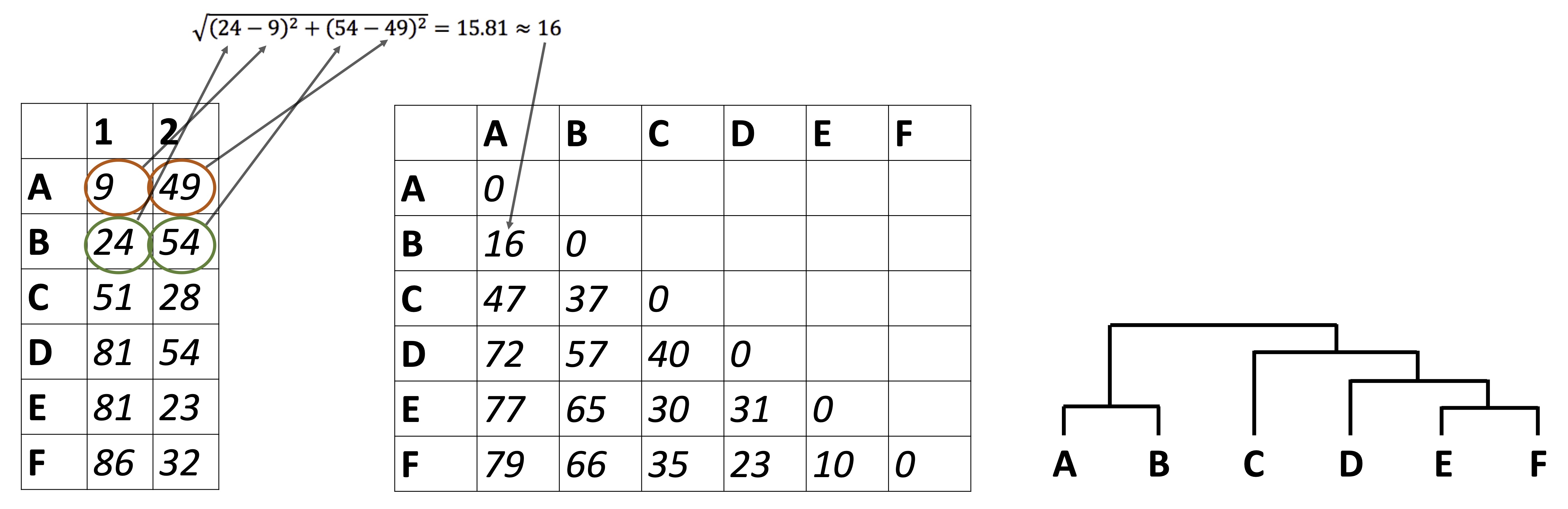
So far we have been looking at how to plot raw data, summarize data, and reduce a data set’s dimensionality. It’s time to look at how to identify relationships between the samples in our data sets. For example: in the Alaska lakes dataset, which lake is most similar, chemically speaking, to Lake Narvakrak? Answering this requires calculating numeric distances between samples based on their chemical properties. For this, the first thing we need is a distance matrix:
Please note that we can get distance matrices directly from runMatrixAnalysis by specifying analysis = "dist":
dist <- runMatrixAnalysis(
    data = alaska_lake_data,
    analysis = c("dist"),
    column_w_names_of_multiple_analytes = "element",
    column_w_values_for_multiple_analytes = "mg_per_L",
    columns_w_values_for_single_analyte = c("water_temp", "pH"),
    columns_w_additional_analyte_info = "element_type",
    columns_w_sample_ID_info = c("lake", "park")
)
## Replacing NAs in your data with mean

as.matrix(dist)[1:3,1:3]
##                          Devil_Mountain_Lake_BELA
## Devil_Mountain_Lake_BELA                 0.000000
## Imuruk_Lake_BELA                         3.672034
## Kuzitrin_Lake_BELA                       1.663147
##                          Imuruk_Lake_BELA
## Devil_Mountain_Lake_BELA         3.672034
## Imuruk_Lake_BELA                 0.000000
## Kuzitrin_Lake_BELA               3.062381
##                          Kuzitrin_Lake_BELA
## Devil_Mountain_Lake_BELA           1.663147
## Imuruk_Lake_BELA                   3.062381
## Kuzitrin_Lake_BELA                 0.000000
There is more that we can do with distance matrices though, lots more. Let’s start by looking at an example of hierarchical clustering. For this, we just need to tell runMatrixAnalysis() to use analysis = "hclust":
AK_lakes_clustered <- runMatrixAnalysis(
    data = alaska_lake_data,
    analysis = "hclust",
    column_w_names_of_multiple_analytes = "element",
    column_w_values_for_multiple_analytes = "mg_per_L",
    columns_w_values_for_single_analyte = c("water_temp", "pH"),
    columns_w_additional_analyte_info = "element_type",
    columns_w_sample_ID_info = c("lake", "park"),
    na_replacement = "mean"
)
## Replacing NAs in your data with mean
AK_lakes_clustered
## # A tibble: 39 × 26
##    sample_unique_ID   lake  park  parent  node branch.length
##    <chr>              <chr> <chr>  <int> <int>         <dbl>
##  1 Devil_Mountain_La… Devi… BELA      33     1          8.12
##  2 Imuruk_Lake_BELA   Imur… BELA      32     2          4.81
##  3 Kuzitrin_Lake_BELA Kuzi… BELA      37     3          3.01
##  4 Lava_Lake_BELA     Lava… BELA      38     4          2.97
##  5 North_Killeak_Lak… Nort… BELA      21     5        254.
##  6 White_Fish_Lake_B… Whit… BELA      22     6         80.9
##  7 Iniakuk_Lake_GAAR  Inia… GAAR      29     7          3.60
##  8 Kurupa_Lake_GAAR   Kuru… GAAR      31     8          8.57
##  9 Lake_Matcharak_GA… Lake… GAAR      29     9          3.60
## 10 Lake_Selby_GAAR    Lake… GAAR      30    10          4.80
## # ℹ 29 more rows
## # ℹ 20 more variables: label <chr>, isTip <lgl>, x <dbl>,
## #   y <dbl>, branch <dbl>, angle <dbl>, bootstrap <dbl>,
## #   water_temp <dbl>, pH <dbl>, C <dbl>, N <dbl>, P <dbl>,
## #   Cl <dbl>, S <dbl>, F <dbl>, Br <dbl>, Na <dbl>,
## #   K <dbl>, Ca <dbl>, Mg <dbl>
It works! Now we can plot our cluster diagram with a ggplot add-on called ggtree. We’ve seen that ggplot takes a “data” argument (i.e. ggplot(data = <some_data>) + geom_*() etc.). In contrast, ggtree takes an argument called tr, though if you’re using the runMatrixAnalysis() function, you can treat these two (data and tr) the same, so, use: ggtree(tr = <output_from_runMatrixAnalysis>) + geom_*() etc.
Note that ggtree also comes with several great new geoms: geom_tiplab() and geom_tippoint(). Let’s try those out:
library(ggtree)
AK_lakes_clustered %>%
ggtree() +
  geom_tiplab() +
  geom_tippoint() +
  theme_classic()
Cool! Though that plot could use some tweaking… let’s try:
AK_lakes_clustered %>%
ggtree() +
    geom_tiplab(aes(label = lake), offset = 10, align = TRUE) +
    geom_tippoint(shape = 21, aes(fill = park), size = 4) +
    scale_x_continuous(limits = c(0,375)) +
    scale_fill_brewer(palette = "Set1") +
    # theme_classic() +
    theme(
      legend.position = c(0.2,0.8)
    )
Very nice!
further reading
For more information on plotting annotated trees, see: https://yulab-smu.top/treedata-book/chapter10.html.
For more on clustering, see: https://ryanwingate.com/intro-to-machine-learning/unsupervised/hierarchical-and-density-based-clustering/.
exercises
For this set of exercises, please use runMatrixAnalysis() to run and visualize a hierarchical cluster analysis with each of the main datasets that we have worked with so far, except for NY_trees. This means: algae_data (which algae strains are most similar to each other?), alaska_lake_data (which lakes are most similar to each other?). and solvents (which solvents are most similar to each other?). It also means you should use the periodic table (which elements are most similar to each other?), though please don’t use the whole periodic table, rather, use periodic_table_subset. Please also conduct a heirarchical clustering analysis for a dataset of your own choice that is not provided by the source() code. For each of these, create (i) a tree diagram that shows how the “samples” in each data set are related to each other based on the numerical data associated with them, (ii) a caption for each diagram, and (iii) describe, in two or so sentences, an interesting trend you see in the diagram. You can ignore columns that contain categorical data, or you can list those columns as “additional_analyte_info”.
For this assignment, you may again find the colnames() function and square bracket-subsetting useful. It will list all or a subset of the column names in a dataset for you. For example:
colnames(solvents)
##  [1] "solvent"             "formula"
##  [3] "boiling_point"       "melting_point"
##  [5] "density"             "miscible_with_water"
##  [7] "solubility_in_water" "relative_polarity"
##  [9] "vapor_pressure"      "CAS_number"
## [11] "formula_weight"      "refractive_index"
## [13] "specific_gravity"    "category"

colnames(solvents)[1:3]
## [1] "solvent"       "formula"       "boiling_point"

colnames(solvents)[c(1,5,7)]
## [1] "solvent"             "density"
## [3] "solubility_in_water"
k-means and dbscan
“Do my samples fall into definable clusters?”
theory
One of the questions we’ve been asking is “which of my samples are most closely related?”. We’ve been answering that question using clustering. However, now that we know how to run principal components analyses, we can use another approach. This alternative approach is called k-means, and can help us decide how to assign our data into clusters. It is generally desirable to have a small number of clusters, however, this must be balanced by not having the variance within each cluster be too big. To strike this balance point, the elbow method is used. For it, we must first determine the maximum within-group variance at each possible number of clusters. An illustration of this is shown in A below:
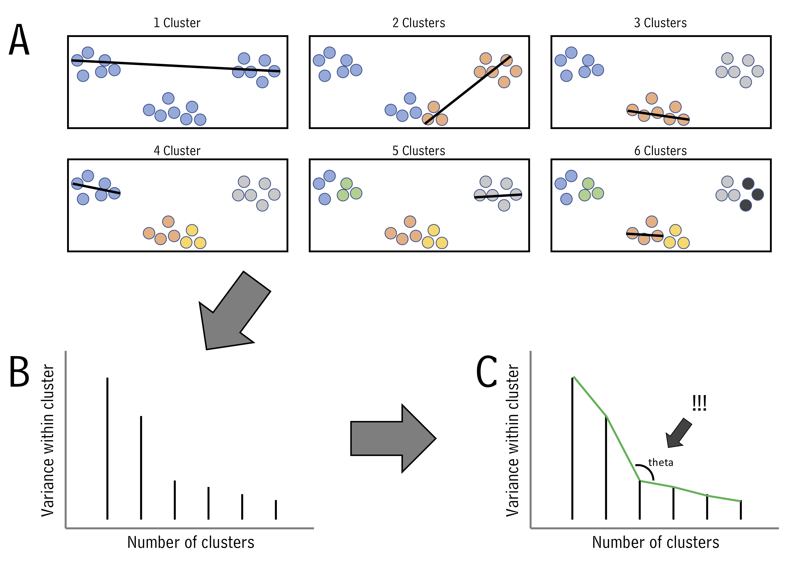
One we know within-group variances, we find the “elbow” point - the point with minimum angle theta - thus picking the outcome with a good balance of cluster number and within-cluster variance (illustrated above in B and C.)
Let’s try k-means using runMatrixAnalysis. For this example, let’s run it on the PCA projection of the alaska lakes data set. We can set analysis = "kmeans". When we do this, an application will load that will show us the threshold value for the number of clusters we want. We set the number of clusters and then close the app. In the context of markdown document, simply provide the number of clusters to the parameters argument:
alaska_lake_data_pca <- runMatrixAnalysis(
data = alaska_lake_data,
analysis = c("pca"),
column_w_names_of_multiple_analytes = "element",
column_w_values_for_multiple_analytes = "mg_per_L",
columns_w_values_for_single_analyte = c("water_temp", "pH"),
columns_w_additional_analyte_info = "element_type",
columns_w_sample_ID_info = c("lake", "park")
)
## Replacing NAs in your data with mean
alaska_lake_data_pca_clusters <- runMatrixAnalysis(
data = alaska_lake_data_pca,
analysis = c("kmeans"),
parameters = c(5),
column_w_names_of_multiple_analytes = NULL,
column_w_values_for_multiple_analytes = NULL,
columns_w_values_for_single_analyte = c("Dim.1", "Dim.2"),
columns_w_sample_ID_info = "sample_unique_ID"
)
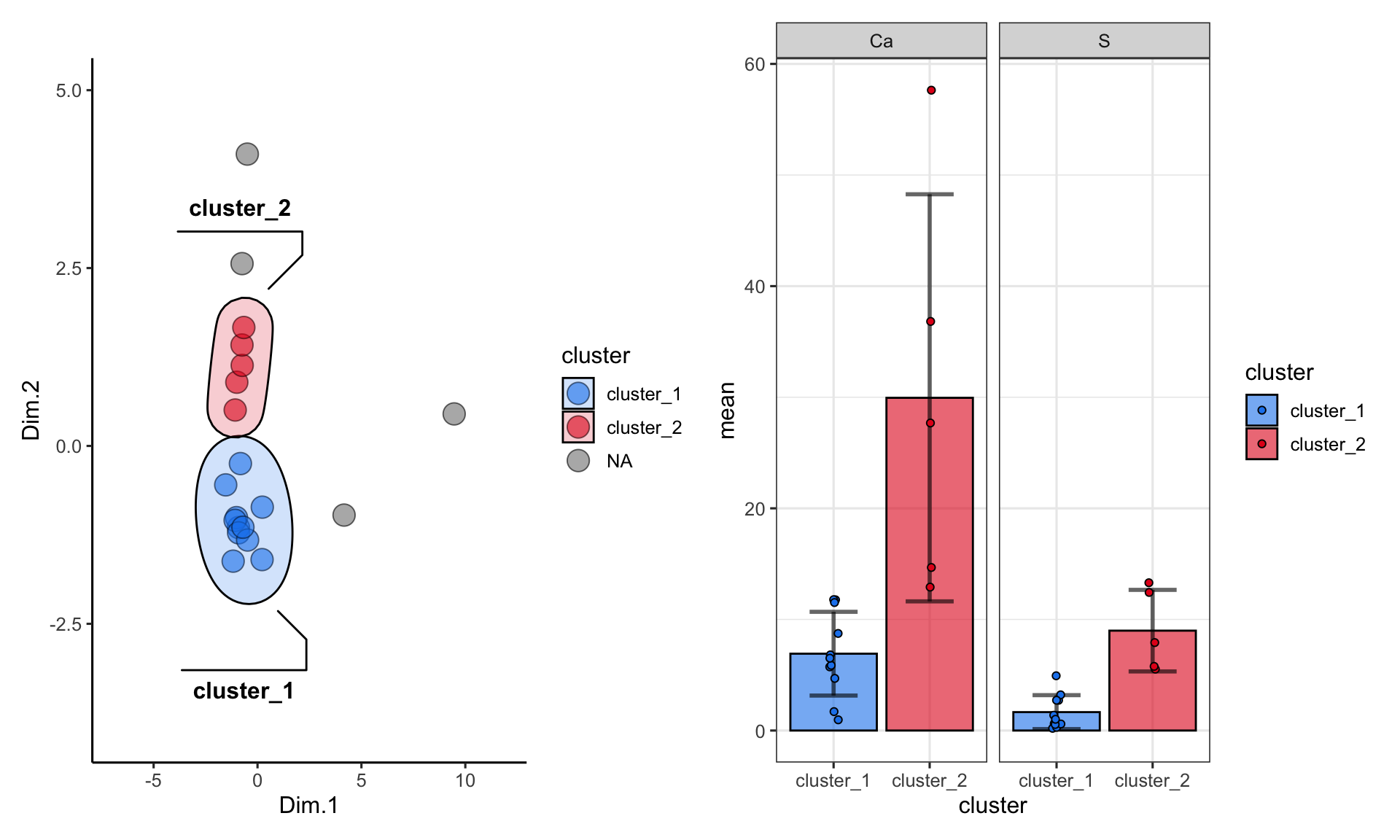
alaska_lake_data_pca_clusters <- left_join(alaska_lake_data_pca_clusters, alaska_lake_data_pca) We can plot the results and color them according to the group that kmeans suggested. We can also highlight groups using geom_mark_ellipse. Note that it is recommended to specify both fill and label for geom_mark_ellipse:
alaska_lake_data_pca_clusters$cluster <- factor(alaska_lake_data_pca_clusters$cluster)
ggplot() +
  geom_point(
    data = alaska_lake_data_pca_clusters,
    aes(x = Dim.1, y = Dim.2, fill = cluster), shape = 21, size = 5, alpha = 0.6
  ) +
  geom_mark_ellipse(
    data = alaska_lake_data_pca_clusters,
    aes(x = Dim.1, y = Dim.2, label = cluster, fill = cluster), alpha = 0.2
  ) +
  theme_classic() +
  coord_cartesian(xlim = c(-7,12), ylim = c(-4,5)) +
  scale_fill_manual(values = discrete_palette)
## Coordinate system already present. Adding new coordinate
## system, which will replace the existing one.
There is another method to define clusters that we call dbscan. In this method, not all points are necessarily assigned to a cluster, and we define clusters according to a set of parameters, instead of simply defining the number of clusteres, as in kmeans. In interactive mode, runMatrixAnalysis() will again load an interactive means of selecting parameters for defining dbscan clusters (“k”, and “threshold”). In the context of markdown document, simply provide “k” and “threshold” to the parameters argument:
alaska_lake_data_pca <- runMatrixAnalysis(
    data = alaska_lake_data,
    analysis = c("pca"),
    column_w_names_of_multiple_analytes = "element",
    column_w_values_for_multiple_analytes = "mg_per_L",
    columns_w_values_for_single_analyte = c("water_temp", "pH"),
    columns_w_additional_analyte_info = "element_type",
    columns_w_sample_ID_info = c("lake", "park")
)
## Replacing NAs in your data with mean

alaska_lake_data_pca_clusters <- runMatrixAnalysis(
    data = alaska_lake_data_pca,
    analysis = c("dbscan"),
    parameters = c(4, 0.45),
    column_w_names_of_multiple_analytes = NULL,
    column_w_values_for_multiple_analytes = NULL,
    columns_w_values_for_single_analyte = c("Dim.1", "Dim.2"),
    columns_w_sample_ID_info = "sample_unique_ID"
)
## Using 4 as a value for k.
## Using 0.45 as a value for threshold.

alaska_lake_data_pca_clusters <- left_join(alaska_lake_data_pca_clusters, alaska_lake_data_pca)
We can make the plot in the same way, but please note that to get geom_mark_ellipse to omit the ellipse for NAs you need to feed it data without NAs:
alaska_lake_data_pca_clusters$cluster <- factor(alaska_lake_data_pca_clusters$cluster)
ggplot() +
  geom_point(
    data = alaska_lake_data_pca_clusters,
    aes(x = Dim.1, y = Dim.2, fill = cluster), shape = 21, size = 5, alpha = 0.6
  ) +
  geom_mark_ellipse(
    data = drop_na(alaska_lake_data_pca_clusters),
    aes(x = Dim.1, y = Dim.2, label = cluster, fill = cluster), alpha = 0.2
  ) +
  theme_classic() +
  coord_cartesian(xlim = c(-7,12), ylim = c(-4,5)) +
  scale_fill_manual(values = discrete_palette)
## Coordinate system already present. Adding new coordinate
## system, which will replace the existing one.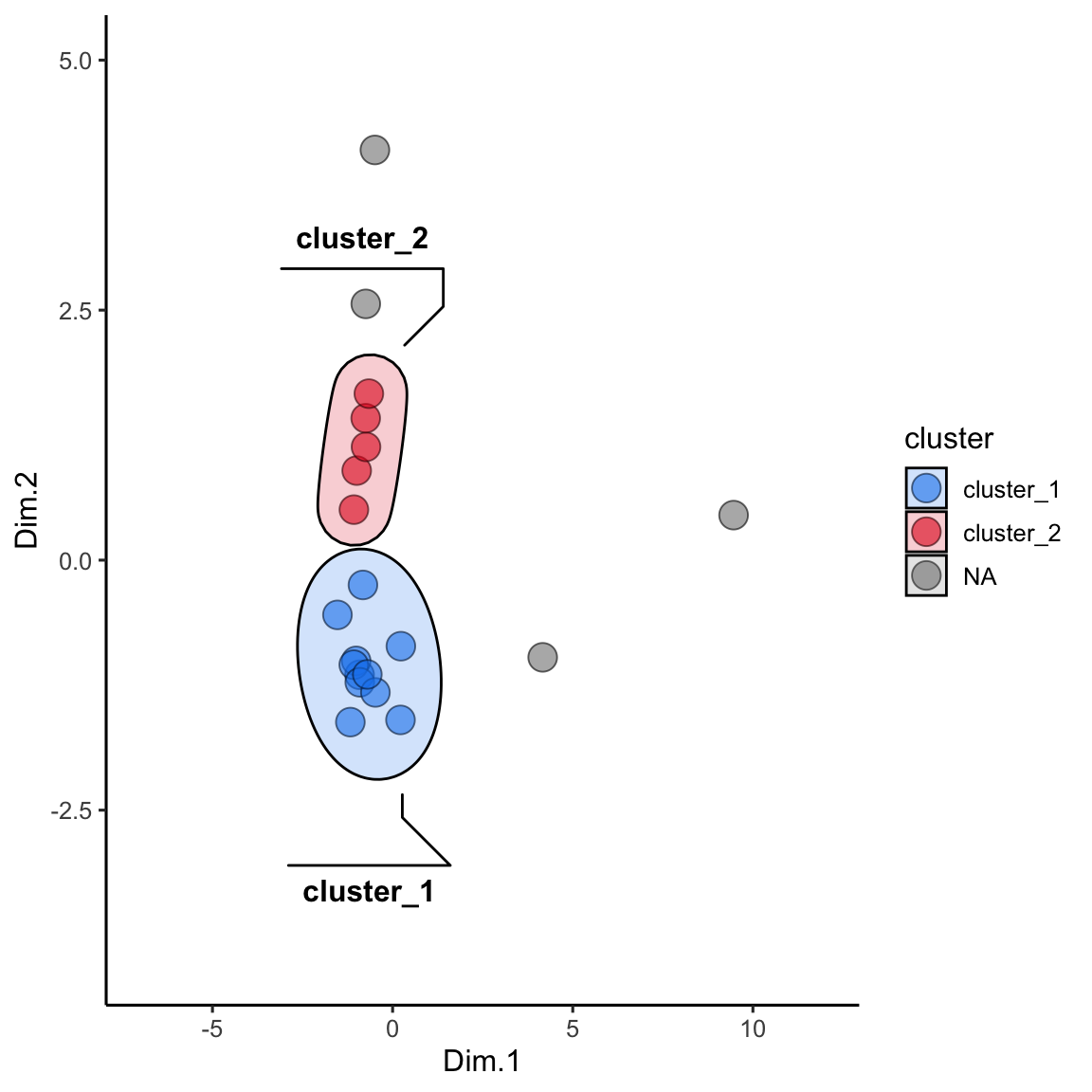
summarize by cluster
One more important point: when using kmeans or dbscan, we can use the clusters as groupings for summary statistics. For example, suppose we want to see the differences in abundances of certain chemicals among the clusters:
alaska_lake_data_pca <- runMatrixAnalysis(
  data = alaska_lake_data,
  analysis = c("pca"),
  column_w_names_of_multiple_analytes = "element",
  column_w_values_for_multiple_analytes = "mg_per_L",
  columns_w_values_for_single_analyte = c("water_temp", "pH"),
  columns_w_additional_analyte_info = "element_type",
  columns_w_sample_ID_info = c("lake", "park")
)
## Replacing NAs in your data with mean

alaska_lake_data_pca_clusters <- runMatrixAnalysis(
  data = alaska_lake_data_pca,
  analysis = c("dbscan"),
  parameters = c(4, 0.45),
  column_w_names_of_multiple_analytes = NULL,
  column_w_values_for_multiple_analytes = NULL,
  columns_w_values_for_single_analyte = c("Dim.1", "Dim.2"),
  columns_w_sample_ID_info = "sample_unique_ID",
  columns_w_additional_analyte_info = colnames(alaska_lake_data_pca)[6:18]
)
## Using 4 as a value for k.
## Using 0.45 as a value for threshold.

alaska_lake_data_pca_clusters <- left_join(alaska_lake_data_pca_clusters, alaska_lake_data_pca)

alaska_lake_data_pca_clusters %>%
  select(cluster, S, Ca) %>%
  pivot_longer(cols = c(2,3), names_to = "analyte", values_to = "mg_per_L") %>%
  drop_na() %>%
  group_by(cluster, analyte) -> alaska_lake_data_pca_clusters_clean

plot_2 <- ggplot() +
  geom_col(
    data = summarize(
      alaska_lake_data_pca_clusters_clean,
      mean = mean(mg_per_L), sd = sd(mg_per_L)
    ),
    aes(x = cluster, y = mean, fill = cluster),
    color = "black", alpha = 0.6
  ) +
  geom_errorbar(
    data = summarize(
      alaska_lake_data_pca_clusters_clean,
      mean = mean(mg_per_L), sd = sd(mg_per_L)
    ),
    aes(x = cluster, ymin = mean-sd, ymax = mean+sd, fill = cluster),
    color = "black", alpha = 0.6, width = 0.5, size = 1
  ) +
  facet_grid(.~analyte) + theme_bw() +
  geom_jitter(
    data = alaska_lake_data_pca_clusters_clean,
    aes(x = cluster, y = mg_per_L, fill = cluster), width = 0.05,
    shape = 21
  ) +
  scale_fill_manual(values = discrete_palette)

plot_1<- ggplot() +
  geom_point(
    data = alaska_lake_data_pca_clusters,
    aes(x = Dim.1, y = Dim.2, fill = cluster), shape = 21, size = 5, alpha = 0.6
  ) +
  geom_mark_ellipse(
    data = drop_na(alaska_lake_data_pca_clusters),
    aes(x = Dim.1, y = Dim.2, label = cluster, fill = cluster), alpha = 0.2
  ) +
  theme_classic() + coord_cartesian(xlim = c(-7,12), ylim = c(-4,5)) +
  scale_fill_manual(values = discrete_palette)

plot_1 + plot_2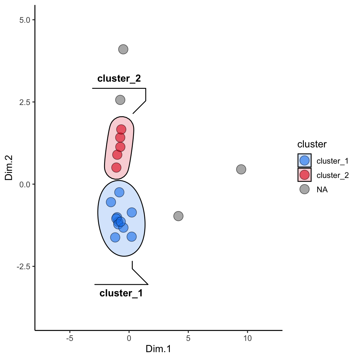
further reading
http://www.sthda.com/english/wiki/wiki.php?id_contents=7940
https://www.geeksforgeeks.org/dbscan-clustering-in-r-programming/
exercises
For this set of exercises, please use the dataset hawaii_aquifers or tequila_chemistry, available after you run the source() command. Do the following:
Run a PCA analysis on the data set and plot the results.
Create an ordination plot and identify one analyte that varies with Dim.1 and one analyte that varies with Dim.2 (these are your “variables of interest”).
Run kmeans clustering on your PCA output. Create a set of clusters that seems to appropriately subdivide the data set.
Use the clusters defined by kmeans as groupings on which to run summary statistics for your two variables of interest.
Create a plot with three subpanels that shows: (i) the PCA analysis (colored by kmeans clusters), (ii) the ordination analysis, and (iii) the summary statistics for your two variables of interest within the kmeans groups. Please note that subpanel plots can be created by sending ggplots to their own objects and then adding those objects together. Please see the subsection in the data visualization chapter on subplots.
Run dbscan clustering on your PCA output. Create a set of clusters that seems to appropriately subdivide the data set.
Use the clusters defined by dbscan as groupings on which to run summary statistics for your two variables of interest.
Create a plot with three subpanels that shows: (i) the PCA analysis (colored by dbscan clusters), (ii) the ordination analysis, and (iii) the summary statistics for your two variables of interest within the dbscan groups.