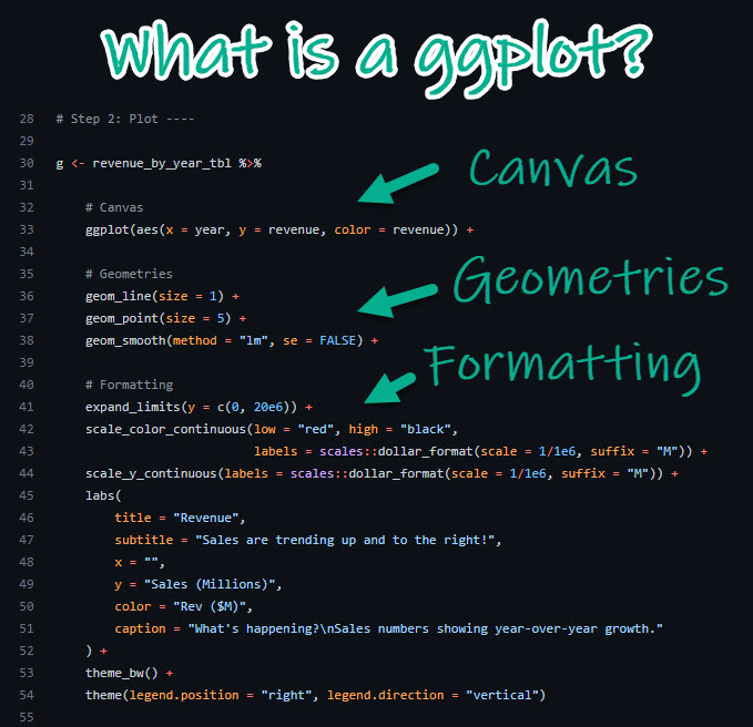
data visualization
Visualization is one of the most fun parts of working with data. In this section, we will jump into visualization as quickly as possible - after just a few prerequisites. Please note that data visualization is a whole field in and of itself (just google “data visualization” and see what happens). Data visualization is also rife with “trendy” visuals, misleading visuals, and visuals that look cool but don’t actually communicate much information. We will touch on these topics briefly, but will spend most of our time practicing how to represent our data in intuitive and interpretable ways. Let’s get started!
objects
In R, data is stored in objects. You can think of objects as if they were “files” inside an R session. phylochemistry provides a variety of objects for us to work with. Let’s look at how to create an object. For this, we can use an arrow: <- . The arrow will take something and store it inside an object. For example:
new_object <- 1Now we’ve got a new object called new_object, and inside of it is the number 1. To look at what’s inside an object, we can simply type the name of the object into the console:
new_object
## [1] 1
Easy! Let’s look at one of the objects that comes with our class code base. What are the dimensions of the “algae_data” data set?
algae_data
## # A tibble: 180 × 5
##    replicate algae_strain harvesting_regime chemical_species
##        <dbl> <chr>        <chr>             <chr>
##  1         1 Tsv1         Heavy             FAs
##  2         1 Tsv1         Heavy             saturated_Fas
##  3         1 Tsv1         Heavy             omega_3_polyuns…
##  4         1 Tsv1         Heavy             monounsaturated…
##  5         1 Tsv1         Heavy             polyunsaturated…
##  6         1 Tsv1         Heavy             omega_6_polyuns…
##  7         1 Tsv1         Heavy             lysine
##  8         1 Tsv1         Heavy             methionine
##  9         1 Tsv1         Heavy             essential_Aas
## 10         1 Tsv1         Heavy             non_essential_A…
## # ℹ 170 more rows
## # ℹ 1 more variable: abundance <dbl>
functions
Excellent - we’ve got data. Now we need to manipulate it. For this we need functions:
- A function is a command that tells R to perform an action!
- A function begins and ends with parentheses:
this_is_a_function() - The stuff inside the parentheses are the details of how you want the function to perform its action:
run_this_analysis(on_this_data)
Let’s illustrate this with an example. algae_data is a pretty big object. For our next chapter on visualization, it would be nice to have a smaller dataset object to work with. Let’s use another tidyverse command called filter to filter the algae_data object. We will need to tell the filter command what to filter out using “logical predicates” (things like equal to: ==, less than: <, greater than: >, greater-than-or-equal-to: <=, etc.). Let’s filter algae_data so that only rows where the chemical_species is equal to FAs (fatty acids) is preserved. This will look like chemical_species == "FAs". Here we go:
filter(algae_data, chemical_species == "FAs")
## # A tibble: 18 × 5
##    replicate algae_strain harvesting_regime chemical_species
##        <dbl> <chr>        <chr>             <chr>
##  1         1 Tsv1         Heavy             FAs
##  2         2 Tsv1         Heavy             FAs
##  3         3 Tsv1         Heavy             FAs
##  4         1 Tsv1         Light             FAs
##  5         2 Tsv1         Light             FAs
##  6         3 Tsv1         Light             FAs
##  7         1 Tsv2         Heavy             FAs
##  8         2 Tsv2         Heavy             FAs
##  9         3 Tsv2         Heavy             FAs
## 10         1 Tsv2         Light             FAs
## 11         2 Tsv2         Light             FAs
## 12         3 Tsv2         Light             FAs
## 13         1 Tsv11        Heavy             FAs
## 14         2 Tsv11        Heavy             FAs
## 15         3 Tsv11        Heavy             FAs
## 16         1 Tsv11        Light             FAs
## 17         2 Tsv11        Light             FAs
## 18         3 Tsv11        Light             FAs
## # ℹ 1 more variable: abundance <dbl>
Cool! Now it’s just showing us the 18 rows where the chemical_species is fatty acids (FAs). Let’s write this new, smaller dataset into a new object. For that we use <-, remember?
algae_data_small <- filter(algae_data, chemical_species == "FAs")
algae_data_small
## # A tibble: 18 × 5
##    replicate algae_strain harvesting_regime chemical_species
##        <dbl> <chr>        <chr>             <chr>
##  1         1 Tsv1         Heavy             FAs
##  2         2 Tsv1         Heavy             FAs
##  3         3 Tsv1         Heavy             FAs
##  4         1 Tsv1         Light             FAs
##  5         2 Tsv1         Light             FAs
##  6         3 Tsv1         Light             FAs
##  7         1 Tsv2         Heavy             FAs
##  8         2 Tsv2         Heavy             FAs
##  9         3 Tsv2         Heavy             FAs
## 10         1 Tsv2         Light             FAs
## 11         2 Tsv2         Light             FAs
## 12         3 Tsv2         Light             FAs
## 13         1 Tsv11        Heavy             FAs
## 14         2 Tsv11        Heavy             FAs
## 15         3 Tsv11        Heavy             FAs
## 16         1 Tsv11        Light             FAs
## 17         2 Tsv11        Light             FAs
## 18         3 Tsv11        Light             FAs
## # ℹ 1 more variable: abundance <dbl>
ggplot & geoms
Now we have a nice, small table that we can use to practice data visualization. For visualization, we’re going to use ggplot2 - a powerful set of commands for plot generation.
There are three steps to setting up a ggplot:
- Define the data you want to use.
We do this using the ggplot function’s data argument. When we run that line, it just shows a grey plot space. Why is this? It’s because all we’ve done is told ggplot that (i) we want to make a plot and (ii) what data should be used. We haven’t explained how to represent features of the data using ink.
ggplot(data = algae_data_small)
- Define how your variables map onto the axes.
This is called aesthetic mapping and is done with the aes() function. aes() should be placed inside the ggplot command. Now when we run it, we get our axes!
ggplot(data = algae_data_small, aes(x = algae_strain, y = abundance))
- Use geometric shapes to represent other variables in your data.
Map your variables onto the geometric features of the shapes. To define which shape should be used, use a geom_* command. Some options are, for example, geom_point(), geom_boxplot(), and geom_violin(). These functions should be added to your plot using the + sign. We can use a new line to keep the code from getting too wide, just make sure the + sign is at the end fo the top line. Let’s try it:
ggplot(data = algae_data_small, aes(x = algae_strain, y = abundance)) +
  geom_point()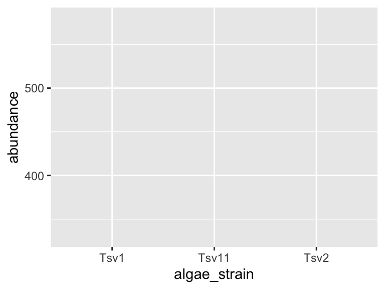
In the same way that we mapped variables in our dataset to the plot axes, we can map variables in the dataset to the geometric features of the shapes we are using to represent our data. For this, again, use aes() to map your variables onto the geometric features of the shapes:
ggplot(data = algae_data_small, aes(x = algae_strain, y = abundance)) +
  geom_point(aes(color = harvesting_regime))
In the plot above, the points are a bit small, how could we fix that? We can modify the features of the shapes by adding additional arguments to the geom_*() functions. To change the size of the points created by the geom_point() function, this means that we need to add the size = argument. IMPORTANT! Please note that when we map a feature of a shape to a variable in our data(as we did with color/harvesting regime, above) then it goes inside aes(). In contrast, when we map a feature of a shape to a constant, it goes outside aes(). Here’s an example:
ggplot(data = algae_data_small, aes(x = algae_strain, y = abundance)) +
  geom_point(aes(color = harvesting_regime), size = 5)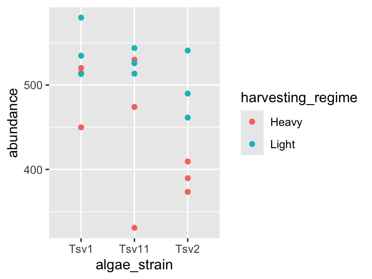
One powerful aspect of ggplot is the ability to quickly change mappings to see if alternative plots are more effective at bringing out the trends in the data. For example, we could modify the plot above by switching how harvesting_regime is mapped:
ggplot(data = algae_data_small, aes(x = algae_strain, y = abundance)) +
  geom_point(aes(size = harvesting_regime), color = "black")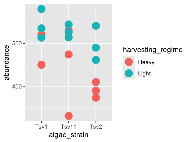
** Important note: Inside the aes() function, map aesthetics (the features of the geom’s shape) to a variable. Outside the aes() function, map aesthetics to constants. You can see this in the above two plots - in the first one, color is inside aes() and mapped to the variable called harvesting_regime, while size is outside the aes() call and is set to the constant 5. In the second plot, the situation is reversed, with size being inside the aes() function and mapped to the variable harvesting_regime, while color is outside the aes() call and is mapped to the constant “black”.
We can also stack geoms on top of one another by using multiple + signs. We also don’t have to assign the same mappings to each geom.
ggplot(data = algae_data_small, aes(x = algae_strain, y = abundance)) +
  geom_violin() +
  geom_point(aes(color = harvesting_regime), size = 5)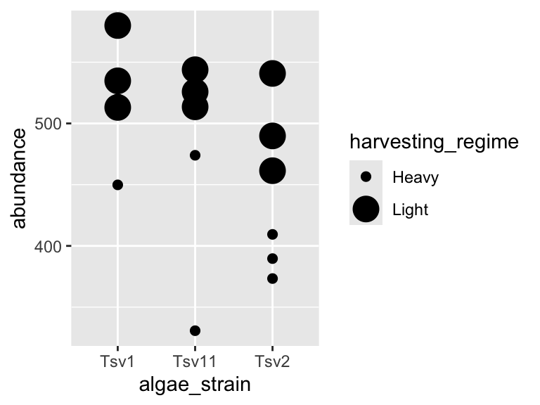
As you can probably guess right now, there are lots of mappings that can be done, and lots of different ways to look at the same data!
ggplot(data = algae_data_small, aes(x = algae_strain, y = abundance)) +
  geom_violin(aes(fill = algae_strain)) +
  geom_point(aes(color = harvesting_regime, size = replicate))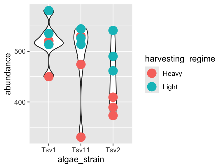
ggplot(data = algae_data_small, aes(x = algae_strain, y = abundance)) +
  geom_boxplot()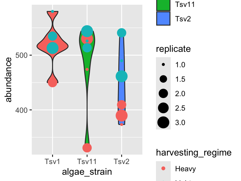
markdown
Now that we are able to filter our data and make plots, we are ready to make reports to show others the data processing and visualization that we are doing. For this, we will use R Markdown. You can open a new markdown document in RStudio by clicking: File -> New File -> R Markdown. You should get a template document that compiles when you press “knit”.
Customize this document by modifying the title, and add author: "your_name" to the header. Delete all the content below the header, then compile again. You should get a page that is blank except for the title and the author name.
You can think of your markdown document as a stand-alone R Session. This means you will need to load our class code base into each new markdown doument you create. You can do this by adding a “chunk” or R code. That looks like this:
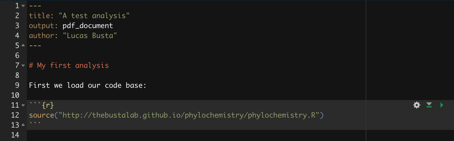
You can compilie this document into a pdf. We can also run R chunks right inside the document and create figures. You should notice a few things when you compile this document:
Headings: When you compile that code, the “# My first analysis” creates a header. You can create headers of various levels by increasing the number of hashtags you use in front of the header. For example, “## Part 1” will create a subheading, “### Part 1.1” will create a sub-subheading, and so on.
Plain text: Plain text in an R Markdown document creates a plan text entry in your compiled document. You can use this to explain your analyses and your figures, etc.
You can modify the output of a code chunk by adding arguments to its header. Useful arguments are fig.height, fig.width, and fig.cap. Dr. Busta will show you how to do this in class.
exercises I
In this set of exercises we’re going to practice filtering and plotting data in R Markdown. We’re going to work with two datasets: (i) algae_data and (ii) alaska_lake_data. For these exercises, you will write your code and answers to all questions in an R Markdown report, compile it as a pdf, and submit it on Canvas. If you have any questions please let me know
Some pointers:
If your code goes off the page, don’t be afraid to wrap it across multiple lines, as shown in some of the examples.
Don’t be afraid to put the variable with the long elements / long text on the y-axis and the continuous variable on the x-axis.
algae
You will have
algae_datastored in an object calledalgae_dataas soon as you runsource("https://thebustalab.github.io/phylochemistry/phylochemistry.R"). For this question, filter the data so that only entries are shown for which thechemical_speciesis “FAs” (remember that quotes are needed around FAs here!). What are the dimensions (i.e. number of rows and columns) of the resulting dataset?Now filter the original dataset (
algae_data) so that only entries for thealgae_strain“Tsv1” are shown. What are the dimensions of the resulting dataset?Now filter the original dataset (
algae_data) so that only entries with an abundance greater than 250 are shown. Note that>can be used in the filter command instead of==, and that numbers inside a filter command do not require quotes around them. What are the dimensions of the resulting dataset?Use the original dataset (
algae_data) to make a ggplot that hasalgae_strainon the x axis andabundanceon the y axis. Remember aboutaes(). Use points (geom_point()) to represent each compound. You don’t need to color the points. Which algae strain has the most abundant compound out of all the compounds in the dataset?Make a ggplot that has
abundanceon the x axis andchemical_specieson the y axis. Use points to represent each compound. You don’t need to color the points. Generally speaking, what are the two most abundant classes of chemical species in these algae strains? (FAs/Fas stand for fatty acids, AAs/Aas stand for amino acids.)I am going to show you an example of how you can filter and plot at the same time. To do this, we nest the filter command inside ggplot’s data argument:
ggplot(
  data = filter(algae_data, chemical_species == "essential_Aas"),
  aes(x = algae_strain, y = abundance)) +
geom_point()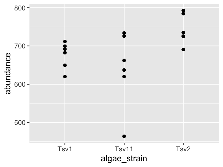
Using the above as a template, make a plot that shows just omega_3_polyunsaturated_Fas, with algae_strain on the x axis, and abundance on the y axis. Color the points so that they correspond to harvesting_regime. Remember that mapping a feature of a shape onto a variable must be done inside aes(). Change the plot so that all the points are size = 5. Remember that mapping features of a shape to a constant needs to be done outside aes(). Which harvesting regime leads to higher levels of omega_3_polyunsaturated_Fas?
Use a combination of filtering and plotting to show the abundance of the different chemical species in just the
algae_straincalled “Tsv1”. Use an x and y axis, as well as points to represent the measurements. Make point size correspond to the replicate, and color the points according to harvesting regime.Make a plot that checks to see which
chemical_specieswere more abundant under light as opposed to heavyharvesting_regimein all three replicates. Use filtered data so that just onealgae_strainis shown, an x and a y axis, and points to represent the measurements. Make the pointssize = 5and also set the point’salpha = 0.6. The points should be colored according to harvesting_regime. Make 3 plots, one for each strain of algae.Take the code that you made for the question above. Remove the filtering. Add the following line to the end of the plot:
facet_grid(.~algae_strain). Remember that adding things to plots is done with the+sign, so your code should look something like:
ggplot(data = algae_data, aes(x = <something>, y = <something else>)) +
  geom_point(aes(<some things>), <some here too>) +
  facet_grid(.~algae_strain)
Also try, instead of facet_grid(.~algae_strain), facet_grid(algae_strain~.) at the end of you plot command. (note the swap in the position of the .~ relative to algae_strain). This means your code should look something like:
ggplot(data = algae_data, aes(x = <something>, y = <something else>)) +
  geom_point(aes(<some things>), <some here too>) +
  facet_grid(algae_strain~.)
What advantages does this one extra line (i.e. facet_grid) provide over what you had to do in question 8?
alaska lakes
Use R to view the first few lines of the
alaska_lake_datadataset. Do your best to describe, in written format, the kind of data that are in this data set.How many variables are in the Alaska lakes dataset?
Filter the data set so only meausurements of free elements (i.e. element_type is “free”) are shown. Remember, it’s
==, not=. What are the dimensions of the resulting dataset?Make a plot that shows the water temperatures of each lake. Don’t worry if you get a warning message from R about “missing values”. Which is the hottest lake? The coolest?
Make a plot that shows the water temperature of each lake. The x axis should be
park, the y axiswater temp. Add geom_violin() to the plot first, then geom_point(). Make the points size = 5. Color the points according to water_temp. Which park has four lakes with very similar temperatures?From the plot you made for question 5, it should be apparent that there is one lake in NOAT that is much warmer than the others. Filter the data so that only entries from
park == "NOAT"are shown (note the double equals sign and the quotes around NOAT…). Combine this filtering with plotting and use geom_point() to make a plot that shows which specific lake that is.Make a plot that shows which lake has the highest abundance of sulfur.
Make a plot that uses geom_point(). Set the “shape” aesthetic of the points to 21, i.e.
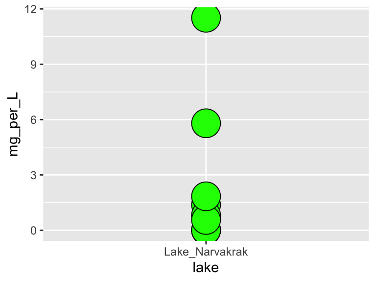
geom_point(aes(...), shape = 21). This gives you access to a new aesthetics:fill. It also changes the behaviour of thecoloraesthetic slightly, in that it now controls border color, not the internal color. Here is an example (though it doesn’t make a very nice plot):
ggplot(
  data = filter(alaska_lake_data, lake == "Lake_Narvakrak"),
  aes(x = lake, y = mg_per_L)
) +
  geom_point(
    shape = 21, size = 10,
    color = "black", fill = "green"
  )
Now we have lots of aesthetics we can map to: x, y, size, color, and fill (leave shape set to 21 for now). Make a plot of your own design. It should include filtering, and all the aesthetics listed above, though whether you map them to a variable or a constant is up to you.
When you are done with this plot, take a screen shot of it. Go to THIS GOOGLE SHEET, make a slide for yourself (you don’t have to include your name), and paste your screen shot there. Add a small caption that explains how your variables are mapped.
more geoms
We’ve looked at how to filter data and map variables in our data to geometric shapes to make plots. Let’s have a look at a few more things. For these examples, we’re going to use the data set called solvents. In these examples, I’d like to introduce you to two new geoms. The first geom_smooth() is used when there are two continuous variables. It is particularly nice when geom_point() is stacked on top of it.
ggplot(data = solvents, aes(x = boiling_point, y = vapor_pressure)) +
  geom_smooth() +
  geom_point()
## `geom_smooth()` using method = 'loess' and formula = 'y ~
## x'
Also, please be aware of geom_tile(), which is nice for situations with two discrete variables and one continuous variable. geom_tile() makes what are often referred to as heat maps. Note that geom_tile() is somewhat similar to geom_point(shape = 21), in that it has both fill and color aesthetics that control the fill color and the border color, respectively.
ggplot(
  data = filter(algae_data, harvesting_regime == "Heavy"),
  aes(x = algae_strain, y = chemical_species)
) +
  geom_tile(aes(fill = abundance), color = "black", size = 1)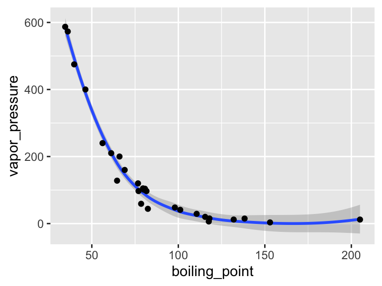
These examples should illustrate that there is, to some degree, correspondence between the type of data you are interested in plotting (number of discrete and continuous variables) and the types of geoms that can effectively be used to represent the data.
i2 <- iris %>%
  mutate(Species2 = rep(c("A","B"), 75))
p <- ggplot(i2, aes(Sepal.Width, Sepal.Length, color = Species)) +
  geom_point()

p + geom_xsidedensity(aes(y=stat(density), xfill = Species), position = "stack")+
  geom_ysidedensity(aes(x=stat(density), yfill = Species2), position = "stack") +
  theme_bw() +
  facet_grid(Species~Species2, space = "free", scales = "free") +
  labs(title = "FacetGrid", subtitle = "Collapsing All Side Panels") +
  ggside(collapse = "all") +
  scale_xfill_manual(values = c("darkred","darkgreen","darkblue")) +
  scale_yfill_manual(values = c("black","gold"))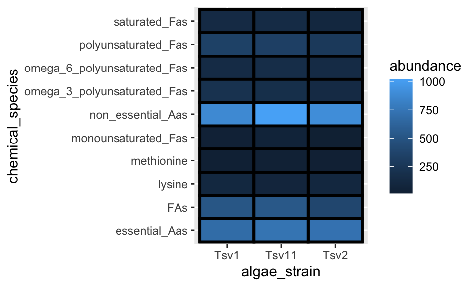
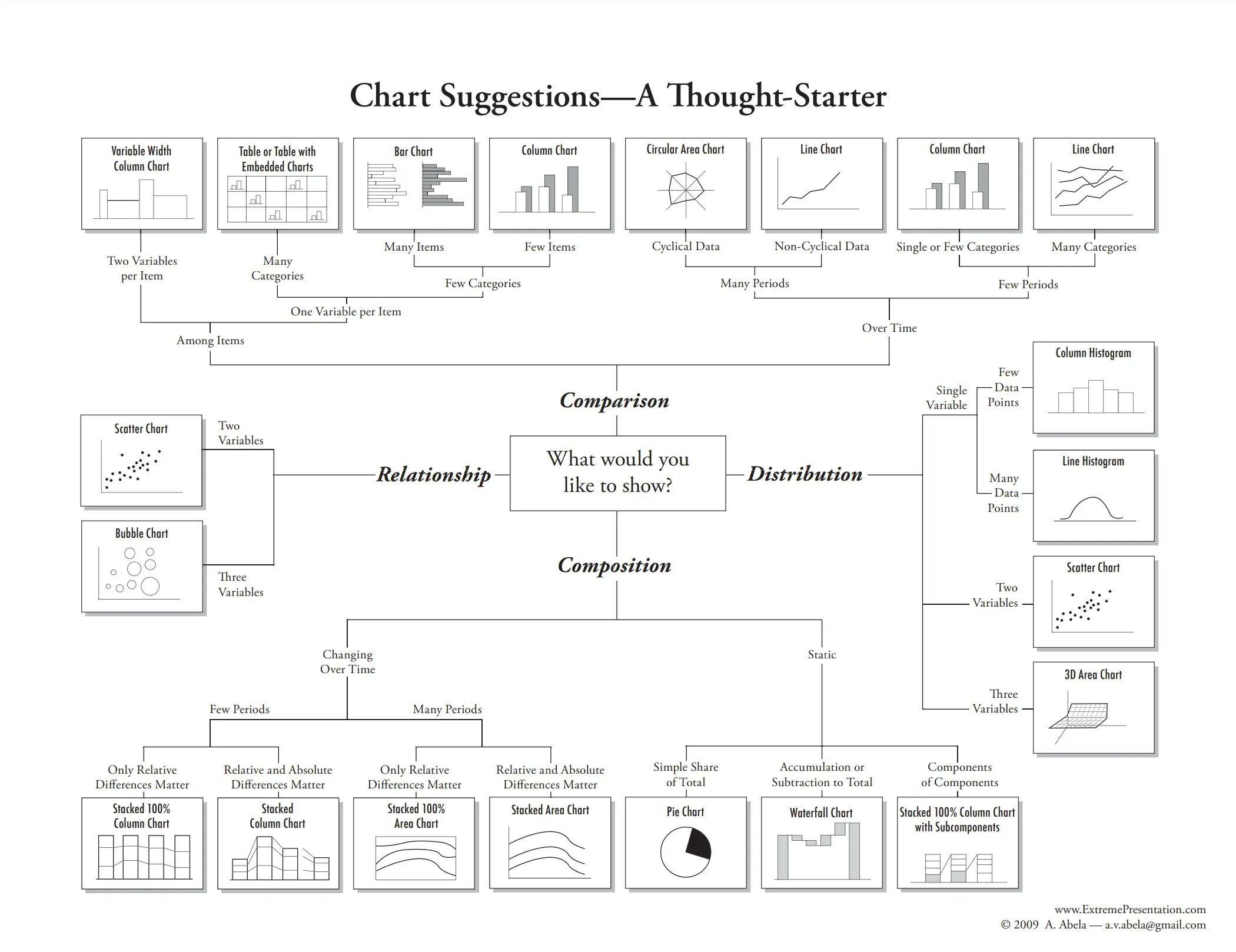
There is a handy cheat sheet that can help you identify the right geom for your situation. Please keep this cheat sheet in mind for your future plotting needs…
You can also combine geoms to create more detailed representations of distributions:
mpg %>% filter(cyl %in% c(4,6,8)) %>%
  ggplot(aes(x = factor(cyl), y = hwy, fill = factor(cyl))) +
  ggdist::stat_halfeye(
    adjust = 0.5, justification = -0.2, .width = 0, point_colour = NA
  ) +
  geom_boxplot(width = 0.12, outlier.color = NA, alpha = 0.5) +
  ggdist::stat_dots(side = "left", justification = 1.1, binwidth = .25)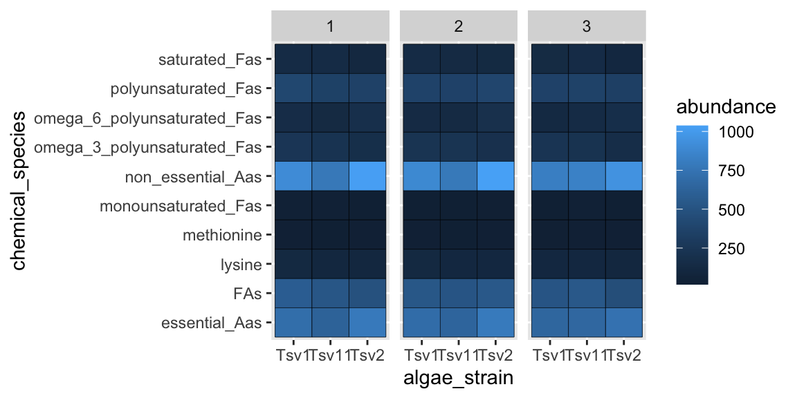
facets
As alluded to in Exercises 1, it is possible to map variables in your dataset to more than the geometric features of shapes (i.e. geoms). One very common way of doing this is with facets. Faceting creates small multiples of your plot, each of which shows a different subset of your data based on a categorical variable of your choice. Let’s check it out.
Here, we can facet in the horizontal direction:
ggplot(data = algae_data, aes(x = algae_strain, y = chemical_species)) +
  geom_tile(aes(fill = abundance), color = "black") +
  facet_grid(.~replicate)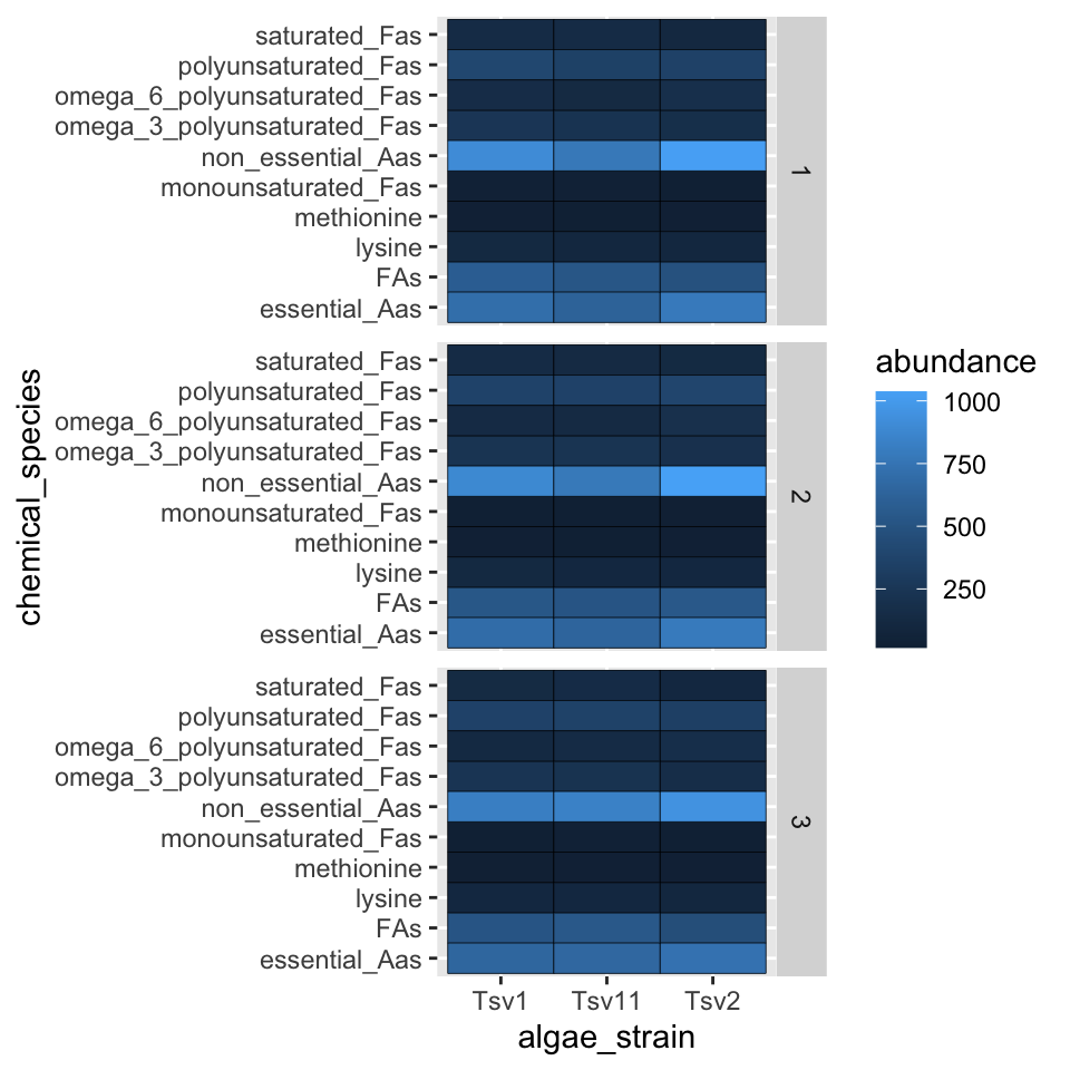
We can facet in the vertical direction:
ggplot(data = algae_data, aes(x = algae_strain, y = chemical_species)) +
  geom_tile(aes(fill = abundance), color = "black") +
  facet_grid(replicate~.)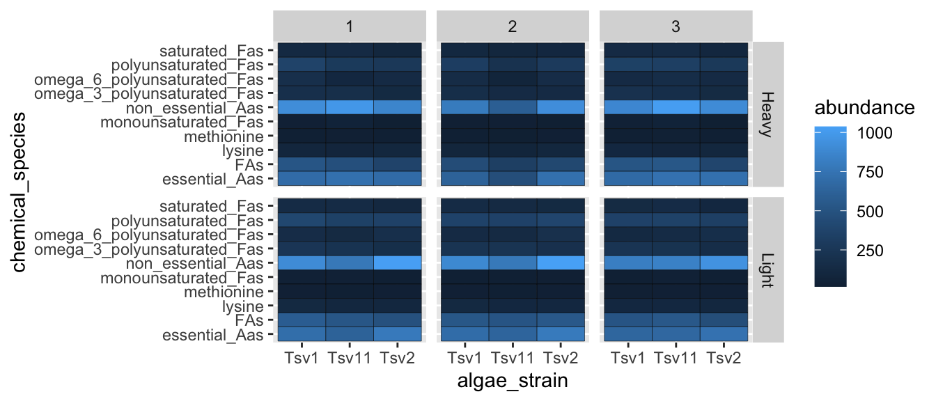
And we can do both at the same time:
ggplot(data = algae_data, aes(x = algae_strain, y = chemical_species)) +
  geom_tile(aes(fill = abundance), color = "black") +
  facet_grid(harvesting_regime~replicate)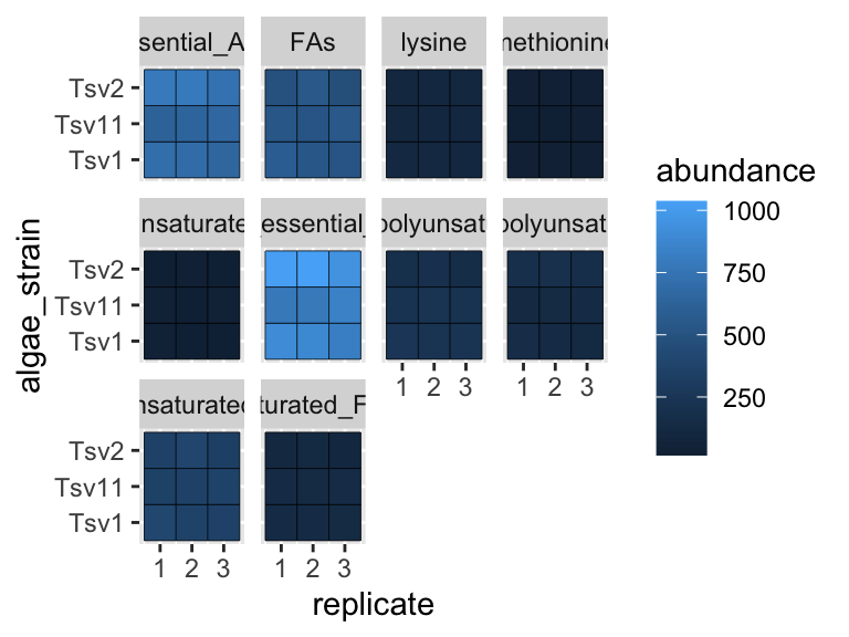
Faceting is a great way to describe more variation in your plot without having to make your geoms more complicated. For situations where you need to generate lots and lots of facets, consider facet_wrap instead of facet_grid:
ggplot(data = algae_data, aes(x = replicate, y = algae_strain)) +
  geom_tile(aes(fill = abundance), color = "black") +
  facet_wrap(chemical_species~.)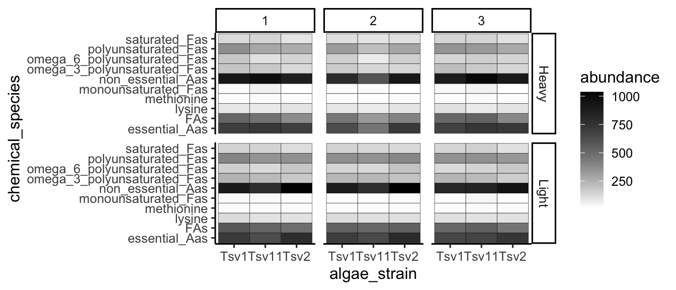
scales
Every time you define an aesthetic mapping (e.g. aes(x = algae_strain)), you are defining a new scale that is added to your plot. You can control these scales using the scale_* family of commands. Consider our faceting example above. In it, we use geom_tile(aes(fill = abundance)) to map the abundance variable to the fill aesthetic of the tiles. This creates a scale called fill that we can adjust using scale_fill_*. In this case, fill is mapped to a continuous variable and so the fill scale is a color gradient. Therefore, scale_fill_gradient() is the command we need to change it. Remember that you could always type ?scale_fill_ into the console and it will help you find relevant help topics that will provide more detail. Another option is to google: “How to modify color scale ggplot geom_tile”, which will undoubtedly turn up a wealth of help.
ggplot(data = algae_data, aes(x = algae_strain, y = chemical_species)) +
  geom_tile(aes(fill = abundance), color = "black") +
  facet_grid(harvesting_regime~replicate) +
  scale_fill_gradient(low = "white", high = "black") +
  theme_classic()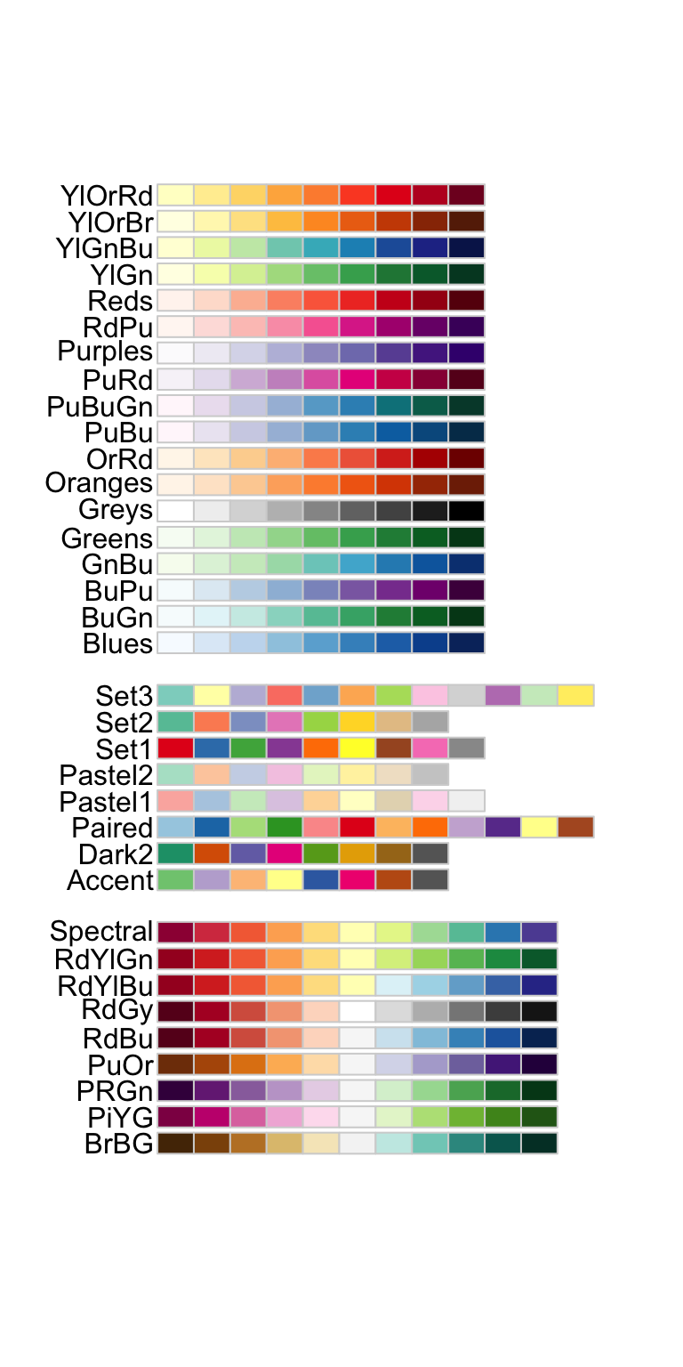
One particularly useful type of scale are the color scales provided by RColorBrewer:
display.brewer.all()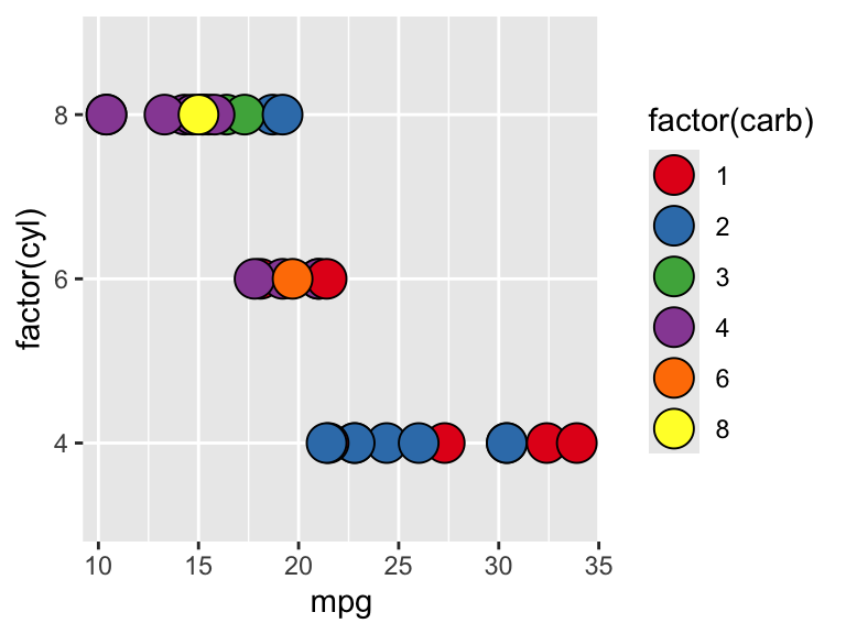
ggplot(mtcars) +
  geom_point(
    aes(x = mpg, y = factor(cyl), fill = factor(carb)),
    shape = 21, size = 6
  ) +
  scale_fill_brewer(palette = "Set1")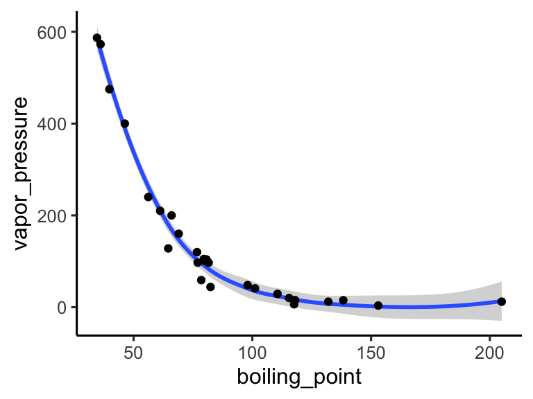
themes
So far we’ve just looked at how to control the means by which your data is represented on the plot. There are also components of the plot that are, strictly speaking, not data per se, but rather non-data ink. These are controlled using the theme() family of commands. There are two ways to go about this.
ggplot comes with a handful of built in “complete themes”. These will change the appearance of your plots with respect to the non-data ink. Compare the following plots:
ggplot(data = solvents, aes(x = boiling_point, y = vapor_pressure)) +
  geom_smooth() +
  geom_point() +
  theme_classic()
## `geom_smooth()` using method = 'loess' and formula = 'y ~
## x'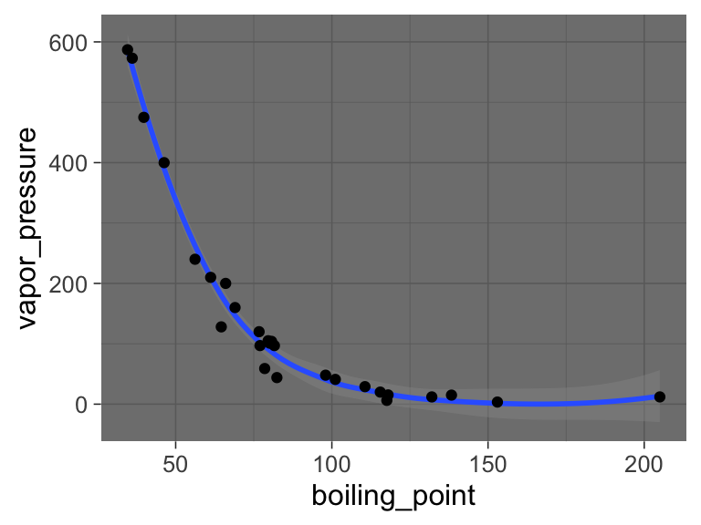
ggplot(data = solvents, aes(x = boiling_point, y = vapor_pressure)) +
  geom_smooth() +
  geom_point() +
  theme_dark()
## `geom_smooth()` using method = 'loess' and formula = 'y ~
## x'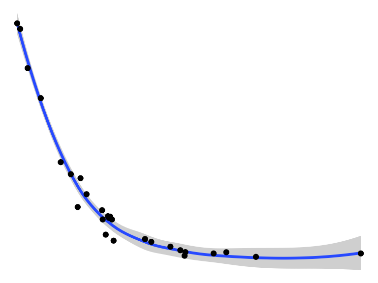
ggplot(data = solvents, aes(x = boiling_point, y = vapor_pressure)) +
  geom_smooth() +
  geom_point() +
  theme_void()
## `geom_smooth()` using method = 'loess' and formula = 'y ~
## x'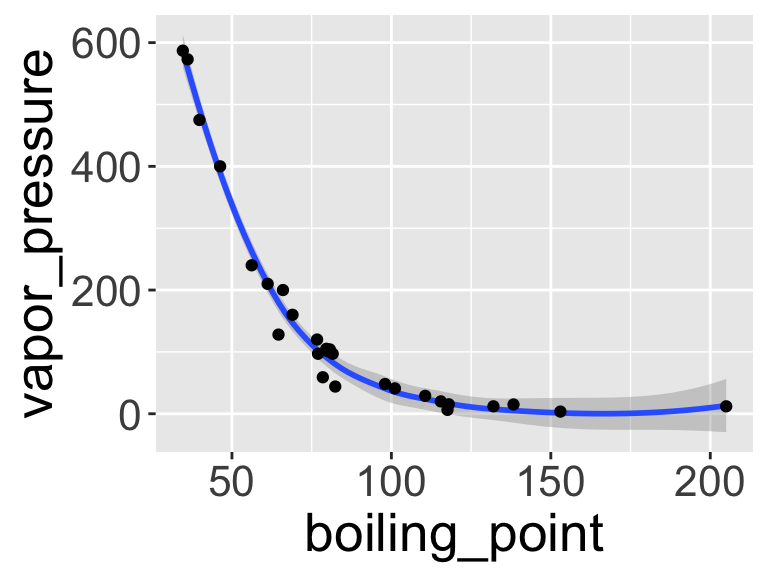
You can also change individual components of themes. This can be a bit tricky, but it’s all explained if you run ?theme(). Hare is an example (and google will provide many, many more).
ggplot(data = solvents, aes(x = boiling_point, y = vapor_pressure)) +
  geom_smooth() +
  geom_point() +
  theme(
    text = element_text(size = 20, color = "black")
  )
## `geom_smooth()` using method = 'loess' and formula = 'y ~
## x'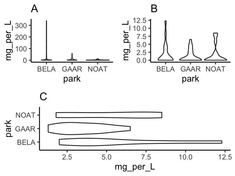
Last, here is an example of combining scale_* and theme* with previous commands to really get a plot looking sharp.
ggplot(data = solvents, aes(x = boiling_point, y = vapor_pressure)) +
  geom_smooth(color = "#4daf4a") +
  scale_x_continuous(
    name = "Boiling Point", breaks = seq(0,200,25), limits = c(30,210)
  ) +
  scale_y_continuous(
    name = "Vapor Pressure", breaks = seq(0,600,50)
  ) +
  geom_point(color = "#377eb8", size = 4, alpha = 0.6) +
  theme_bw() +
  theme(
    axis.text = element_text(color = "black"),
    text = element_text(size = 16, color = "black")
  )
## `geom_smooth()` using method = 'loess' and formula = 'y ~
## x'
Figure 1.1: Vapor pressure as a function of boiling point. A scatter plot with trendline showing the vapor pressure of thirty-two solvents (y-axis) a as a function of their boiling points (x-axis). Each point represents the boiling point and vapor pressure of one solvent. Data are from the ‘solvents’ dataset used in UMD CHEM5725.
subplots
We can make subplots using the cowplot package, which comes with the source() command. Let’s see:
library(patchwork)
plot1 <-  ggplot(
            filter(alaska_lake_data, element_type == "free")
          ) +
          geom_violin(aes(x = park, y = mg_per_L)) + theme_classic() +
          ggtitle("A")

plot2 <-  ggplot(
            filter(alaska_lake_data, element_type == "bound")
          ) +
          geom_violin(aes(x = park, y = mg_per_L)) + theme_classic() +
          ggtitle("B")

plot3 <-  ggplot(
            filter(alaska_lake_data, element == "C")
          ) +
          geom_violin(aes(x = park, y = mg_per_L)) + theme_classic() +
          coord_flip() + ggtitle("C")

plot_grid(plot_grid(plot1, plot2), plot3, ncol = 1)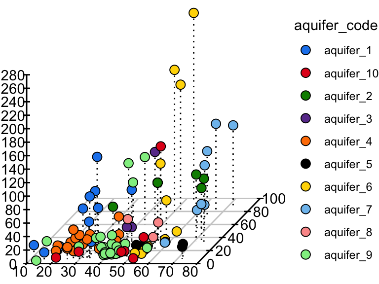
3D scatter plots
phylochemistry contains a function to help you make somewhat decent 3D scatter plots. Let’s look at an example (see below). For this, we use the function points3D. Se give it a data argument that gives it vectors of data that should be on the x, y, and z axes, along with a vector that uniquely identifies each observation. We also tell it the angle of the z axis that we want, the integer to which ticks should be rounded, and the tick intervals. The function returns data that we can pass to ggplot to make a 3D plot.
pivot_wider(hawaii_aquifers, names_from = "analyte", values_from = "abundance") %>%
  mutate(sample_unique_ID = paste0(aquifer_code, "_", well_name)) -> aquifers

output <- points3D(
  data = data.frame(
    x = aquifers$SiO2,
    y = aquifers$Cl,
    z = aquifers$Mg,
    sample_unique_ID = aquifers$sample_unique_ID
  ),
  angle = pi/2.4,
  tick_round = 10,
  x_tick_interval = 10,
  y_tick_interval = 20,
  z_tick_interval = 20
)

str(output)
## List of 6
##  $ grid          :'data.frame':  14 obs. of  4 variables:
##   ..$ y   : num [1:14] 0 0 0 0 0 ...
##   ..$ yend: num [1:14] 96.6 96.6 96.6 96.6 96.6 ...
##   ..$ x   : num [1:14] 10 20 30 40 50 ...
##   ..$ xend: num [1:14] 35.9 45.9 55.9 65.9 75.9 ...
##  $ ticks         :'data.frame':  37 obs. of  4 variables:
##   ..$ y   : num [1:37] 0 0 0 0 0 0 0 0 0 0 ...
##   ..$ yend: num [1:37] 1.93 1.93 1.93 1.93 1.93 ...
##   ..$ x   : num [1:37] 10 20 30 40 50 60 70 80 10 20 ...
##   ..$ xend: num [1:37] 10.5 20.5 30.5 40.5 50.5 ...
##  $ labels        :'data.frame':  29 obs. of  3 variables:
##   ..$ y    : num [1:29] -11.2 -11.2 -11.2 -11.2 -11.2 -11.2 -11.2 -11.2 0 20 ...
##   ..$ x    : num [1:29] 7.2 17.2 27.2 37.2 47.2 57.2 67.2 77.2 4.4 4.4 ...
##   ..$ label: num [1:29] 10 20 30 40 50 60 70 80 0 20 ...
##  $ axes          :'data.frame':  3 obs. of  4 variables:
##   ..$ x   : num [1:3] 10 10 80
##   ..$ xend: num [1:3] 80 10 106
##   ..$ y   : num [1:3] 0 0 0
##   ..$ yend: num [1:3] 0 280 96.6
##  $ point_segments:'data.frame':  106 obs. of  4 variables:
##   ..$ x   : num [1:106] 13 33.1 39.4 53.1 22.5 ...
##   ..$ xend: num [1:106] 13 33.1 39.4 53.1 22.5 ...
##   ..$ y   : num [1:106] 27.3 81.6 82.6 109.5 19.5 ...
##   ..$ yend: num [1:106] 7.34 11.59 12.56 15.45 5.51 ...
##  $ points        :'data.frame':  106 obs. of  3 variables:
##   ..$ x               : num [1:106] 13 33.1 39.4 53.1 22.5 ...
##   ..$ y               : num [1:106] 27.3 81.6 82.6 109.5 19.5 ...
##   ..$ sample_unique_ID: chr [1:106] "aquifer_1_Alewa_Heights_Spring" "aquifer_1_Beretania_High_Service" "aquifer_1_Beretania_Low_Service" "aquifer_1_Kuliouou_Well" ...
The output from points3D contains a grid, axes, and ticks, which should all be plotted using geom_segment. It also contains points that should be plotted with geom_point, and point segments that should be plotted with geom_segement. We can take the output from points3D and join it with the original data, which will occurr according to our sample_unique_ID column. Then, we can also plot point metadata:
output$points <- left_join(output$points, aquifers)
## Joining with `by = join_by(sample_unique_ID)`

ggplot() +
  geom_segment(
    data = output$grid, aes(x = x, xend = xend, y = y, yend = yend),
    color = "grey80"
  ) +
  geom_segment(data = output$axes, aes(x = x, xend = xend, y = y, yend = yend)) +
  geom_segment(data = output$ticks, aes(x = x, xend = xend, y = y, yend = yend)) +
  geom_text(
    data = output$labels, aes(x = x, y = y, label = label),
    hjust = 0.5
  ) +
  geom_segment(
    data = output$point_segments,
    aes(x = x, xend = xend, y = y, yend = yend),
    linetype = "dotted", color = "black"
  ) +
  geom_point(
    data = output$points, aes(x = x, y = y, fill = aquifer_code),
    size = 3, shape = 21
  ) +
  theme_void() +
  scale_fill_manual(values = discrete_palette)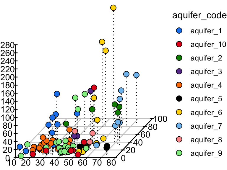
data vis exercises II
In this set of exercises we’re going to practice making more plots using the dataset solvents. Well, you don’t have to use solvents, you could use something else if you want, but solvents is a fun one to explore. Since you are now familiar with filtering and plotting data, the prompts in this assignment are going to be relatively open ended - I do not care what variables you map to x, y, fill, color, etc. Rather, I expect your submission to demonstrate to me that you have explored each of the new topics covered in the previous chapter. This includes geoms beyond geom_point() and geom_violin(), facets, scale modifications, and theme adjustments. Be creative! Explore the solvents dataset. Find something interesting! Show me that you have mastered this material. Don’t forget about the ggplot cheat sheet (see the “Links” section in this book).
As before, for these exercises, you will write your code and answers to any questions in the Script Editor window of your RStudio as an R Markdown document. You will compile that file as a pdf and submit it on Canvas. If you have any questions please let me know.
Some pointers:
If your code goes off the page, don’t be afraid to wrap it across multiple lines, as shown in some of the examples in the previous set of exercises.
Don’t be afraid to put the variable with the long elements / long text on the y-axis and the continuous variable on the x-axis.
Create a plot that has x and y axes that are continuous variables. Add to this plot
facet_grid, and specify that the facets should be based on a categorical variable (ideally a categorical variable with a small number of total categories). Now make two versions of that plot, one that uses thescales = "free"feature offacet_gridand a second the other does not (i.e. one should usefacet_grid(<things>), while the other usesfacet_grid(<things>, scales = "free")). Write a single caption that describes both plots, highlighting the advantages provided by each plot over the other. For additional tips on writing captions, please see the “Writing” chapter in this book.Using a continuous variable on one axis and a discrete (categorical) variable on the other, create two plots that are identical except that one uses
geom_point(), while the other usesgeom_jitter(). Write a single caption that describes both plots. The caption should highlight the differences bewteen these two plots and it should describe case(s) in which you think it would be appropriate to usegeom_jitter()overgeom_point().Make a plot that has four aesthetic mappings (x and y mappings count). Use the
scales_*family of commands to modify some aspect of each scale create by the four mappings. Hint: some scales are somewhat tricky to modify (alpha, linetype, …), and some scales are easier to modify (x, y, color, fill, shape). You may need to use some google searches to help you. Queries along the lines of “how to modify point color in ggplot” should direct you to a useful resource.Make a plot and manually modify at least three aspects of its theme (i.e. do not use one of the build in complete themes such as
theme_classic(), rather, manually modify components of the theme usingtheme()). This means that inside yourtheme()command, there should be three arguments separated by commas.Identify a relationship between two variables in the dataset. Create a plot that is optimized (see note) to highlight the features of this relationship. Write a short caption that describes the plot and the trend you’ve identified and highlighted. Note: I realize that the word “optimize” is not clearly defined here. That’s ok! You are the judge of what is optimized and what is not. Use your caption to make a case for why your plot is optimized. Defend your ideas with argument!
Watch this video on bar plots. Add a section to the end of the R Markdown document you made for Part 2 that describes the problem outlined in the video and one potential solution to the problem.
further reading
For additional explanations of ggplot2: ggplot2-book.
Check out some of the incredible geoms that are easy to access using R and ggplot2: R Graph Gallery. Use these to make your figures attractive and easy to interpret!
For a challenge, try implementing these awesome color scales: Famous R Color Palettes. Note that some of these are optimized for colorblind individuals and that other are optimized for continuous hue gradients, etc.
For a list of data visualization sins: Friends Don’t Let Friends. Some interesting things in here!
For more information on data visualization and graphics theory, check out the works by Edward Tufte: Edward Tufte. A digital text that covers similar topics is here: [Look At Data] (https://socviz.co/lookatdata.html).
Some examples of award winning data visualization: Information Is Beautiful Awards and Data Vis Inspiration.