5 the pipe and summaries
5.1 the pipe (%>%)
We have seen how to create new objects using <-, and we have been filtering and plotting data using, for example:
ggplot(filter(alaska_lake_data, park == "BELA"), aes(x = pH, y = lake)) + geom_col()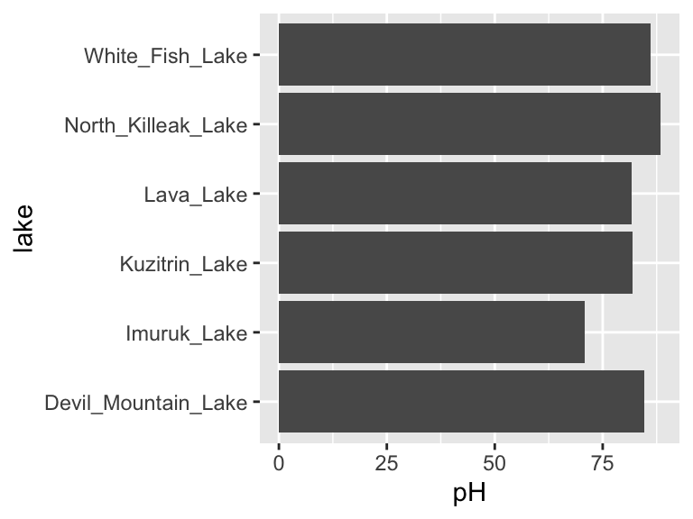
However, as our analyses get more complex, the code can get long and hard to read. We’re going to use the pipe %>% to help us with this. Check it out:
alaska_lake_data %>%
  filter(park == "BELA") %>%
  ggplot(aes(x = pH, y = lake)) + geom_col()
Neat! Another way to think about the pipe:
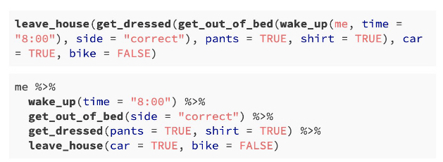
The pipe will become more important as our analyses become more sophisticated, which happens very quickly when we start working with summary statistics, as we shall now see…
5.2 summary statistics
So far, we have been plotting raw data. This is well and good, but it is not always suitable. Often we have scientific questions that cannot be answered by looking at raw data alone, or sometimes there is too much raw data to plot. For this, we need summary statistics - things like averages, standard deviations, and so on. While these metrics can be computed in Excel, programming such can be time consuming, especially for group statistics. Consider the example below, which uses the ny_trees dataset. The NY Trees dataset contains information on nearly half a million trees in New York City (this is after considerable filtering and simplification):
ny_trees
## # A tibble: 378,762 × 14
##    tree_height tree_diameter address tree_loc pit_type soil_lvl status spc_latin
##          <dbl>         <dbl> <chr>   <chr>    <chr>    <chr>    <chr>  <chr>
##  1        21.1             6 1139 5… Front    Sidewal… Level    Good   PYRUS CA…
##  2        59.0             6 2220 B… Across   Sidewal… Level    Good   PLATANUS…
##  3        92.4            13 2254 B… Across   Sidewal… Level    Good   PLATANUS…
##  4        50.2            15 2332 B… Across   Sidewal… Level    Good   PLATANUS…
##  5        95.0            21 2361 E… Front    Sidewal… Level    Poor   PLATANUS…
##  6        67.5            19 2409 E… Front    Continu… Level    Good   PLATANUS…
##  7        75.3            11 1481 E… Front    Lawn     Level    Excel… PLATANUS…
##  8        27.9             7 1129 5… Front    Sidewal… Level    Good   PYRUS CA…
##  9       111.             26 2076 E… Across   Sidewal… Level    Excel… PLATANUS…
## 10        83.9            20 2025 E… Front    Sidewal… Level    Excel… PLATANUS…
## # … with 378,752 more rows, and 6 more variables: spc_common <chr>,
## #   trunk_dmg <chr>, zipcode <dbl>, boroname <chr>, latitude <dbl>,
## #   longitude <dbl>
More than 300,000 observations of 14 variables! That’s 4.2M data points! Now, what is the average and standard deviation of the height and diameter of each tree species within each NY borough? Do those values change for trees that are in parks versus sidewalk pits?? I don’t even know how one would begin to approach such questions using traditional spreadsheets. Here, we will answer these questions with ease using two new commands: group_by() and summarize(). Let’s get to it.
Say that we want to know (and of course, visualize) the mean and standard deviation of the heights of each tree species in NYC. We can see that data in first few columns of the NY trees dataset above, but how to calculate these statistics? In R, mean can be computed with mean() and standard deviation can be calculated with sd(). We will use the function summarize() to calculate summary statistics. So, we can calculate the average and standard deviation of all the trees in the data set as follows:
ny_trees %>%
  summarize(mean_height = mean(tree_height))
## # A tibble: 1 × 1
##   mean_height
##         <dbl>
## 1        72.6

ny_trees %>%
  summarize(stdev_height = sd(tree_height))
## # A tibble: 1 × 1
##   stdev_height
##          <dbl>
## 1         28.7
Great! But how to do this for each species? We need to subdivide the data by species, then compute the mean and standard deviation, then recombine the results into a new table. First, we use group_by(). Note that in ny_trees, species are indicated in the column called spc_latin. Once the data is grouped, we can use summarize() to compute statistics.
ny_trees %>%
  group_by(spc_latin) %>%
  summarize(mean_height = mean(tree_height))
## # A tibble: 12 × 2
##    spc_latin              mean_height
##    <chr>                        <dbl>
##  1 ACER PLATANOIDES              82.6
##  2 ACER RUBRUM                  106.
##  3 ACER SACCHARINUM              65.6
##  4 FRAXINUS PENNSYLVANICA        60.6
##  5 GINKGO BILOBA                 90.4
##  6 GLEDITSIA TRIACANTHOS         53.0
##  7 PLATANUS ACERIFOLIA           82.0
##  8 PYRUS CALLERYANA              21.0
##  9 QUERCUS PALUSTRIS             65.5
## 10 QUERCUS RUBRA                111.
## 11 TILIA CORDATA                 98.8
## 12 ZELKOVA SERRATA              101.
Bam. Mean height of each tree species. summarize() is more powerful though, we can do many summary statistics at once:
ny_trees %>%
  group_by(spc_latin) %>%
  summarize(
    mean_height = mean(tree_height),
    stdev_height = sd(tree_height)
  ) -> ny_trees_by_spc_summ
ny_trees_by_spc_summ
## # A tibble: 12 × 3
##    spc_latin              mean_height stdev_height
##    <chr>                        <dbl>        <dbl>
##  1 ACER PLATANOIDES              82.6        17.6
##  2 ACER RUBRUM                  106.         15.7
##  3 ACER SACCHARINUM              65.6        16.6
##  4 FRAXINUS PENNSYLVANICA        60.6        21.3
##  5 GINKGO BILOBA                 90.4        24.5
##  6 GLEDITSIA TRIACANTHOS         53.0        13.0
##  7 PLATANUS ACERIFOLIA           82.0        16.0
##  8 PYRUS CALLERYANA              21.0         5.00
##  9 QUERCUS PALUSTRIS             65.5         6.48
## 10 QUERCUS RUBRA                111.         20.7
## 11 TILIA CORDATA                 98.8        32.6
## 12 ZELKOVA SERRATA              101.         10.7
Now we can use this data in plotting. For this, we will use a new geom, geom_pointrange, which takes x and y aesthetics, as usual, but also requires two additional y-ish aesthetics ymin and ymax (or xmin and xmax if you want them to vary along x). Also, note that in the aesthetic mappings for xmin and xmax, we can use a mathematical expression: mean-stdev and mean+stdev, respectivey. In our case, these are mean_height - stdev_height and mean_height + stdev_height. Let’s see it in action:
ny_trees_by_spc_summ %>%
ggplot() +
  geom_pointrange(
      aes(
        y = spc_latin,
        x = mean_height,
        xmin = mean_height - stdev_height,
        xmax = mean_height + stdev_height
      )
    )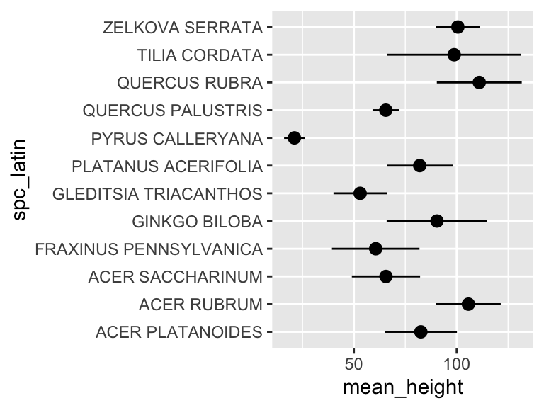
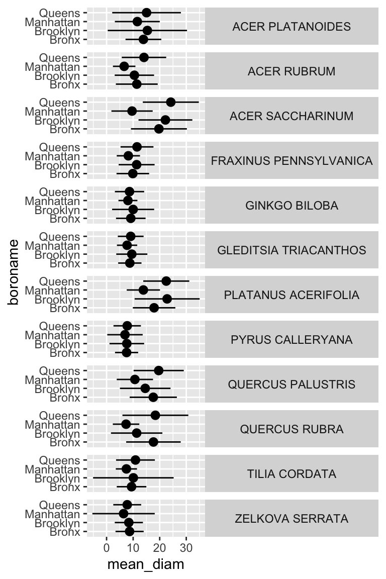
Cool! Just like that, we’ve found (and visualized) the average and standard deviation of tree heights, by species, in NYC. But it doesn’t stop there. We can use group_by() and summarize() on multiple variables (i.e. more groups). We can do this to examine the properties of each tree species in each NYC borough. Let’s check it out:
ny_trees %>%
  group_by(spc_latin, boroname) %>%
  summarize(
    mean_diam = mean(tree_diameter),
    stdev_diam = sd(tree_diameter)
  ) -> ny_trees_by_spc_boro_summ
## `summarise()` has grouped output by 'spc_latin'. You can override using the `.groups` argument.
ny_trees_by_spc_boro_summ
## # A tibble: 48 × 4
## # Groups:   spc_latin [12]
##    spc_latin        boroname  mean_diam stdev_diam
##    <chr>            <chr>         <dbl>      <dbl>
##  1 ACER PLATANOIDES Bronx         13.9        6.74
##  2 ACER PLATANOIDES Brooklyn      15.4       14.9
##  3 ACER PLATANOIDES Manhattan     11.6        8.45
##  4 ACER PLATANOIDES Queens        15.1       12.9
##  5 ACER RUBRUM      Bronx         11.4        7.88
##  6 ACER RUBRUM      Brooklyn      10.5        7.41
##  7 ACER RUBRUM      Manhattan      6.63       4.23
##  8 ACER RUBRUM      Queens        14.1        8.36
##  9 ACER SACCHARINUM Bronx         19.7       10.5
## 10 ACER SACCHARINUM Brooklyn      22.2       10.1
## # … with 38 more rows
Now we have summary statistics for each tree species within each borough. This is different from the previous plot in that we now have an additional variable (boroname) in our summarized dataset. This additional variable needs to be encoded in our plot. Let’s map boroname to x and facet over tree species, which used to be on x. We’ll also manually modify the theme element strip.text.y to get the species names in a readable position.
ny_trees_by_spc_boro_summ %>%
ggplot() +
  geom_pointrange(
    aes(
      y = boroname,
      x = mean_diam,
      xmin = mean_diam-stdev_diam,
      xmax = mean_diam+stdev_diam
    )
  ) +
  facet_grid(spc_latin~.) +
  theme(
    strip.text.y = element_text(angle = 0)
  )
Excellent! And if we really want to go for something pretty:
ny_trees_by_spc_boro_summ %>%
ggplot() +
  geom_pointrange(
    aes(
      y = boroname,
      x = mean_diam,
      xmin = mean_diam-stdev_diam,
      xmax = mean_diam+stdev_diam,
      fill = spc_latin
    ), color = "black", shape = 21
  ) +
  labs(
    y = "Borough",
    x = "Trunk diameter",
    caption = str_wrap("Figure 1: Diameters of trees in New York City. Points correspond to average diameters of each tree species in each borough. Horizontal lines indicate the standard deviation of tree diameters. Points are colored according to tree species.", width = 80)
  ) +
  facet_grid(spc_latin~.) +
  guides(fill = "none") +
  scale_fill_brewer(palette = "Paired") +
  theme_bw() +
  theme(
    strip.text.y = element_text(angle = 0),
    plot.caption = element_text(hjust = 0.5)
  )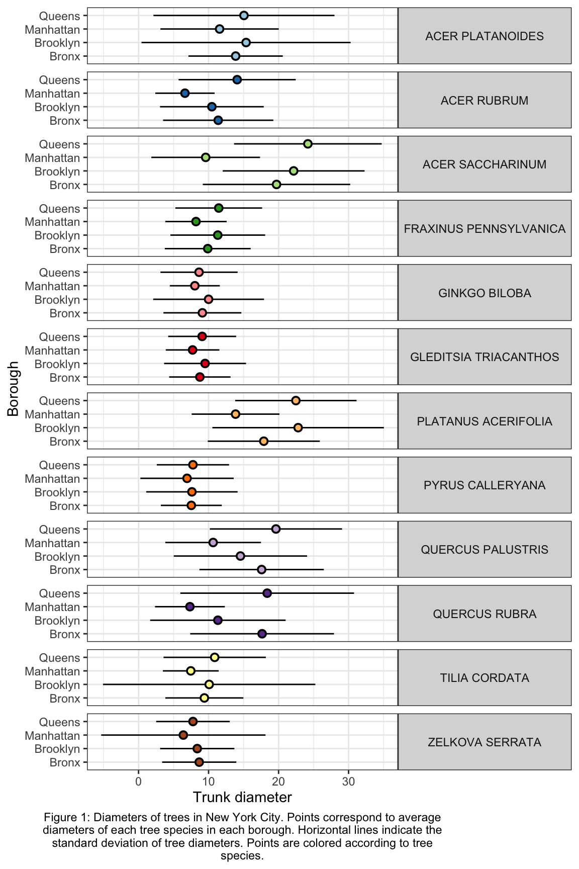
Now we are getting somewhere. It looks like there are some really big maple trees (Acer) in Queens.
5.3 exercises
Isn’t seven the most powerfully magical number? Isn’t seven the most powerfully magical number? Yes… I think the idea of a seven-part assignment would greatly appeal to an alchemist.
In this set of exercises we are going to use the periodic table. After you run source() you can load that dataset using periodic_table. Please use that dataset to run analyses and answer the following quetions/prompts. Compile the answers in an R Markdown document, compile it as a pdf, and upload it to the Canvas assignment. Please let me know if you have any questions. Good luck, and have fun!
Some pointers:
If your code goes off the page, don’t be afraid to wrap it across multiple lines, as shown in some of the examples in the previous set of exercises.
Don’t be afraid to put the variable with the long elements / long text on the y-axis and the continuous variable on the x-axis.
Make a plot using
geom_point()that shows the average atomic weight of the elements discovered in each year spanned by the dataset (i.e. what was the average weight of the elements discovered in 1900? 1901? 1902? etc.). You should see a trend, particularly after 1950. What do you think has caused this trend?The column
state_at_RTindicates the state of each element at room temperate. Make a plot that shows the average first ionization potential of all the elements belonging to each state group indicated instate_at_RT(i.e. what is the average 1st ionization potential of all elements that are solid at room temp? liquid? etc.). Which is the highest?Filter the dataset so that only elements with atomic number less than 85 are included. Considering only these elements, what is the average and standard deviation of boiling points for each type of
crystal_structure? Make a plot usinggeom_pointrange()that shows the mean and standard deviation of each of these groups. What’s up with elements that have a cubic crystal structure?Now filter the original dataset so that only elements with atomic number less than 37 are considered. The elements in this dataset belong to the first four periods. What is the average abundance of each of these four periods in seawater? i.e. what is the average abundance of all elements from period 1? period 2? etc. Which period is the most abundant? In this context what does “CHON” mean? (not the rock band, though they are also excellent, especially that song that features GoYama)
Now filter the original dataset so that only elements with atomic number less than 103 are considered. Filter it further so that elements from group number 18 are excluded. Using this twice-filtered dataset, compute the average, minimum, and maximum values for electronegativiy for each
group_number. Usegeom_point()andgeom_errorbar()to illustrate the average, minimum, and maximum values for each group number.Filter the dataset so that only elements with atomic number less than 85 are considered. Group these by
color. Now filter out those that havecolor == "colorless". Of the remaining elements, which has the widest range of specific heats? Usegeom_point()andgeom_errorbar()to illustrate the mean and standard deviation of each color’s specific heats.You have learned many things in this course so far.
filter(),ggplot(), and nowgroup_by()andsummarize(). Using all these commands, create a graphic to illustrate what you consider to be an interesting periodic trend. Use theme elements and scales to enhance your plot: impress me!